OK. I will try this again. I think we have a communication problem, which is completely understandable, and I will try to communicate better. And I thank you for your attempt to help.
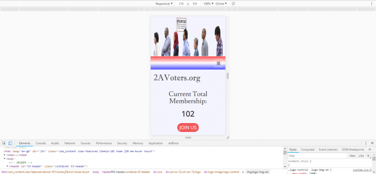
If I use your css rules, they do not work. The img class in the rule does not work. The rules do nothing if the img class is included in the rule. I am using Chrome inspector on windows machine. I am testing both large and small screen. To make the rules work, I must use the rules WITHOUT the img class, like this:
.logo-control .logo-img{

	    max-width: 100%;

		  min-height: 170px;

        }

	.logo-control .logo-img-sm{

		max-width: 100%;

		min-height: 170px;

		}
The max-width rule solves the swipe-left right-whitespace problem, but it causes a decrease-img-height problem which then causes a sticky navbar failure.
The min-height rule solves the decrease-img-height problem, but it causes an image distortion problem because the 2 combined rules are forcing the logo-img to be 2 things: responsive AND min-height, which = distortion.
In my screenshots above, pic1 shows the swipe-left problem that occurs when there is no max-width or min-height rule. The logo-img is wider than the container, therefore the page has whitespace on the right side. HOWEVER, the sticky navbar in this situation is perfect: smooth with no jump.
In my screenshot pic2, it is using only max-width rule, which solves the swipe-left whitespace problem, but causes the jumpy navbar problem where the navbar can scroll above the pagetop before jumping back down to cover over page content. You can see in pic2 that the navbar is almost gone above the pagetop, and this is before the affix event has occurred. If you test these problems yourself, you will see it.
If I use both the max-width and min-height rule, then the screen looks like pic3, attached to this post. Using both rules solves both the swipe-left problem AND the jumpy navbar problem, but it causes a 3rd problem of distorted image (tall figures in image).
So my goal is to solve the swipe-left right-whitespace problem without causing a new jumpy navbar problem or a new distorted logo-img problem.
My other goal is to communicate clearly enough so that when i read your replies, I feel like you understand what my actual problem is.
My hope is that there is a way to make the container ignore images that are wider than the container. This means that the container would just a crop the edge off the image and display what is left.
This is against to typical responsive design, but it is also a perfect solution for a bootstrap affix scrolling-sticky navbar where the affix point must be set at a fixed value (170px in my site). The bootstrap affix element requires that the header image is a constant height on all screen widths, NOT a responsive header image that changes width and therefore also changes height to avoid distortion.
If you can undertstand all 3 problems I described in this thread, and you can then say that what I want is impossible, that will be fine. So far, you have not said that. The replies that you made above made me think that you did not understand my actual problem because I failed to fully explain it.
Also, it is possible that your test results are different than mine because your css rules have the img class as the last designation, but the rules do not work for me until I remove the img class from the rule. Maybe that is a problem?
OK! Thank you for your time! If you can help with this, that would be great! Or if you fully understand the issue and the JA team believes that my goal is impossible, that would also be great, because then I would know...
DS
