How can I adjust the mobile view logo and trigger menu icon so that they don't cover the module just below them, in this case the Banner module. If I unpublish the module the logo covers the next lower module.

The "mobile-logo" and the "off-canvas-trigger-mobile" menu icon are both in the default toolbar row.

Also, how can I make the logo and menu no longer "sticky"?

Thank you
Sharon

    ssartjb You can try add this to custom.css file and adjust height value accordingly :

    @media only screen 
      and (max-device-width: 480px)
     {#logowrap{position: relative !important;height: 130px;}}

    Kindly ensure to clear your browser cache if changes dont reflect

    I tested your solution and cleared all browser history. It seemed to have no effect at all. Could it be you have given me some useful code but are targeting the wrong row and module?

    I noticed your code targets #logowrap. Correct me if I am wrong but wouldn't that target the "logo" row or the "logo" module position?

    The modules I am trying to fix are in module positions named " Mobile-logo" and "off-canvas-trigger-mobile". The modules are in the row named "toolbar" . Please see attached screenshot of "Buildr design view" .

    I tried the same code you gave me changing #logowarp to #toolbarwrap and still saw no effect. The reason I am placing the modules in the toolbar row is that the "off-canvas-trigger-mobile" doesn't seem to work properly in other rows.
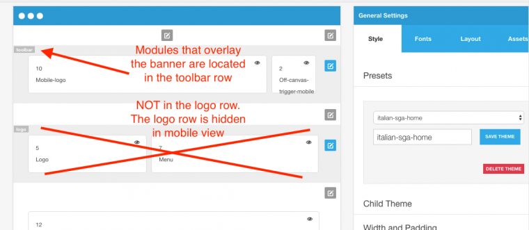
      ssartjb

      Try this one:

      @media (max-width: 768px) {
      #toolbar.zen-row-wrap {
          position: relative !important;
      }
      
      #bannerwrap {
          margin-top: 0px !important;
          padding-top: 10px;
      }
      }
      Write a Reply...
      You need to Login to view replies.