Template and k2 gets messed up after update - Part 3
aman204 Please try now. Thx!
- Edited
aman204 Thx, it looks good!
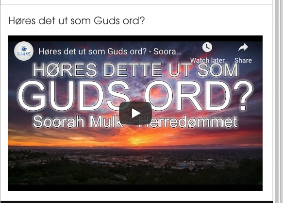
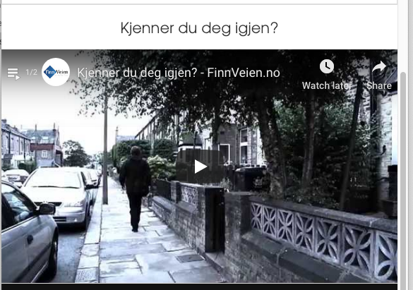
A) In terms of the YT video, I mean from the breakpoint at 767px and downwards. It is not stretching out to the edges as in the other two sites.
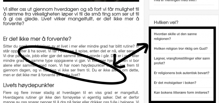
B ) On the front page, from 522px to 480px, one of the module items is being pushed down, is it possible to fix that?

C) The big blue button inside articles, it was green before. Can it be made green again:

D) Also these links should be grey, and when hoovered they should be green:

starlight Hi
A) Video : And this is how it looks like on the other pages, and should also look like here:
Kindly let us know the other page where similar module can be seen assigned so as to take closer look
C) Quick way would be adding this to CSS file :
#k2Container a.btn-blue {background-color: #4dc247 !important;border-color: #4dc247 !important;}
D) Try add this also to similar CSS file :
.itemBody sup a,.itemCategory a{color:#333 !important;}
.itemBody sup a:hover,.itemCategory a:hover{color:#4dc247 !important;}aman204 Thx.
A ) finnveien.no
D ) That worked. But can you give similiar code for links inside articles, and for the bact too top link as well.


- Edited
starlight Hi
A) Try add this to CSS file :
@media (max-width: 767px){.itemid-435 .t3-content .item-page{padding: 20px 0 0 0 !important;}
D) Try change the above CSS to
.itemBody sup a,.itemCategory a,.itemBody a{color:#333 !important;}
.itemBody sup a:hover,.itemCategory a:hover,.itemBody a:hover{color:#4dc247 !important;}A ) Yes, that fixed it. But can you make the text above the video centered as well (like the other site), because now its going all the way out to the side.
D ) I have added it. The links are correct, but the back to top button is still the same, and now the big button text has also been affected. Its supposed to be white, also when hoovered.
aman204 Yes, that looks good. I was going to check why the YT video had black bars on the top and the bottom, but for some reason, after saving the article, without any change in the code, without enabling any editor, the video is not displaying.
This is the embed code: <div class="videoWrapper"><i-frame src=//www.youtube.com/embed/KHD2b7gXLEI?rel=0&modestbranding=1" frameborder="0"allowfullscreen="allowfullscreen"></iframe></div>
What can be the issue?
starlight but for some reason, after saving the article, without any change in the code, without enabling any editor, the video is not displaying.
There is syntax error in specific code snippet due to which it isnt rendering. You may make the code structure right with changing to iframe as seen in screenshot
aman204 I see. I just did so, but after saving it adds the "-" between "i" and "frame" again automatically.
It due to RS Firewall component on your site, check its manual here: https://www.rsjoomla.com/support/documentation/rsfirewall-user-guide/frequently-asked-questions/scrambled-tags-iframe-becomes-i-frame.html
saguaros Thx, that was helpful!
I see that there have been added black bars to top and the bottom of the video. The embed code does not include this as it is responsive. Is there a css override to fix this?
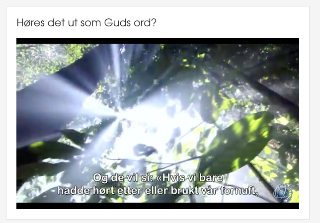
starlight Hi. Problem with bars at top and bottom is because there is no way for CSS to be prepared for resizing. So the default code is prepared for size 16:9. If the video is even slightly bigger in height or weight than it will show those bars. You may play with the padding value in this code:
.videoWrapper {
    padding-bottom: 56.25% !important;
}
but it may fix one video and break (add black bars) in another if they are not equal size.
teitbite Thx, that solved the issue!
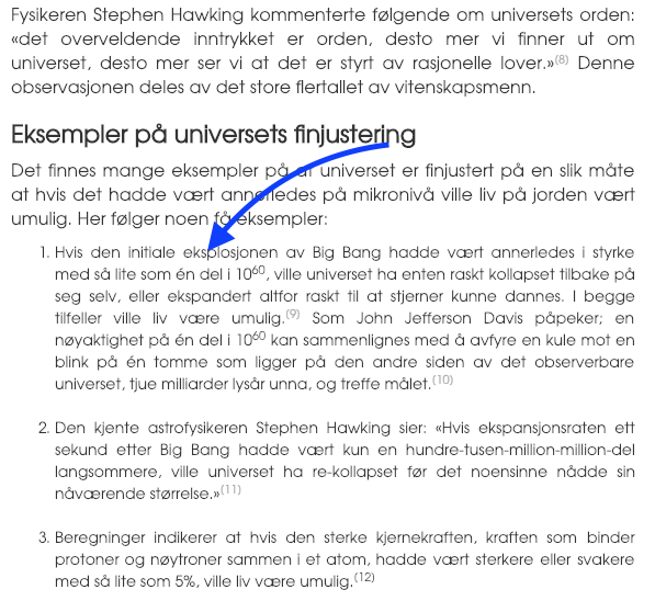
Aman gave me a code to make the paragraph text bigger, and that worked. But I just noticed that the text here was not affected, is there another code I can add to change size of this text: http://www.finnislam.no/finnes-gud/finnes-det-en-gud
- Edited
aman204 Thx. That worked!
On the other sites there is something that is overriding the font type. I wanted to make the font similar on the three sites. When I look at the preview in theme magic, I don't see the font being changed on finnveien.no and muhammed.no.
