Hello,
On the OnePage2 demo site , when background images reduce down for a mobile phone screen size, the middle of the photo seems to stay in the centre with the rest being cropped.
I was wondering which layout setting could do this? On my current site it just collpases to the left hand edge of the photo, therefore not really showing much of the photo (if anything at all).
any ideas?
cheers
Sean

    Salexis To be more precise and avoid confusion/ambiguity in addressing your relative issue, Kindly provide screenshot marked with annotations showing the respective images

      aman204 Sreenshots of what I mean:
      Demosite laptop screen:

      Demosite phone width: (The picture is shown almost as much as the wide version with coffe cup in the middle)

      My site Wide screen:
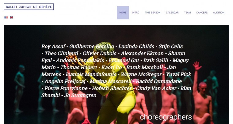
      My site phone screen: (only the dark left side of photo is visible)

      However, as I grabbed the screens I noticed something...Is the demo photo actually quite small and then given a 200% setting in the template? So that when screen width is reduced we are in fact seeing the photo real size?
      I , on the other hand chose a photo that is 1000 pixels wide.

        Write a Reply...
        You need to Login to view replies.