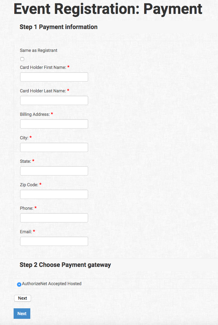
I have similar issues with the Payment Information Process as follows with Step 2:
The radio button is already filled in which indicates to computer literate users that the selection has already been made. Since users think a selection is already made, it's not obvious that they should repeat the selection that's already displayed in order to fix the problem below with the two "next" buttons. If the UI indicates it's selected, then the website should acknowledge it as accepted. If the website is not acknowledging it as selected, then the radio button should not display shaded in as though it is selected. Any situation where that's not the case, the website is broken and it's not obvious to users what they should do.
My guess is that this has to do with browser defaults. Sometimes browsers pre-fill form elements (due to defaults, history, etc.) and sometimes this leads to bugs where programmers are only looking to see if the user clicks the button, not if it was already selected by other means (like browser defaults or even selection by keyboard). That can lead to this kind of issue where the user validly thinks their answer is already indicated because it was shaded by default by the browser, but the web application is wrongly assuming that the choice is empty until a click occurs. The easiest solution is explicitly "empty" the selection so that any default selections are wiped out and/or to more carefully check the selected values to detect all means by which the selection could be made.
Ideally, users shouldn't even have to make a choice like payment gateway with only one valid option (especially as a means to hiding future always-invalid options like the second next button). But at the very least, please implement a solution lives up to the following and test it in the major browsers:
A) If the website is waiting for a selection, the user should see that selection as not having been made (i.e. the radio button would be unchecked).
😎 If the "next" button doesn't take the user to the appropriate "next" step, it should not be visible. The user should not have a way to "break" the process and if they must, it should be obvious to them that that's what they're doing.
UPDATE: : I resolved this issue by changing the payment method from Accepted Hosted to simply SIM payment method. Now there is only one instance for the NEXT button.


 If the "next" button doesn't take the user to the appropriate "next" step, it should not be visible. The user should not have a way to "break" the process and if they must, it should be obvious to them that that's what they're doing.