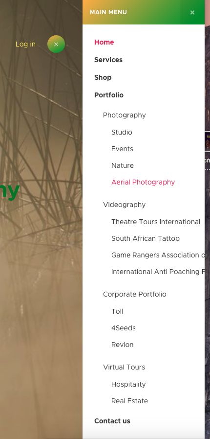
Thanks for looking into that for me. This action combined with the custom.css file i added to templates/'template_name'/css with the following css has made a big improvement.
.t3-off-canvas .dropdown.parent:hover .dropdown-menu
{
display: block;
}
.t3-off-canvas .t3-off-canvas-body .dropdown-menu {
display: none;
}
What css might i add to achieve a style such as pictured, where there is a dropdown arrow to indicate to the user there are other levels. When expanded it should remain so when the user expands the next level 1 menu item. You can find this off canvas functioning on africaslegends.be-artphotography.com 
In addition the off canvas menu expansion(s) per the users session can remain in expanded view as the user browses different pages on the site.
The text for the menu items is remaining on one line and going off screen, can this be resolved by making the off canvas wider or making the text use a second line?
