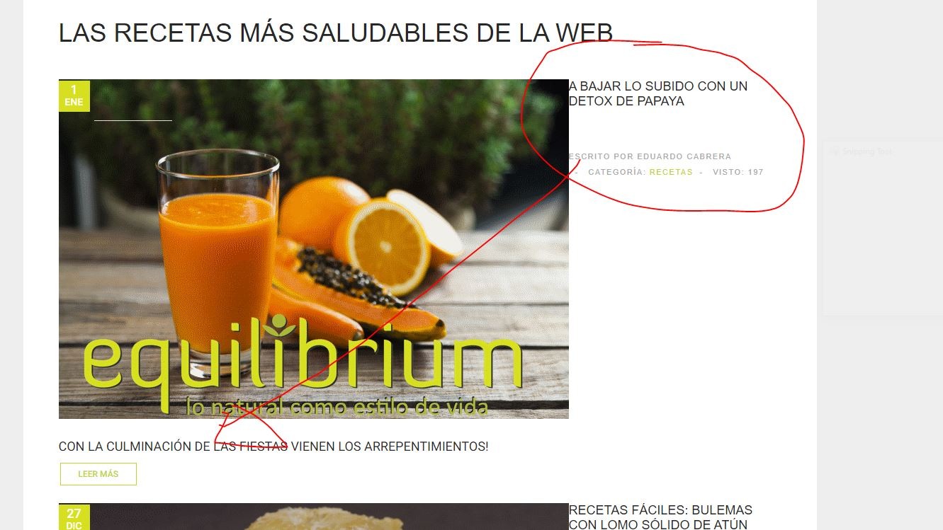
Hello, in the category menu the Article title and date is out of place in the desktop version, and the date is out of place in the mobile version..
Date should be at the left side of the article and the title below the photo.. I dont know what has happened here suddenly.
menu template isues
equilibriumx
Hi
This is because the width of the images you added is not much and its adding empty space
Width should be minimum : 1020px to fill complete space Or you can add this code in override.css file to make 100% width
.blog .section img {width:100%;}- Edited
In desktop is alright. Mobile, the date is all over the image...
As always, your expertise is well appreciated! Thks
equilibriumx
Hi
I can not see any issue with above code in mobile view: http://prntscr.com/qrkuv9

