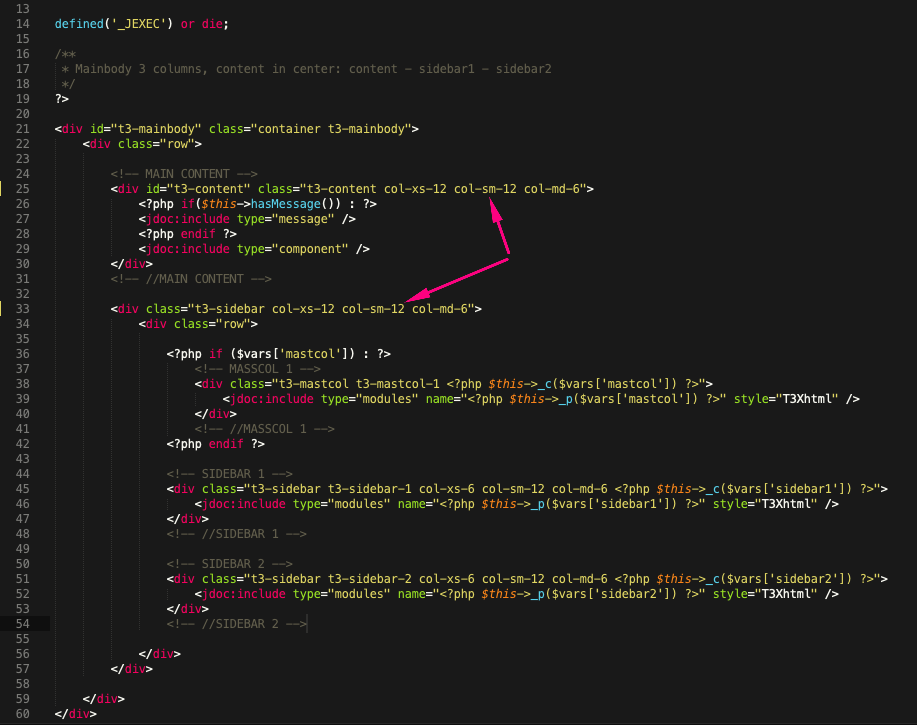
How do I change the "small responsive layout" and the "medium responsive layout" to match the "extra small responsive layout"?

Small: https://share.getcloudapp.com/QwuKWXe0
Extra Samll: https://share.getcloudapp.com/7Ku0BnoJ

I'm trying to position/stack "mast-col, sidebar-1, and sidebar-2" on the small and medium screen layouts as it is on the extra-small screen layout.

I'm using Position & Responsive Configuration: default-content-left (not sure if that is needed or not)

    Hi bwjoomlart

    For other blocks, you can configure via this layout settings but with mainbody part, you will need to change the code a little bit.

    Depend on the layout you're using, you will need to change the associated php file in this directory:

    /templates/ja_sugite/tpls/blocks/mainbody/

    For example, you're using 'default-content-left' layout with main content on the left + 2 sidebars on the right, you will edit this file:

    /templates/ja_sugite/tpls/blocks/mainbody/two-sidebar-right.php

    Look for the classes: col-sm-8 and col-sm-4 >> change them to col-sm-12 like this:

    In case that you're using only 1 sidebar on the right, you will edit this file:

    /templates/ja_sugite/tpls/blocks/mainbody/one-sidebar-right.php

    and edit the same way: https://prnt.sc/ryc7ru

    Write a Reply...
    You need to Login to view replies.