Yes, of course.
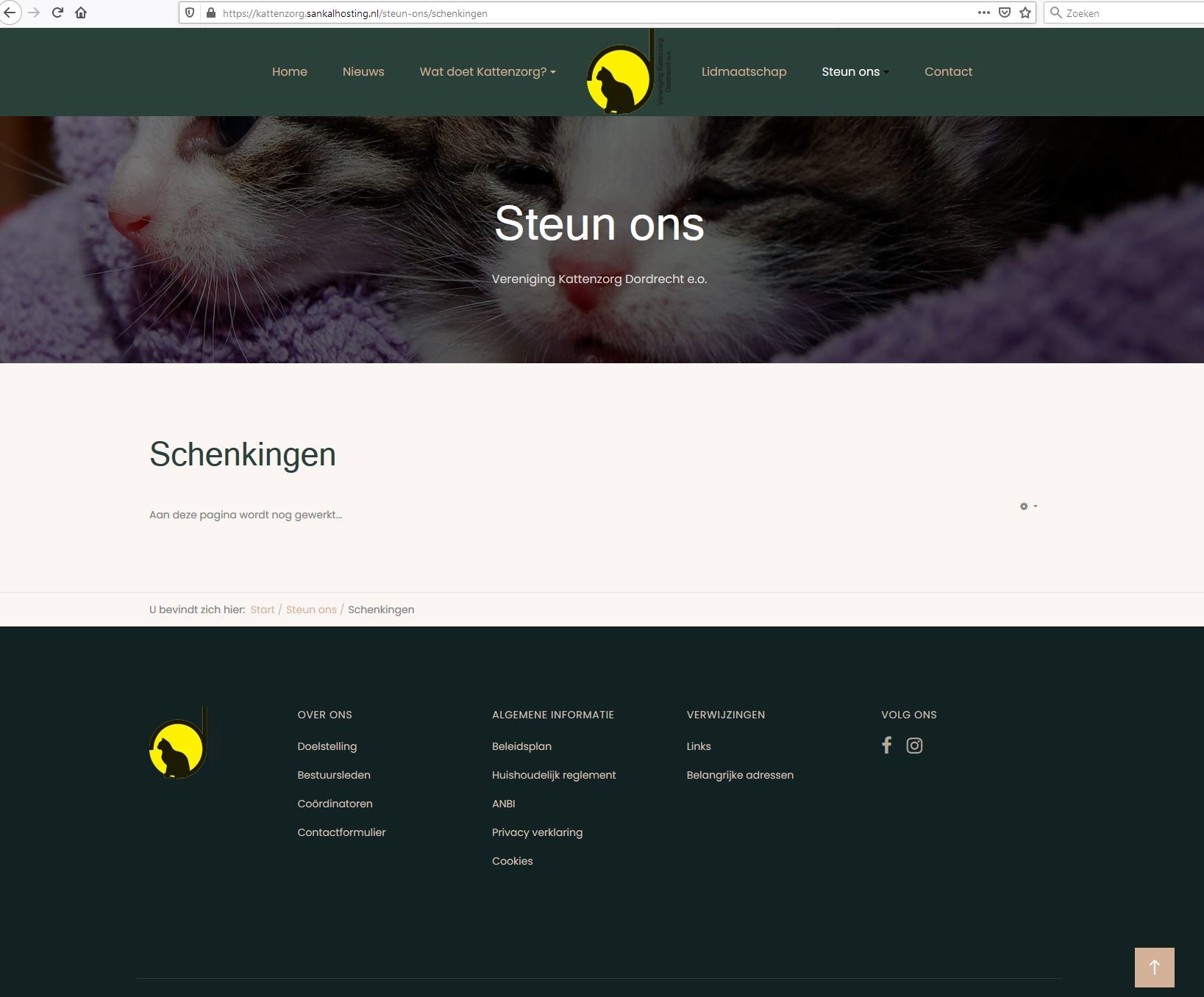
First image is how it is now, when the resolution of the view screen is higher than 1600px, like 1920px or such. As you can see the menu items are alligned in the middle and the logo is in the middle also.

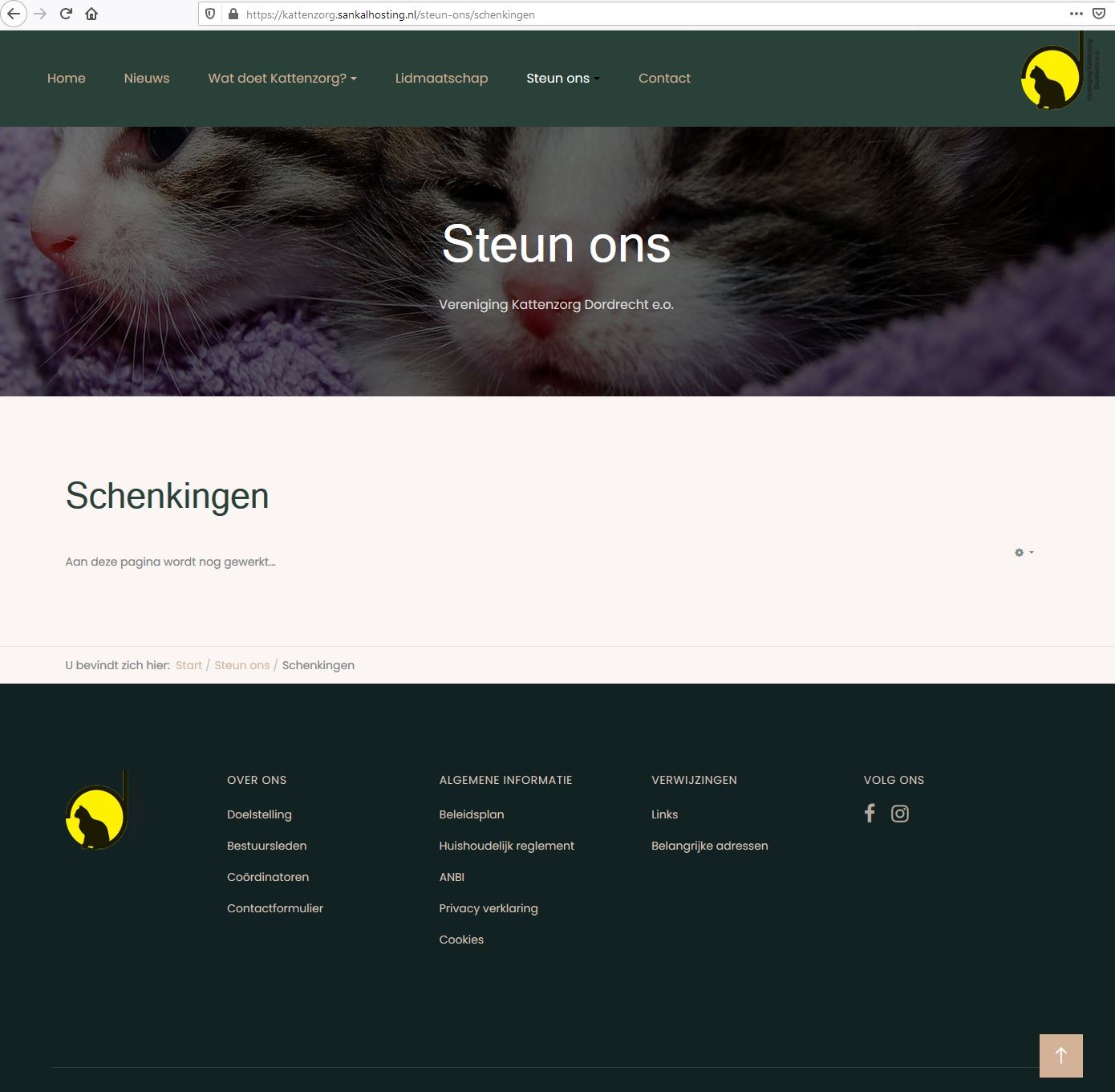
The second image is how it is now when the resolution is lower. The menu items are aligned to the left and the logo is on the right and aligned to the right, just I like to have it.

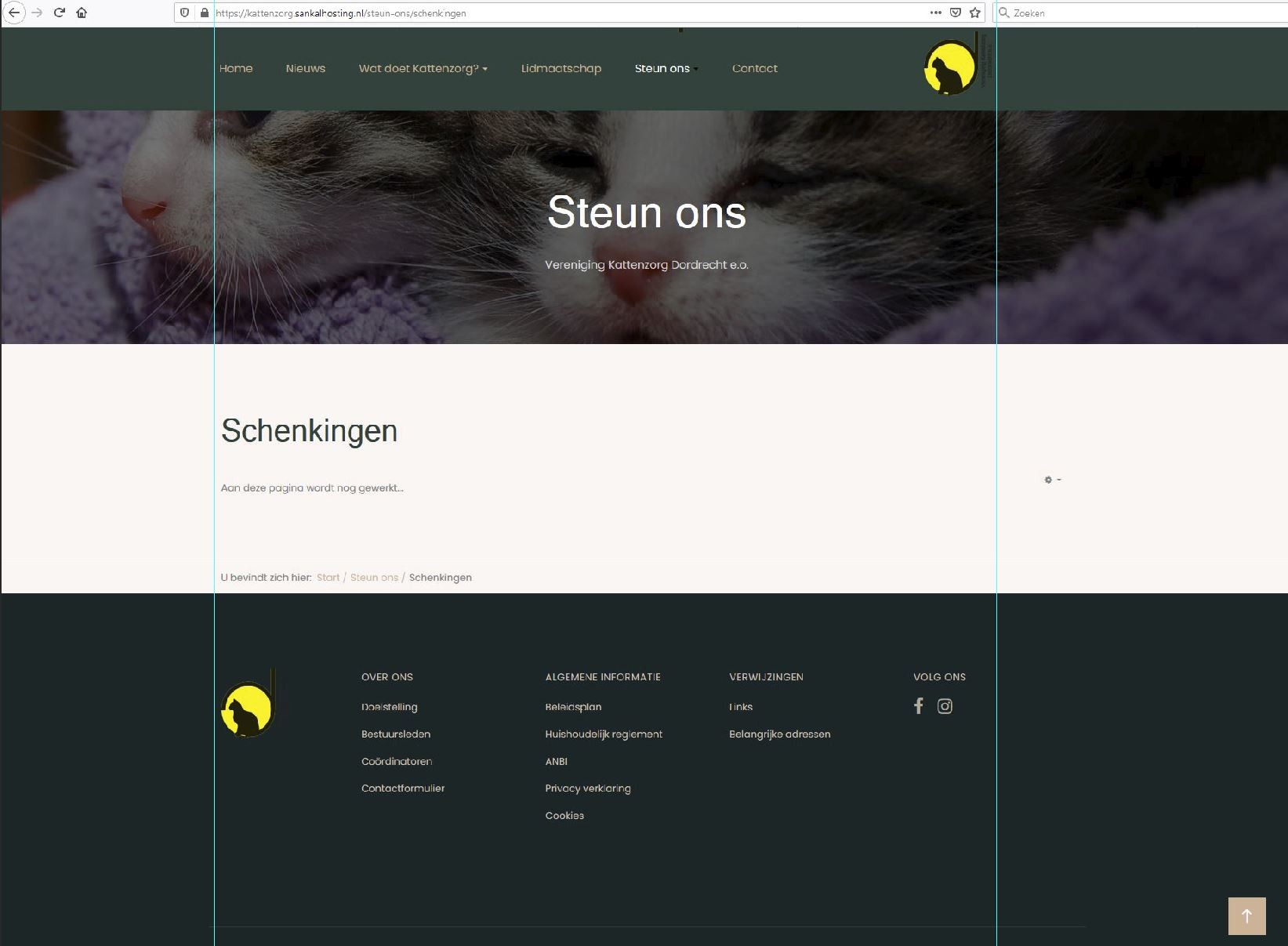
The next image is a photoshopped screenshot. Now the resolution is higer than 1600px, like 1920. As you can see the menu items are aligned to the left and the logo aligned to right, but it are within the outer limits of the footer container div.

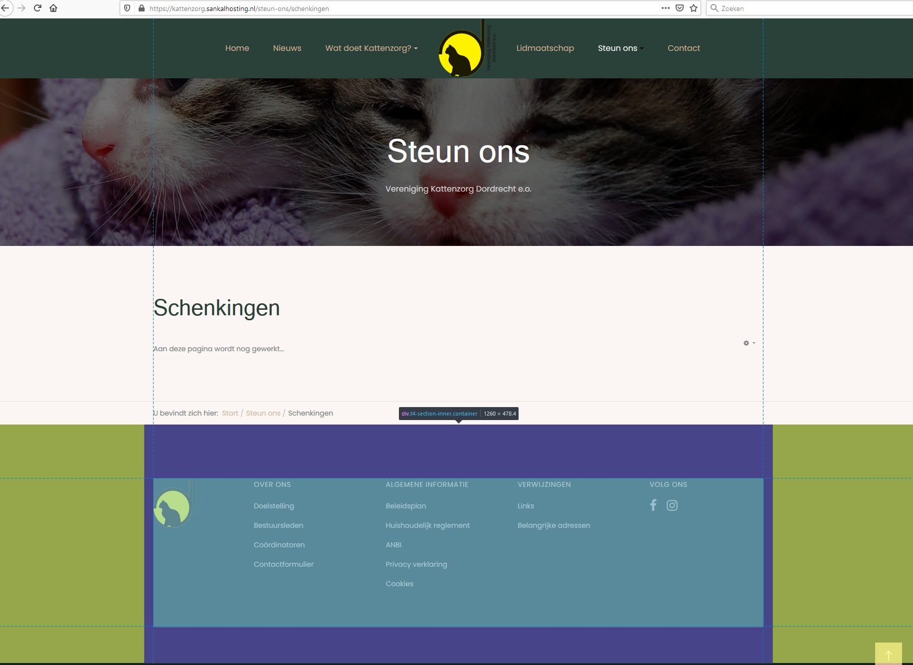
On the next image you can see which div I mean, the purple area
