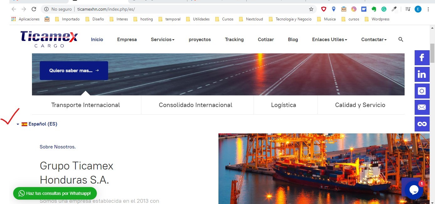
ok, I put the language switcher in the "section top" position, but now I have a small problem, in desktop version looks good, look image attach: : 
but look in Mobile version it has to much space between the flags, can you give me the code so make this margins or padding more shrink. dont see doest big space between flags, look image attach:
