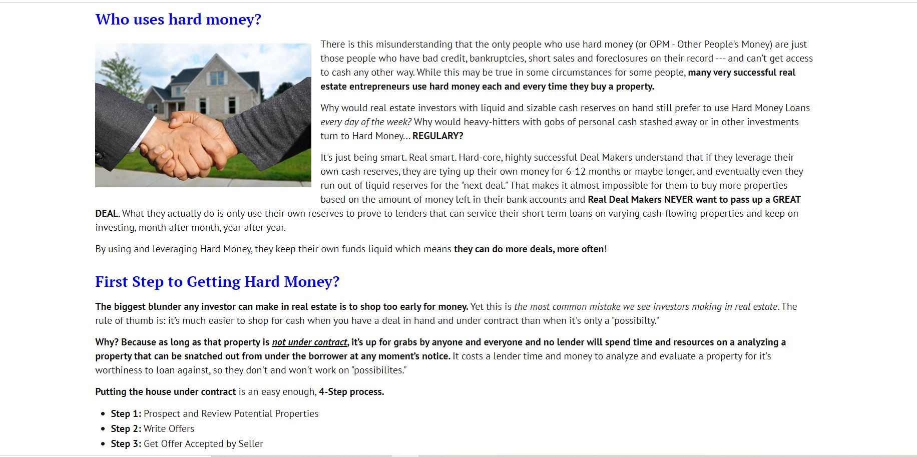
Hi everyone! I'm having a problem with the way articles are being displayed on our website. Suddenly the article content is occupying the entire screen. It's stretching to 100% width. No white borders or padding around it. The template I'm using is Ja Simply and the theme is Simply-Blue.
Here's a screenshot of one of the way the page looks with the Simply-Blue theme (all pages on the website have been assigned that theme, except for the homepage, which is Simpli-Landing page).
This is a screenshot of the the same page when switched from Simply-Blue to Simply-Green:

Notice how with Simply-Green there is a white space around the article. I don't know what we could have done to cause the theme to change like that. I tried to find find a way to fix it in the theme in the theme's manager but I don't see any place where I can have control over the padding around the articles. Does someone know how that can be fixed? Any help would be really appreciated. Thanks a lot in advance!!!
