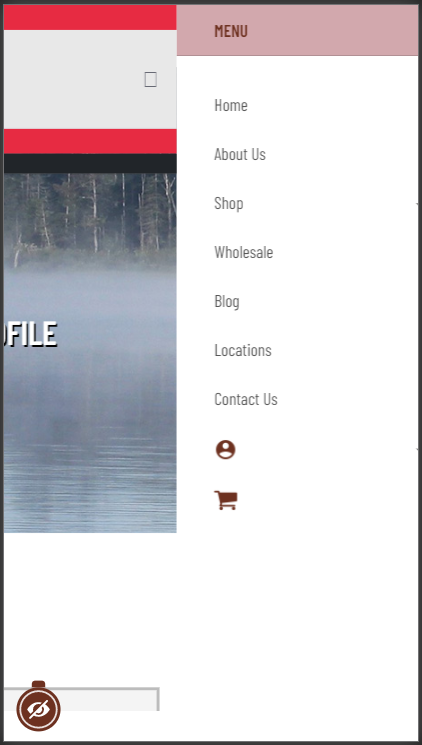
@saguaros I apologize but I made a huge mistake. Please take a look at this at this post. You had given me the CSS for the height but I forgot that before I submitted the last reply on that post I had been trying to fix the menu and left a piece of CSS that hid the mobile menu.
This is the fix I added:
.t4-offcanvas.oc-effect-1 {
    display: none !important;
}

@media only screen and (max-width: 992px) {
    .t4-offcanvas.oc-effect-1 {
        display: block !important;
    }
}
That hides the mobile menu on the desktop and enables it when the site is on a mobile device. The issue is that now, this is what I see on the Edit Profile page:

As you can see, the mobile menu is positioned to the right of the body and you can slide to it. This is how it looks with my fix but I have since removed so that you may do a proper fix. The code you had entered made it so that the menu shows below the red bars but it does not slide down because the mobile menu is displayed already expanded. Those red bars on the menu should not be there as it should match the styling of the other pages beginning with About Us and so on. The Homepage has a different version of that menu. If making changes to that means having to make changes to the rest of the menu I rather leave them there and I will change the color as an easier solution.
I apologize for the inconvenience as I believed I had removed all of my CSS for this portion.