Hi guys
Thanks for your help yesterday helping us to update our JA Sugite template to the latest version, much appreciated. Now the template is updated, we now have some styling issues we would like to resolve please, I hope you don’t mind me putting all of these into the same ticket.
These are:
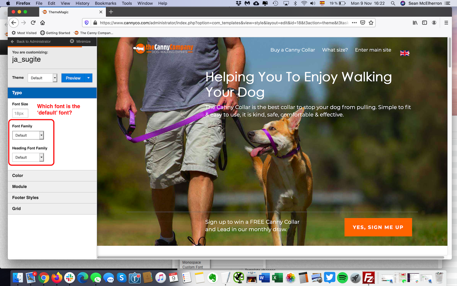
	Change default website font for paragraph and H1, H” headings etc to Helvetica Neue. There seem to be several fonts loading on the site (too many) but we only need two - Century Gothic is our corporate brand so this is for the home page, modules, navigation etc but we would like the body text of the pages to be Helvetica Neue. How do we do this easily please and just load the two basic fonts (I don’t think we need anything from Font Awesome for example)?
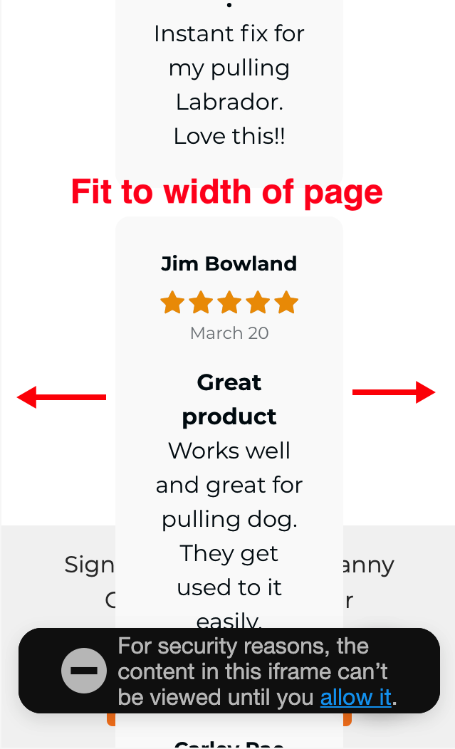
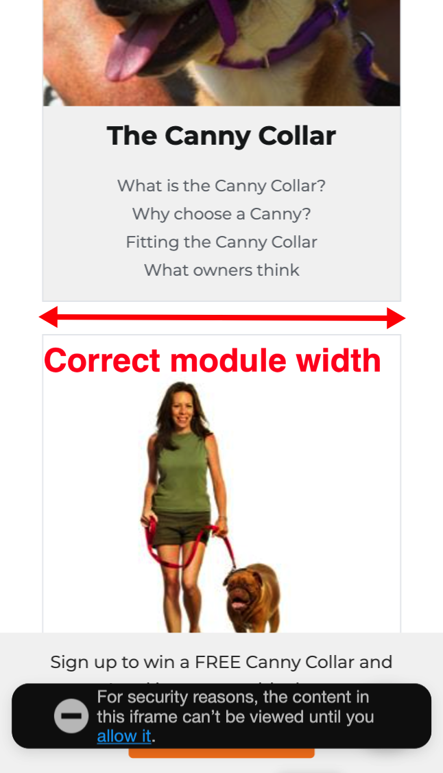
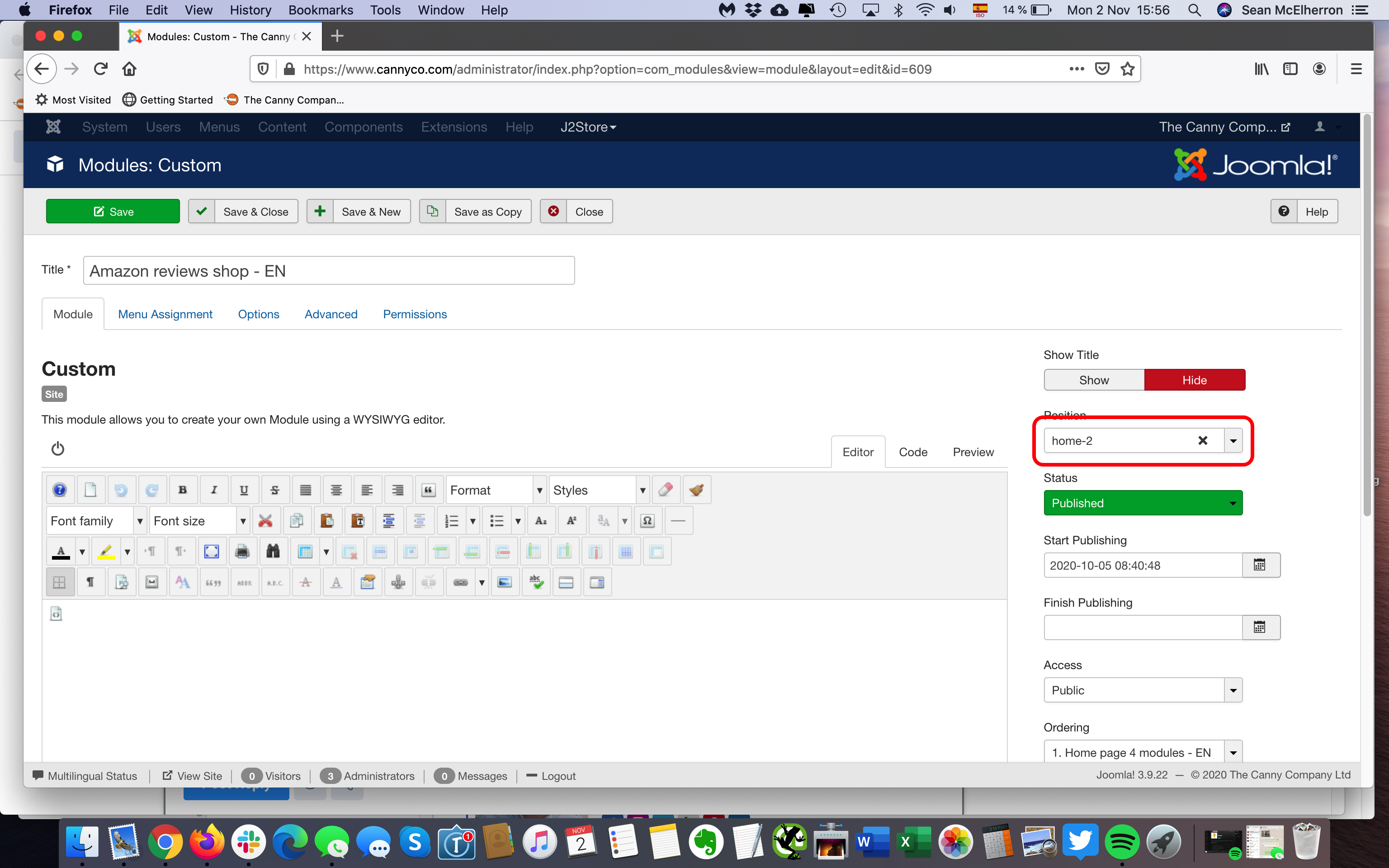
	How do we get the homepage Amazon module to stretch wider on mobile view?
	Is it possible to wrap the text around the images on the product pages for desktop view? Or at least go to the width of the page below the images? On mobile view, can we put the size, colour etc options at the top of the page instead of at the bottom?
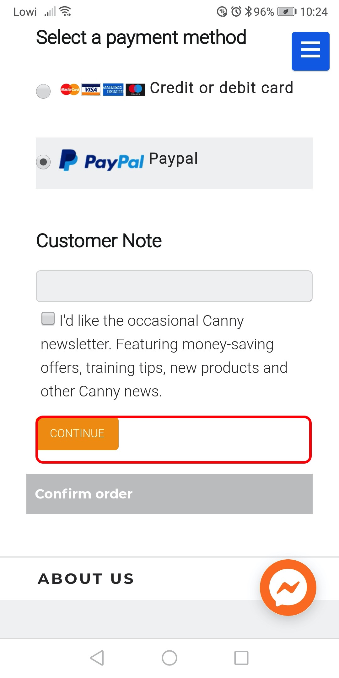
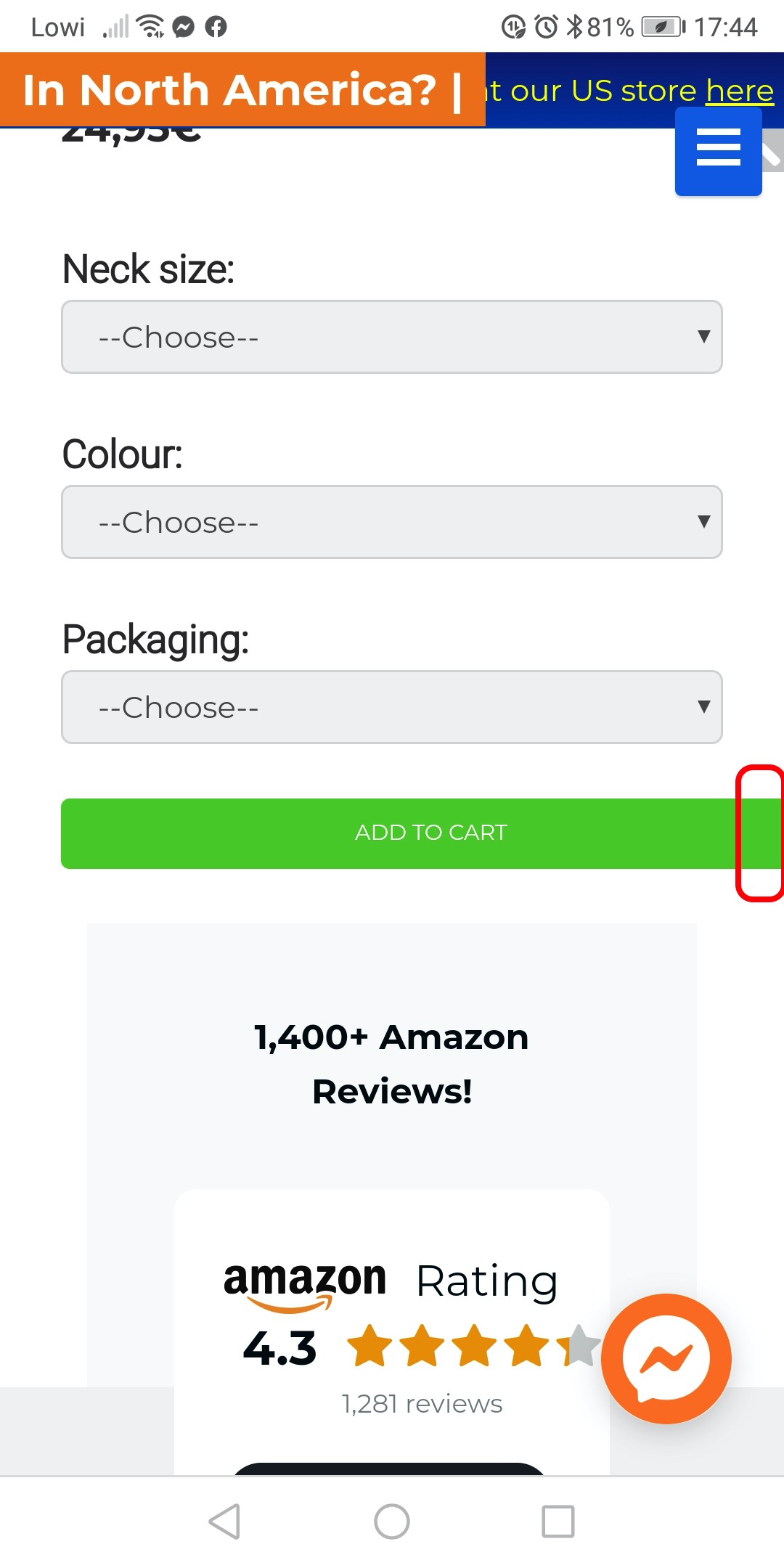
	Can we make the ‘place order’ button on our checkout page the same green as our ‘add to cart’ and ‘proceed to checkout’ buttons? Can we fix the code so that all the buttons use the full width of the page on mobile view and can we increase the size of the button and the font on both mobile and desktop? It's important that they don't go off the edge of the page also.
	Can we include an avatar next to the article author name?
	On the English language pages, the top header bar appears deeper as the flag is being pushed under the cart button compared to the other languages. The links on the English pages also appear in green instead of orange, as on the other languages.
	The flag gif icons are very blurry - how can we get these to be sharper?
	We wish to produce some SVG graphics the same as the first graphic on this page: https://backlinko.com/seo-tutorial. For the JA Sugite template, can we produce them with no writing on them and add this in later? Or is it better with writing already added? On desktop view, the image and writing appear side by side but on the mobile view, one appears above the other. What is the best way to do this please?
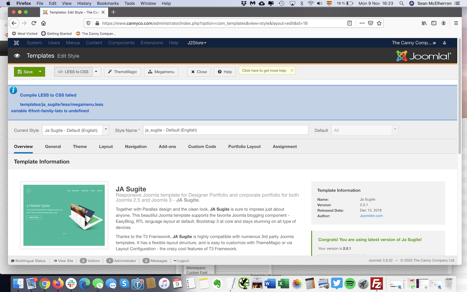
I have attached some screenshots to illustrate the above points.
We are also having some issues with page speed. We have JCH Optimise installed but I have disabled it for now as I think it’s conflicting with other extensions and I would like to address this at the template level rather than relying on plugins. Is there a way to configure the template so that we can lazy load the CSS, JS and images once the basic HTML (and any critical CSS) is loaded?
As always, any help much appreciated.
