- Edited
Hi,
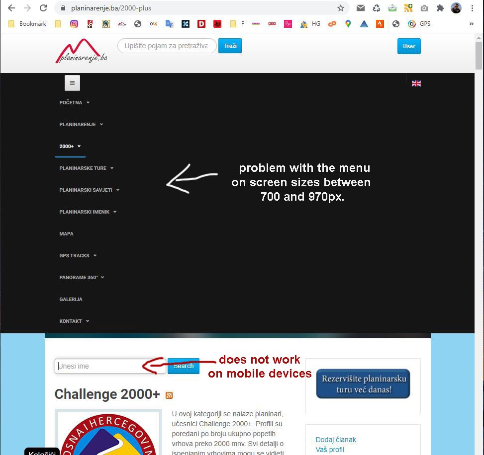
1. I have a problem with the menu on screen sizes between 700 and 970px. That’s the size before the menu turns into a mobile menu and at that point it becomes vertical and looks ugly. (see attached picture). How to solve this so that the menu remains horizontal.
2. On mobile devices, the Search module located just below the masshead position does not work. (on https://planinarenje.ba/2000-plus) I think the problem is in:
.t3-mainnav:after {
    background: none;
    content: "";
    display: block;
    height: 152px;
    position: absolute;
    width: 100%;
    z-index: -1;
}
If I reduce the height from 152px to 15px then it works. Is it okay to do that?