Hi
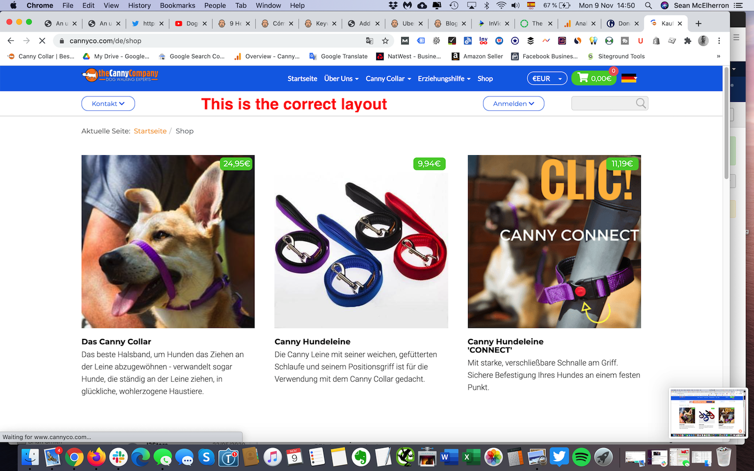
For some reason, on our multilingual site, the header appears deeper on the English language pages than the other languages (which appear correctly). The language flag module appears underneath the cart module when it should appear to the right of it. How can we correct this?
Also, the language flag gifs are very blurry - how can we sharpen these up please?
Any help much appreciated.


