Hi,
Could someone please explain how to to show/hide the objects in the responsive Socialize Theme Header?
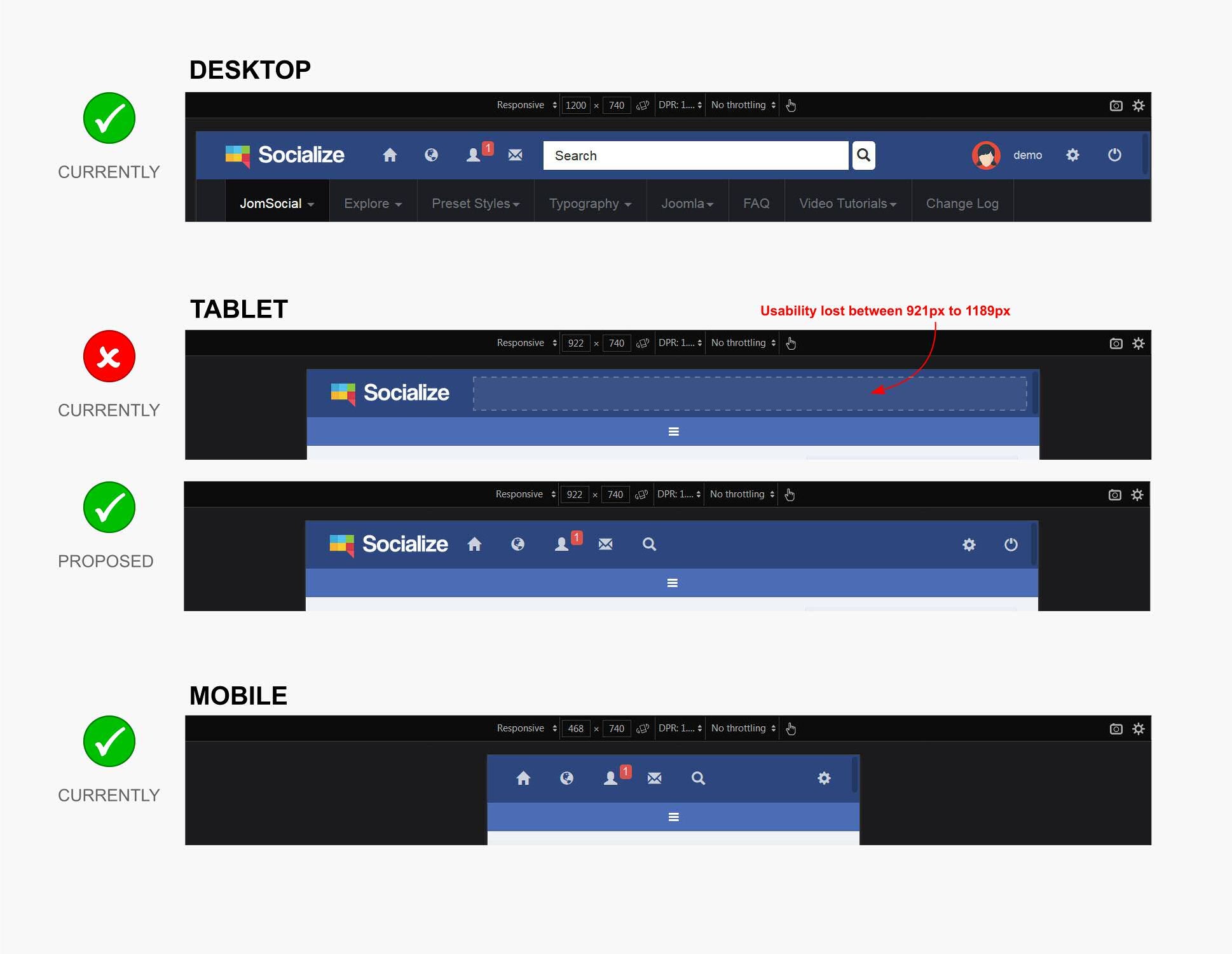
I would like to propose a change in the header to extend the usability for small Laptops/Tablets.
Currently the Smartphones have more usability and functionality than the Tablets do.
Between the screen widths from 921px to 1189px, usability is clearly lost.
Please see attached...
If someone could explain which CSS classes (JS files) to edit to extend the functionality it would be greatly appreciated.
Cheers
