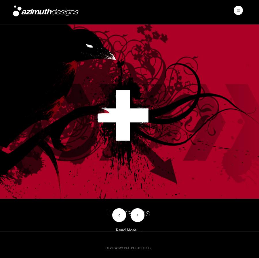
Is there any way to reduce the height for the slideshow component on the front page of the Magazine style?

I've tried several different alterations but they don't seem to be working. I believe it is this css.

.info-inner {
min-height: 335px;
}

    AzimuthDesigns
    Hi
    Set a max height instead
    example below code

    .articles-slideshow .slideshow-inner {
        max-height: 800px;
    }

    Interesting results...the back/forward buttons disappear and the space remains consistantly too high when it responds to a smaller window size. Is there a strategy for a more graceful collapse?

      AzimuthDesigns
      Hi
      The 800px is example
      you can set it as per needs, first add the code

      Also for small screen u can use media query

      @media(max-width:468px}{
      .articles-slideshow .slideshow-inner {
          max-height: 400px;
      }}

      Thank you for the reply, there is an odd discrepancy in the code and/or i am possibly having cache issues.

      which one of the below syntax should it have for parentheses around the max-width?

      @media{max-width:468px}{
      .articles-slideshow .slideshow-inner {
      max-height: 400px;
      }}

      @media(max-width:468px){
      .articles-slideshow .slideshow-inner {
      max-height: 400px;
      }}

      ah it's supposed to be ( )

      and now affects the desktop version of the website.

        AzimuthDesigns
        Hi
        This code will work only for mobile view

        @media(max-width:468px){
        .articles-slideshow .slideshow-inner {
        max-height: 400px;
        }}

        For Desktop you already have another code with 800px value.
        You can also use different media query for different size.

        Write a Reply...
        You need to Login to view replies.