Hi Guys, I bought a RSComments component, after installation I noticed that is not looking good in "mobiles"
I contacted the RSJOOML for support and here is what they suggested. Can you give a hand with that?
RSJOOMLA RESPONSE:
################################################
" previously mentioned, what you're encountering is related to your template styles. For example:
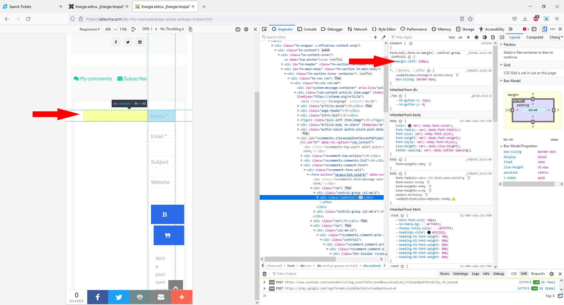
- The fields are displayed to the right (please see 'rsc1' screenshot) due to the following CSS rule:
form:not(.form-no-margin) .control-group .controls {
margin-left: 220px;
}
..located under this path:
https://adsoma.com/templates/ja_coach/css/template.css
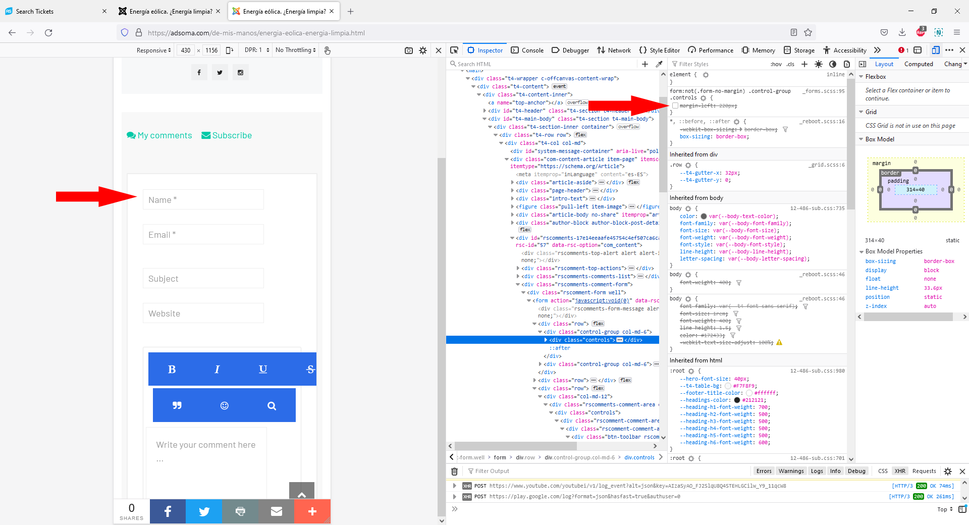
If you'll disable this using the browser inspector (see 'rsc2') you will notice that the fields will be displayed normally.
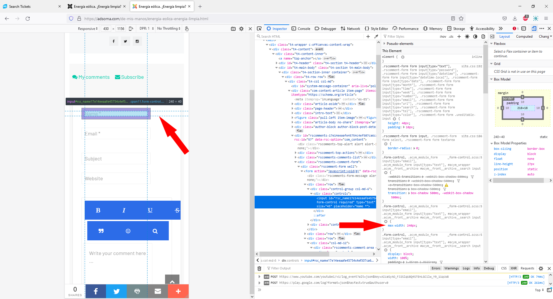
- After disabling the above CSS rule you will notice that these fields are not displayed full width (please see 'rsc3' screenshot) due to the following CSS rule:
.form-control, .acym_module_form input[type="email"], .acym_module_form input[type="text"], #acym_wrapper .acymfrontarchive #acymfrontarchive__search input {
max-width: 240px;
}
..located under this path:
https://adsoma.com/templates/ja_coach/css/template.css
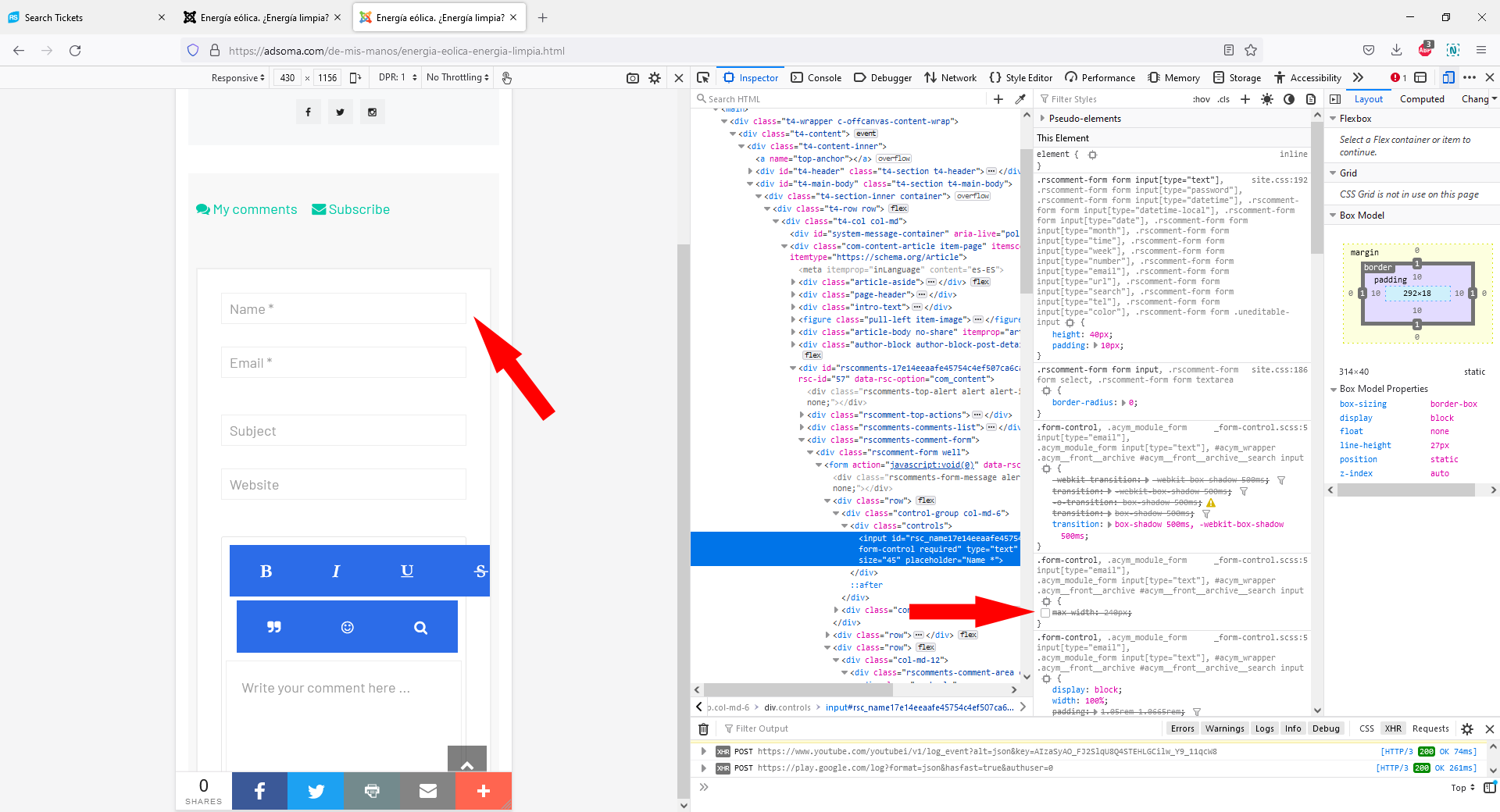
If you will disable this rule using the browser's inspector (please see 'rsc4' screenshot), you'll notice that this will be displayed normally.
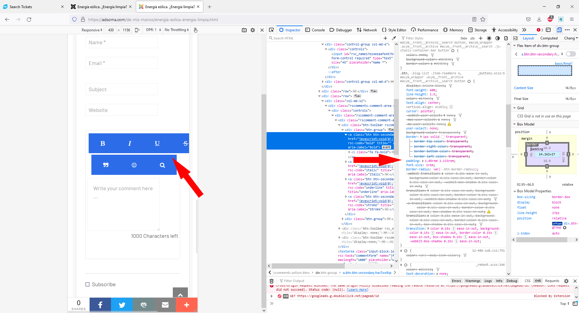
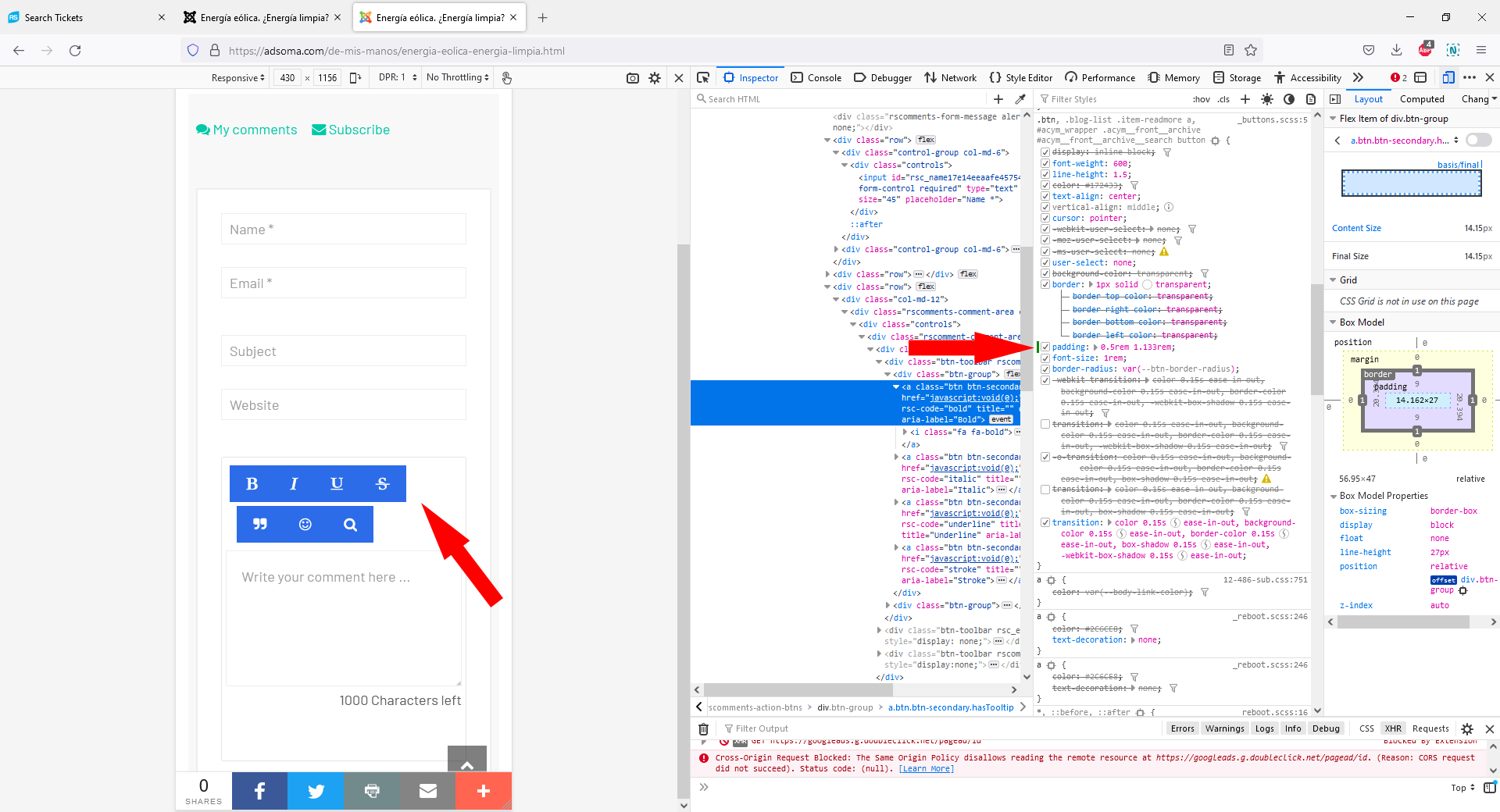
- The blue icons are displayed in this manner due to the following CSS rule (please see 'rsc5' screenshot):
.btn, .blog-list .item-readmore a, #acym_wrapper .acymfrontarchive #acymfrontarchive__search button {
...
padding: 1.05rem 2.133rem;
...
}
..located under this path:
https://adsoma.com/templates/ja_coach/css/template.css
If you will adjust this rule using the browser's inspector (please see 'rsc6' screenshot), you'll notice that these icons will be displayed normally.
############################################################
attached images
