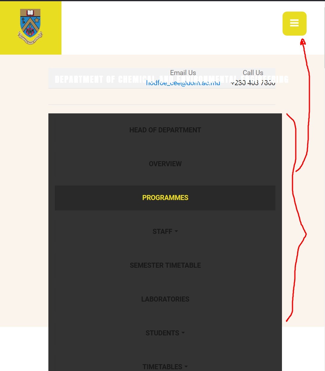
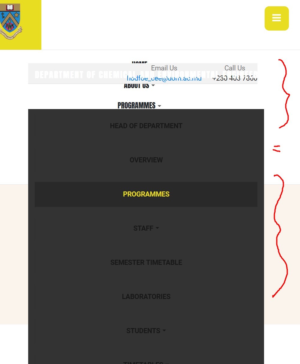
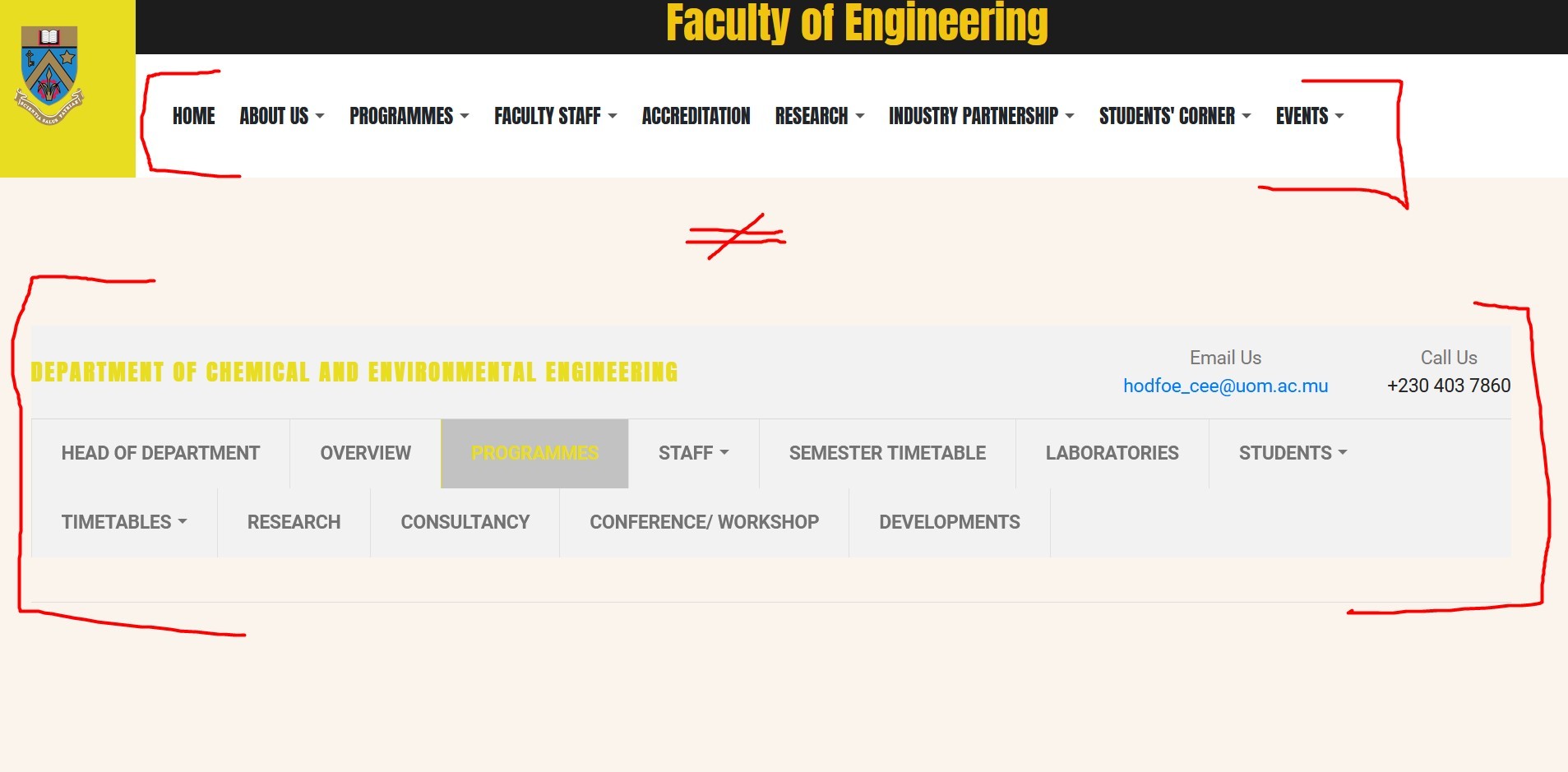
Hi

I added this custom CSS on your site to show this section on small screen size:

@media (max-width: 991px){
#t4-section-1 .t4b-header.t4b-header-4 .header-info {display: block;}
.t4b-header.t4b-header-4 .t4b-header-menu {display: block !important;}
}

However, it looks like you're trying to show the megamenu on mobile view which will not work that way as it supports desktop view only.

    saguaros Thank you. However, it is not displaying;

    1. the right menu
    2. visually well

    Please see attached screenshots;
    The menu that should appear is that of the department concerned on that page instead of the main menu of the website.
    Even if it shows as a mobile menu icon it should be ok.. only that the options should appear on small screens because it is the navigation menu for a specific department within the faculty.

    Kindly advise.

    4 days later
    Write a Reply...
    You need to Login to view replies.