Hello
I have the ja_shoe template. Can I make ONLY on xsmal Responsive Layout 2 products to the same line ( not one ) and all other resolutions will be work default for virtue Mart setting.
And please if it is possible show me.
Best Regards
XSsmal Responsive Layout 2 products to the same line
interested too …
Hi
You can try this custom CSS:
@media (max-width: 991px){
div[class*="-view"] .vm-col.product {
    width: 50% !important;
}}- Edited
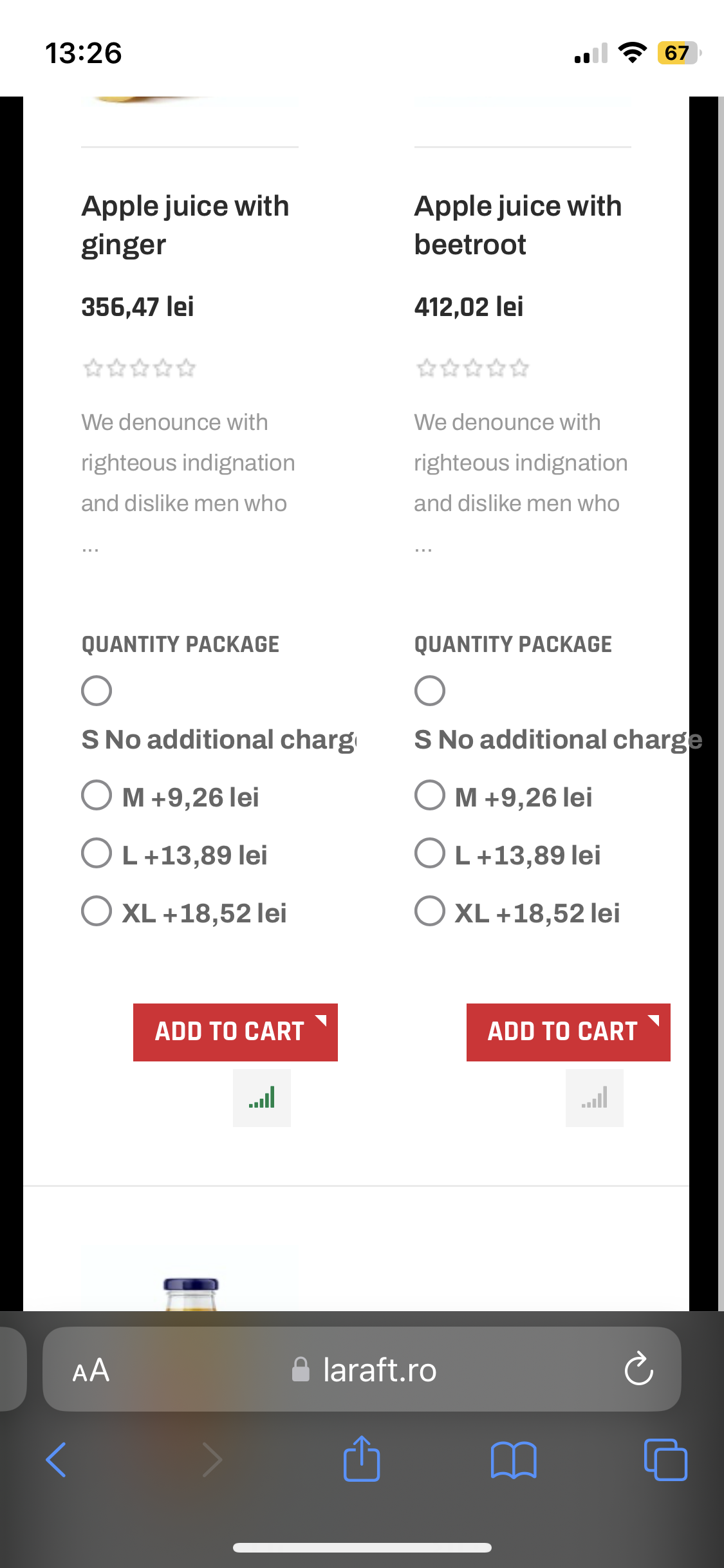
it's working, but there is a problem now with the products show on tabs where is set to be listed one by one in mobile, but the css shrinks the column of that one product listed in tabs in homepage. ... can please take a look how to make it show corectly in tabs in fronpage on XSmall mobile view ?
Thank you
bogdan-tofan Could you share the login info of your site and URL of that page?
… I develope it on ip on host …
bogdan-tofan You can share me the backup of your site, I will check in my local.
- Edited
saguaros I’ve put it on test on www.laraft.ro , check it on xm mobile . thank you
Please try to update the custom css rules:
@media (max-width: 991px){
div[class*="-view"] .row .vm-col.product {
    width: 50% !important;
}}
I have tried to test on your website and it worked fine.
Regards,
- Edited
cssyeah that's almost perfect ... BUT ... on listings in shop if the listed product custom fields are long, the text don't split as it should

. take a look and advice ! ... Thank you in advance !
P.S.1 there is another css issue with the language flags swich, where in the dedicated position for the module don't show in line with cart and off-canvas menu ...

( I think the programmers forget to check in template the module in that position ) ...
P.S. 2 ( how can I add you as friend ?  ... to please you guide in future for some custom css need it )
bogdan-tofan on listings in shop if the listed product custom fields are long, the text don't split as it should
You can try this:
@media (max-width: 991px){
.vm-customfields-wrap .product-fields .product-field .product-field-display .controls .form-check label {
    display: initial;
}
}
About the flags, I replied you in another ticket, kindly follow it 
working ogreat now ! ... BUT  ... the ADD TO CART buton is a litle bit moved in right when custom fields are in products listed. could you take a look and advice ?
- Edited
On mobile devices you might want to reduce the space between products when using 2 columns to make it more compact. You can try using the following style to reduce the space and align the "add to cart" button to the left:
@media (max-width: 991px) {
	div[class*="-view"] .vm-col.product .spacer {
		padding: 20px 15px;
	}

	div[class*="-view"] .vm-col.product .spacer .addtocart-bar {
		text-align: left;
	}
}
Kindly check and let us know if you need further help. 
phinb it seams ok add cart now but something is wrong with stock info box near it.
- Edited
You can try this to align stock info to the left:
@media (max-width: 991px) {
	div[class*="-view"] .vm-product-footer .vmicon {
		float: left;
		margin-left: 0;
		margin-top: 5px
	}
}phinb if you could help me to reduce the gap betwen description and add to cart buton on products without custom fields will be just perfect ! Thank you for your kind support !
You can try this:
@media (max-width: 991px) {
	div[class*="-view"] .product_s_desc + .vm-product-footer {
		margin-top: 15px
	}
}
Regards,