Hi,
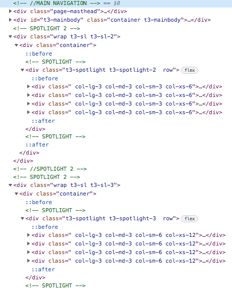
I'm looking for a way to set the same col-sm and col-xs settings to both <div class="t3-spotlight t3-spotlight-2 row"> and <div class="t3-spotlight t3-spotlight-3 row">.
Now there's a difference in the col-sm and col-xs setting with the same number of positions (4 blocks).
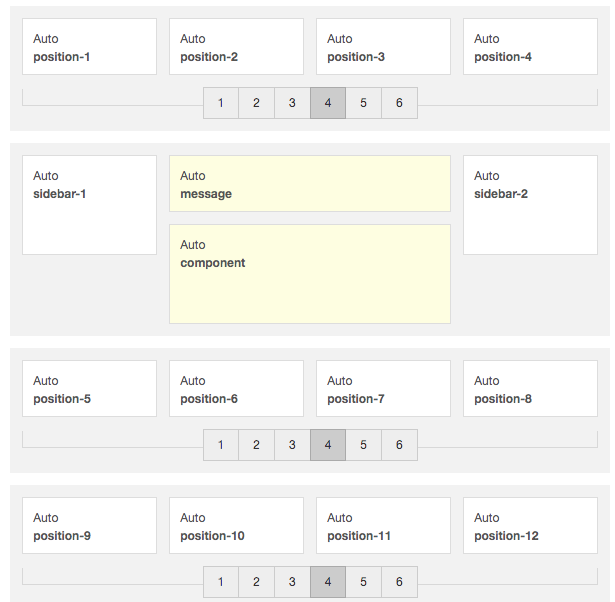
Position 5 tot 8
<div class="t3-spotlight t3-spotlight-2 row">
<div class=" col-lg-3 col-md-3 col-sm-3 col-xs-6">
Position 9 to 12
<div class="t3-spotlight t3-spotlight-3 row">
<div class=" col-lg-3 col-md-3 col-sm-6 col-xs-12">
On a pc or laptop the positions are display correctly, but on a smartphone there's a difference because of the col-sm and col-xs settings.

