- Edited
Good day!
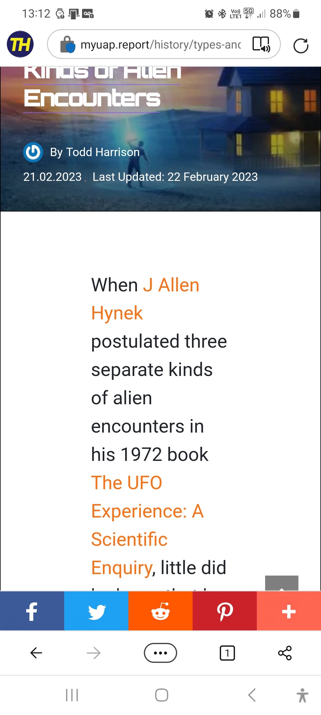
I'm having a problem with the padding on mobile article pages. Please see the screenshot below.

LINK: https://myuap.report/history/types-and-kinds-of-alien-encounters
Would it be possible to supply me with the CSS code in order to make the article text a bit more readable? Otherwise, if there is a setting somewhere that I've missed that's causing the text to be squished up like this, I'd be most happy to take advice.
Thank you!
Todd
