High,
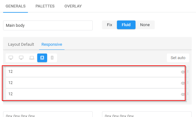
i have set the Responsive Layout for Tablet (tow sidebars and the main Content) to 12-12-12.
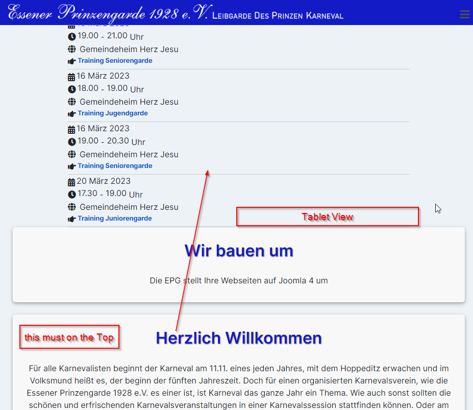
When i look at my tablet (upright) the sidebar left and sidebar right are stil on their position.
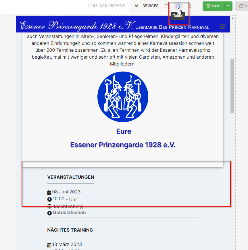
When i look at the preview it looks very good.
I have add in my custom css this Lines:
@media screen and (max-width: 992px) {.sidebar-r {width: 75% !important;}}
@media screen and (max-width: 992px) {.sidebar-l {width: 75% !important;}}
With the CSS it's look good, but now the sidebar right is on the Top position - before the main content.
How can do this, that on my Tablet (upright) the Main content is on the top and the sidebar below?
Thx
Markus

