How to set the web page to be centered on wide screens or expand to full screen?

Page to be centered on wide screens or expand to full screen

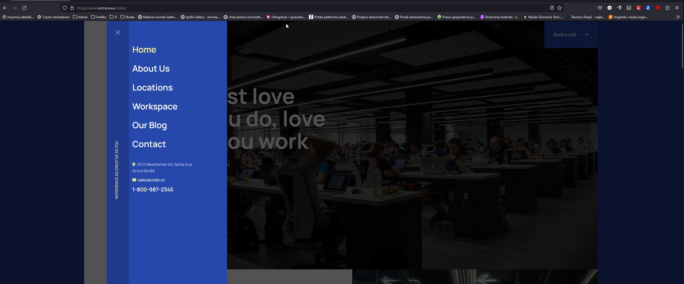
Your solution causes errors on the site.
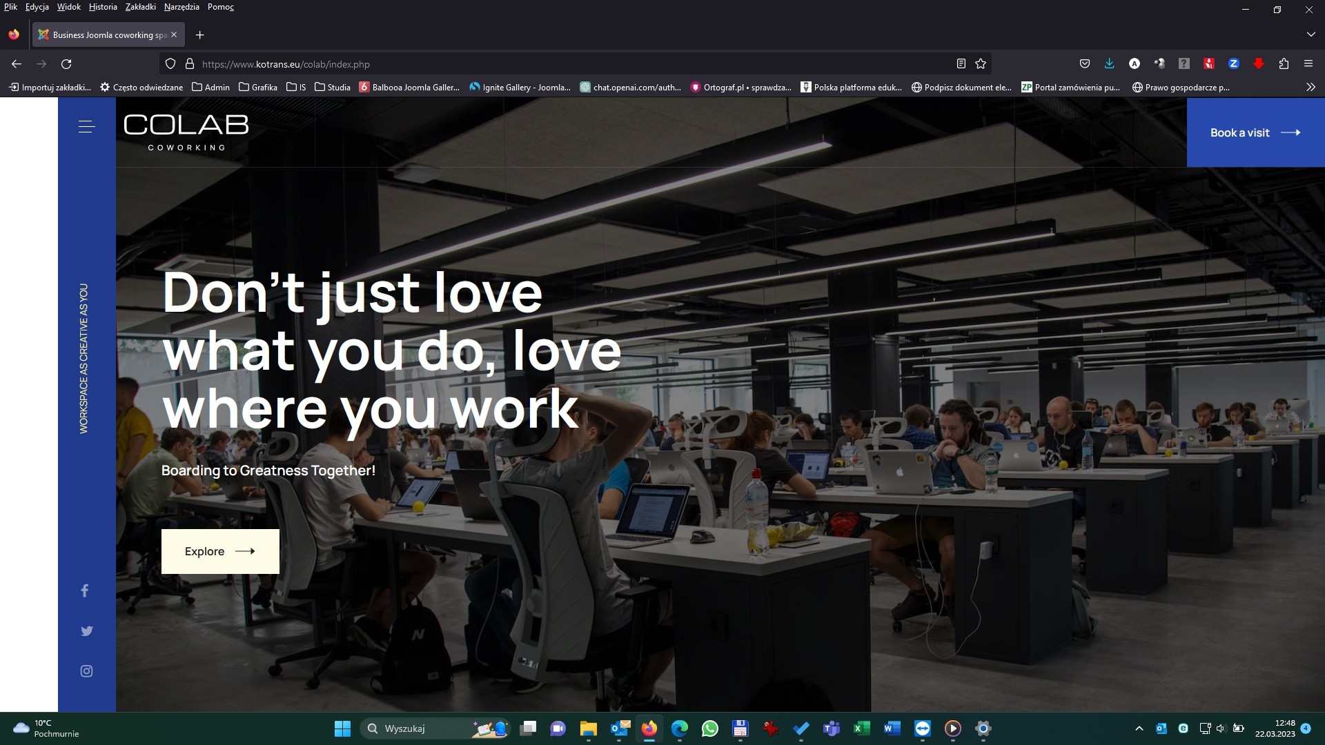
Wide screens:


Resolution 1920x1080:
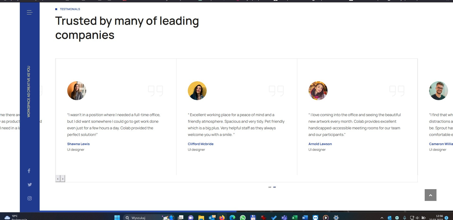
Module problem:
- Edited
The problem of the white bar on the left-hand side and the slide-out menu on the side of the screen remains

Hi @artur1
You can try this custom css (Please copy and overwrite the custom CSS code above)
@media (min-width: 1400px){
  .c-offcanvas--left {
    margin-left: 25px;
  }

  .horizontal-nav::before {
    height: 100%;
    background: var(--horizontal-background);
    content:  "";
    position: absolute;
    right: 100%;
    width: 20000px;
  }

  .horizontal-nav {
      left: auto;
  }

  .t4-content {
      padding-left: 0;
      margin-left: auto;
      margin-right: auto;
  }
}
Regards

saguaros locked the discussion.