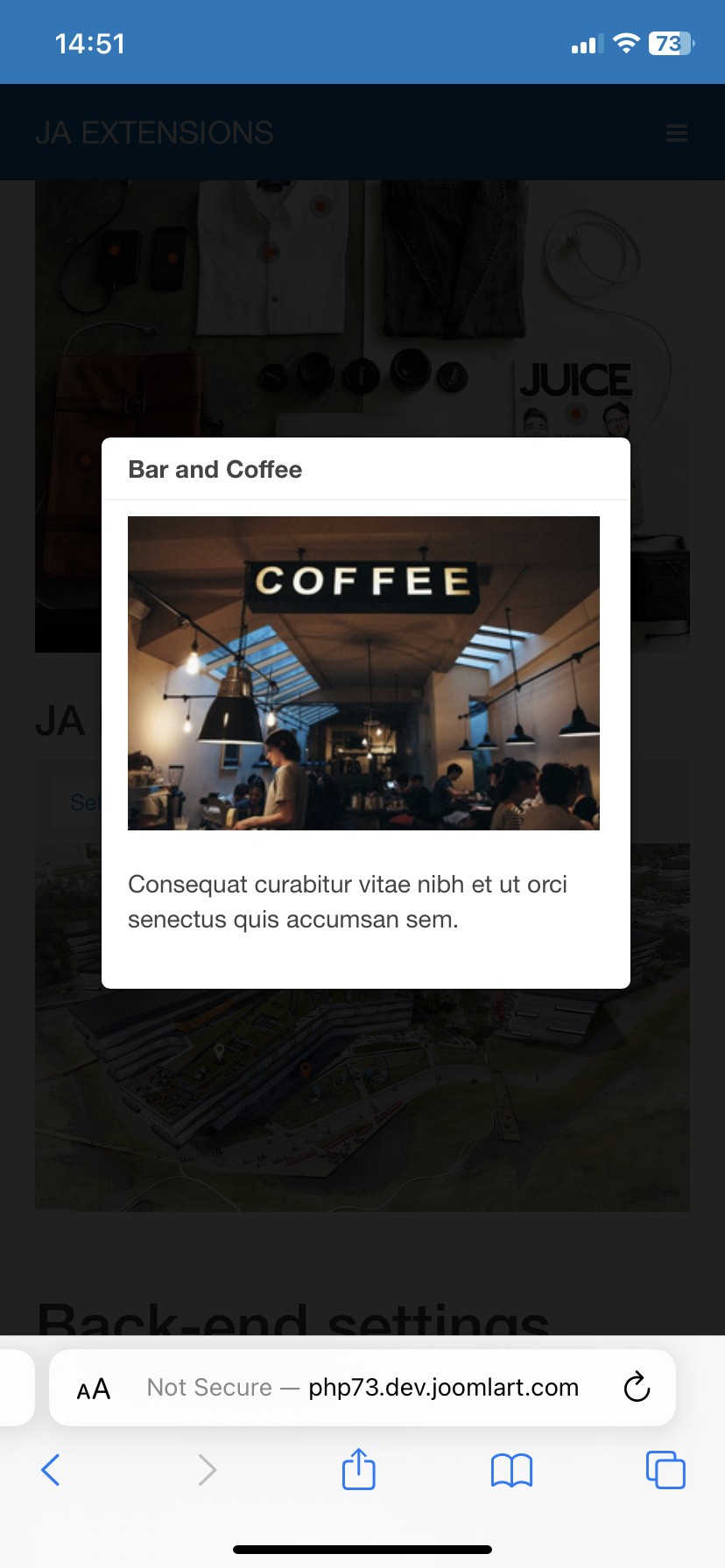
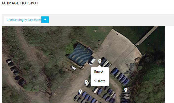
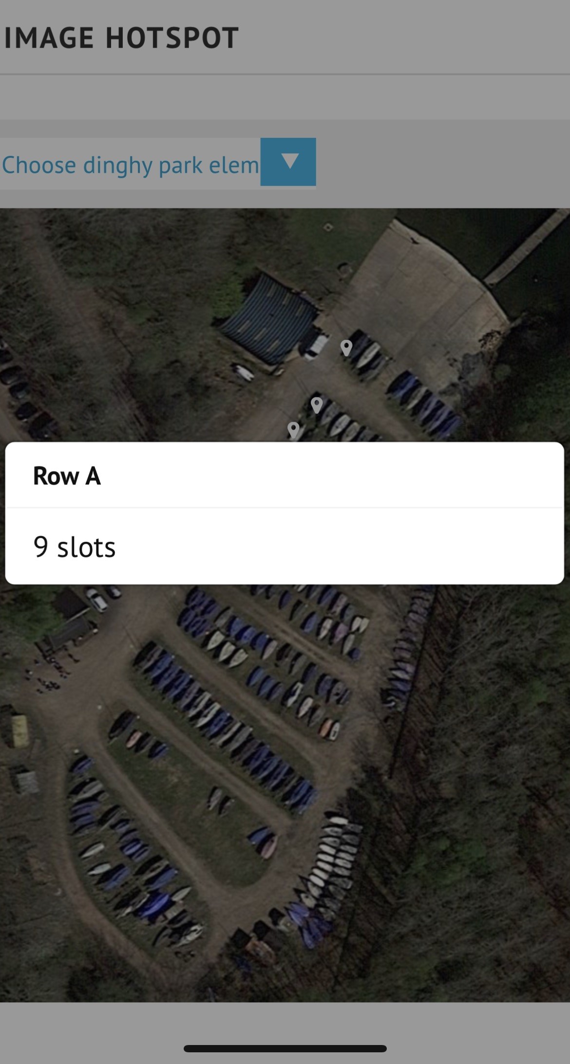
Looking at using this great module on our website. My early testing shows it is just what we want when viewed on a desktop. However when viewed on an iPhone all the tooltips appear in the same place and the size of the tooltip is way too wide for the content displayed. It is currently using auto sizing, but even if I tried fixed width tooltip setting it still appears the same large width.

Testing was using J!3 and both the protostar and ja simpli templates which both have the same issue.

Is there some custom css that might get auto sizing of the tooltip working for iphone?

Note shrinking the browser window width on a desktop does not reproduce the issue seen with an iphone.

    sailbod Hi

    I test my dev site but the tooltip shows normally:

    Are you using latest version of this module? You can share the URL + super admin account so I can check.

    Hi Sagaurus

    I have just added a site URL to the chat that demonstrates the problem.
    We are using JA image hotspot ver 1.2.3

    Here is a screenshot from a desktop:

    and from an iphone

    I have also found that if the module is placed in the main content of a page rather than a module position using
    {loadmoduleid <moduleid>}

    Again there are problems on mobile devices where the tooltips do not appear. This is using both ja simpli and protostar templates. It might bet that using "loadmodule" with a style may help, not explored that yet.

    Also, may work better in J!4, but not in a position to test that yet.

    Turns out the issue with loading the image hotspot module into the main content position was a z-index issue applied to workaround the issue in ja-simpli template (on J!3): https://www.joomlart.com/forums/d/44346-ja-simpli-links-dont-work-on-mobile-version/3 Lowering the z-index in this workaround fixed this, but still leaves the tool tips being larger than needed and always in the same place. The sizing and placing of the tooltip is more of an issue when you zoom into the image a bit.

      sailbod

      You can try this custom css to set the width for this popup on mobile:

      @media (max-width: 576px){
      .webui-popover.fade, .webui-popover.fade-out {
          width: 50px !important;
      }
      }

      and change to your desired value.

      Hi Saguaros, that is better many thanks, although I used "width: auto !important;" rather than a specific size. It still does not draw the tooltip next to the icon like it does on desktop/laptop, but a much better width.

      Write a Reply...
      You need to Login to view replies.