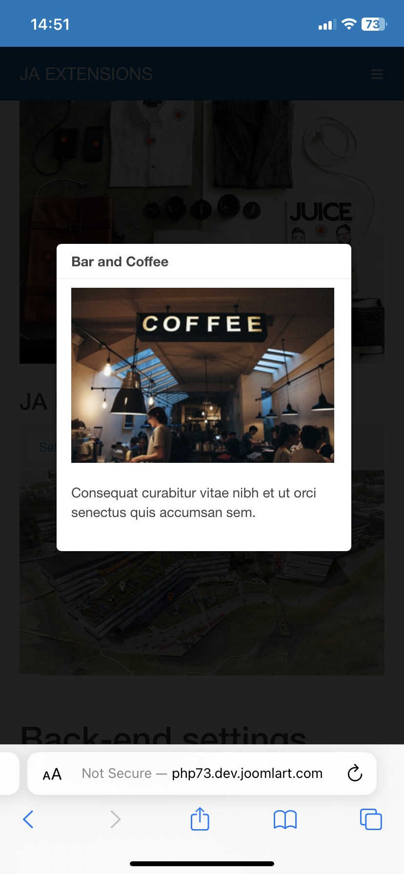
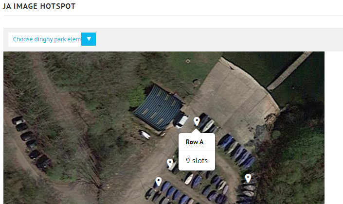
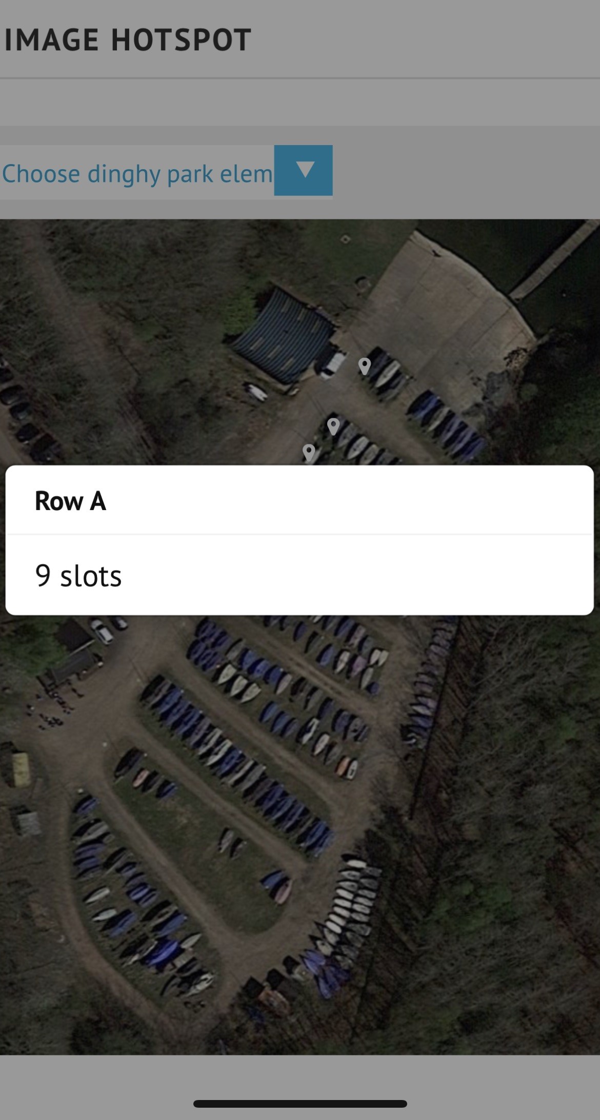
Looking at using this great module on our website. My early testing shows it is just what we want when viewed on a desktop. However when viewed on an iPhone all the tooltips appear in the same place and the size of the tooltip is way too wide for the content displayed. It is currently using auto sizing, but even if I tried fixed width tooltip setting it still appears the same large width.
Testing was using J!3 and both the protostar and ja simpli templates which both have the same issue.
Is there some custom css that might get auto sizing of the tooltip working for iphone?
Note shrinking the browser window width on a desktop does not reproduce the issue seen with an iphone.


