After updating the template the mini-slideshow at the bottom of the homepage is not sizing properly. How can this be fixed?

Hi @cemsdb

We are unable to log in using the account you provided. Please double-check it for us.

    phinb Hi phinb, I just tried and it worked fine. Sometimes one needs to login multiple times to actually get in, while receiving different messages as to why it didn't work. It's actually a bothersome issue that occurs in most Joomlart websites.

    Please try multiple times and let me know if you succeed.

    Hi

    Do you mean the 'Research' section? it looks normally on mobile as I can see.

      saguaros Hi Saguaros, the problem is hard to see on small mobile screens (as the image doesn't even show up). Instead, the improperly-sized image (which affects the whole element) can be see on any screen wider than 500px, including laptop.

        cemsdb Could you share screenshot highlighting the issue and how it should be so I can help?

          saguaros Hi Saguaros, here's two screenshots that might help. One is laptop view and the other is 972px width. The image on the mini-slideshow should be the same size as all the other squares, whatever the screen width.


            saguaros Hi Saguaros, unfortunately that didn't work very well. 300px seems to be smaller than the other squares. Consequently the slideshow squares continues to look different and smaller than it should.

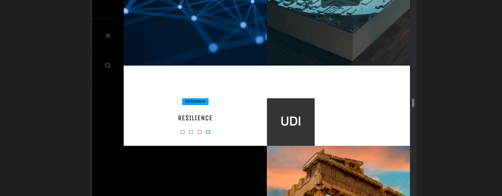
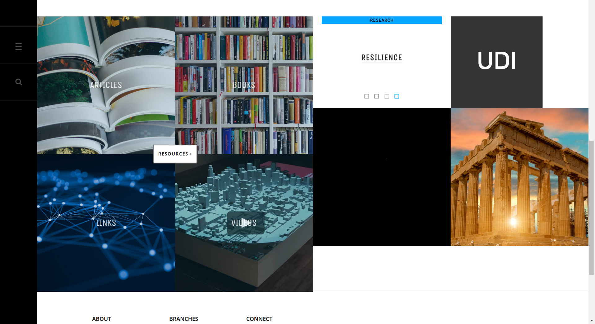
              saguaros I'm not sure I understand. As far as I figure there's no set size for the squares. When working correctly (as the four squares under "Resources" seem to do) they are resizing automatically, depending on the screen width.

              The image we're using is exactly the same size as the default/demo template, yet the slideshow is not resizing correctly. The only difference in the code seems to come from the "element.style" (but I can't find the source).

                cemsdb This article category module will retrieve the intro image of articles and show in that section. It will depend on the ratio of the images you're setting for each article, that section has a fixed height and when the screen is smaller, the image will be resized.

                  saguaros The intro images of the articles are the same size/ratio as the default/demo website (900x450), why do they resize automatically and not on my website?

                  It was working (resizing) fine before the template update.

                    cemsdb It seems that there is issue with the resize function here, let me check and will get back to you.

                      saguaros Hi Saguaros, did you have any success in figuring out the resizing solution?

                        Hi @cemsdb
                        We updated your site, kindly check and let me know if there is any issue.

                          phinb Hello Phinb, thanks for helping! At first, the issue seems to have been resolved; alas, when one rotates the screen or changes screen size the auto-resize breaks again. Is there a way to prevent the auto-resize break when rotating device screens?

                            saguaros Hi Saguaros, I tested with my laptop, Minipad and Pixel cel phone. Simply put, the issue also occurs while using Chrome's 'Developer Tools' (any change in screenwidth breaks the auto-resize). The auto-resize only works when the page is 'refreshed' ...that is, until there's any change in width.

                              You need to Login to view replies.