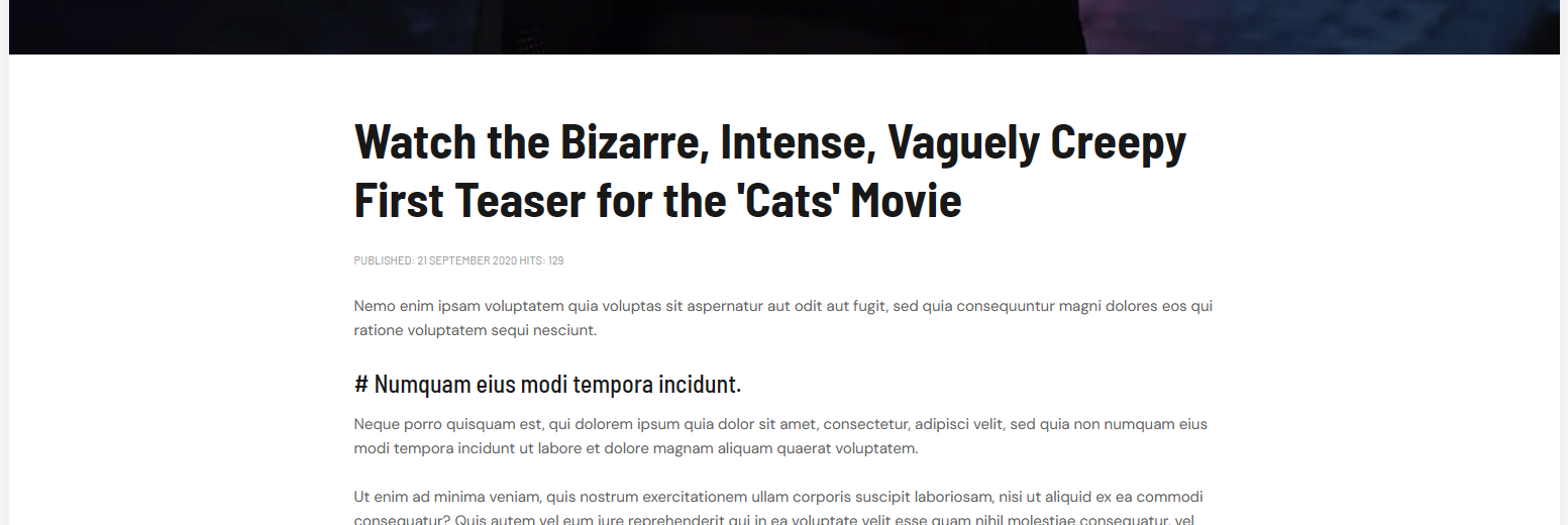
I see in you demo (and on my site) that when choosing Video as content_type, the width is narrower than if I choose Gallery. Gallery uses full width just like a regular article. How can I make the Gallery content_type in the same narrow width as Video?
Different page widths depending on content_type
saguaros Sorry, but the sidebar has nothing to do with it. The article content for either of them differs. If I have an article with Video as content-type, it's narrower than if I choose an article with Gallery as content-type regardless of the sidebar.
I'm referring to sidebar-l | component | sidebar-r where the component width is different depending on content-type.
saguaros But that's what I'm trying to avoid at the moment, since you can check your own demo pages. I simply need to know what I need to change to make the page width the same regardless of content_type or sidebars. I've appended two screenshots to clarity what I'm after. The above screenshot displays a page with Video content!
The below screenshot is what it looks like on a page using Gallery content.

Cheers...
meseko There are containers set for these pages.
For example, in Video page, it's set with padding left/right:
@media (min-width: 992px){
.item-page.type-video .container-inner {
    padding-left: 128px;
    padding-right: 128px;
}
}
and:
@media (min-width: 1536px){
.container {
    max-width: 1140px;
}
}
You can override this value.
saguaros Thank you! But it seems like I need to change the base padding for .container from 16px to 128px (if I want it to look like Video).
.container {
width: 100%; // can also be changed but not recommended
padding-right: 16px; // change to 128px;
padding-left: 16px; // change to 128px;
The reverse is of course the solution if anyone wants Video-pages to appear like Gallery-pages, in terms of content width that is... change padding from 128px to 16px...
Go ahead and close the ticket 
You can add a page class for the menu item of that page and declare new rule for the container so that it will affect that page only 