I've made some minor cosmetic changes to Teline V, and I'm nearly where I want to be. But I just can't seem to get this megamenu color scheme sorted out in custom.css.

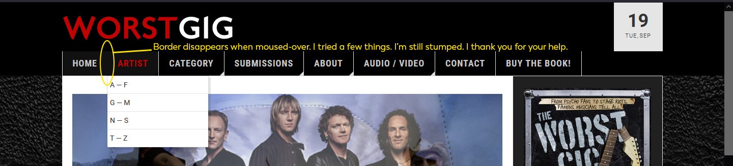
Please refer to the attached images. One shows the site as it is now, and I've circled the elements I want to change.

Specifically, I want the separators (borders) to show between Home and Artist and to the left of Home (even when on the Home Page). This is already how it is on interior pages, and I just want it to be consistent with those.

I also want the Main Menu (1st Level) inactive font color to be #c8c8c8 (including the Home link when on the Home Page), and the active (mouse hover) color to be #c00202. Currently, it's white when hovering, a dark gray (#333333) that's hard to read when not active/hovering.

I have looked in the template.css and the megamenu.css for these settings, and I'm coming up short. I hope you can help. I'm a little rusty, and I'm just not sure what I'm doing wrong.
Desired Styling:

Current Styling:

Hi

Your site seems to be in offline mode now but the provided login info doesn't work, could you check again?

I've re-set the password using the one I included in the private fields of the initial post. Please try? I've logged in using it, so it's definitely working now.

Were you able to access the site?

I updated this custom css rule into the custom.css file on your site:

/*JoomlArt support*/
.navbar-default .navbar-nav {border-left: 2px solid #e5e5e5;}
.navbar-default .navbar-nav > .active > a {border-right: 1px solid #e5e5e5;}
.navbar-default .navbar-nav > li > a, .navbar-default .navbar-nav > li > .separator {
  color: #c8c8c8;
}
.navbar-default .navbar-nav > li > a:hover,
.navbar-default .navbar-nav > li > .separator:hover,
.navbar-default .navbar-nav > li > a:focus,
.navbar-default .navbar-nav > li > .separator:focus {
  color: #c00202 !important;
}

Kindly check.

6 days later

VERY close! The border between Home and Artist disappears when you mouse over it, and the rest of the menu items shift to the left by a pixel, as a result. I will look at your CSS above and see if I can't fix it, but if you have a ready solution, I'd be happy to hear it.

Other than that minor detail, it looks great!

Thank you!

Write a Reply...
You need to Login to view replies.