Hi, can you direct me to the documentation that explains how the header elements size is adjusted for mobile devices?
I have an issue with the Button on header-r on tablet - it shrinks and is unreadable. 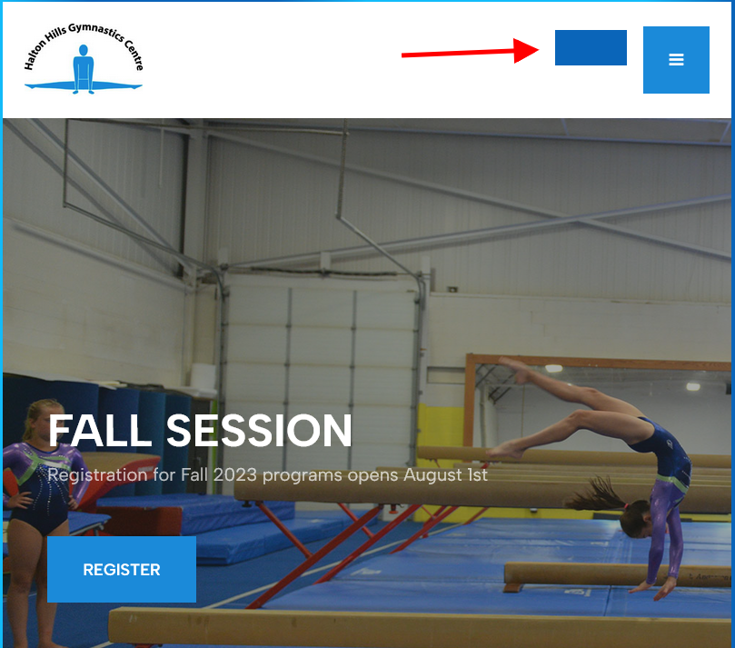
Thank you,
Andrea
Hi, can you direct me to the documentation that explains how the header elements size is adjusted for mobile devices?
I have an issue with the Button on header-r on tablet - it shrinks and is unreadable.
Thank you,
Andrea
Hi Dominic,
thank you. I tried it but it does not help. I even deleted all CSS and tried only this code, but the button on tablet is still small and there's no font. Can you please check the code again? Thank you,
https://23.haltonhillsgymnastics.com/
Andrea
Hi @adwebcom1
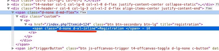
In the JA Right template, when on a small screen, icons are used instead of displaying text. Currently, your website is not using icons, so you can remove the class 'd-none d-xl-inline' from the 'Registration' module to display text on small screens.
Regards,

