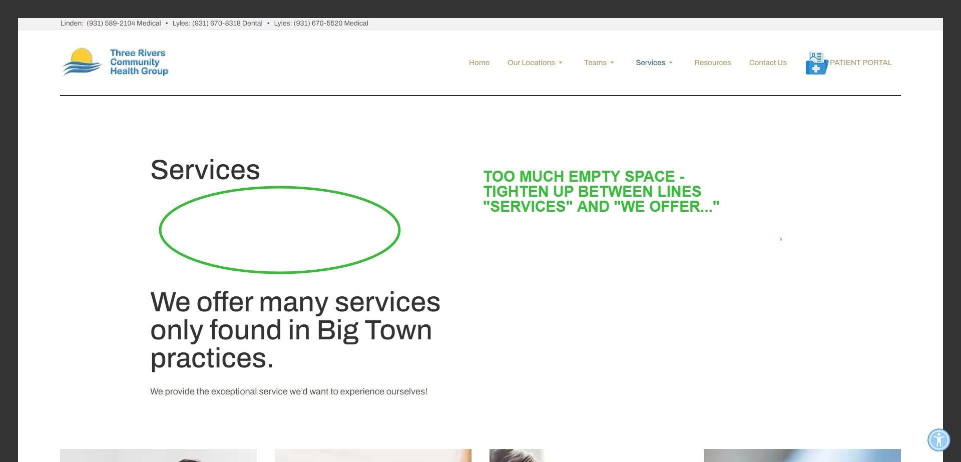
There is another large space that needs to be tightened up:
https://3riverscommunityhealth.com/services
I don;t know what to change to make it closer and less wasted space, image attached:

There is another large space that needs to be tightened up:
https://3riverscommunityhealth.com/services
I don;t know what to change to make it closer and less wasted space, image attached:

Hi Pat,
You can override with this custom css:
#t4-masthead .ja-masthead .ja-masthead-detail {
    padding-top: 7.5rem !impotant;
    padding-bottom: 4rem !impotant;
}
and change to your desired value
Thanks, I think I'm going to use the masthead image. I'll keep this code though, in case I have a page where a masthead just makes it too busy.