- Edited
How do I get a space between the search field and the button?
I thought of:
.mod-finder__search.input-group {

     display: flex;

     gap: 10px;

}
But the registration form also moves.
https://wishpacker.lima-city.de/Joomla/
How do I get a space between the search field and the button?
I thought of:
.mod-finder__search.input-group {
display: flex;
gap: 10px;
}
But the registration form also moves.
https://wishpacker.lima-city.de/Joomla/
Hi wishpacker,
You can use the following CSS code to change the search form:
.mod-finder__search.input-group {
    gap: 10px;
}
.mod-finder__search.input-group button.btn {
    padding: 6px 8px;
    font-size: 14px;
}
.mod-finder__search.input-group input[type="text"] {
    width: 155px;
}Thank you. I like your version a little better. But then what I wrote wasn't wrong and it must have something to do with the following statement:
.mod-finder__search.input-group button.btn {

     padding: 10px;

     font-size: 15px;

}
Can you explain it to me? As I said, I don't understand why the registration form moves with it.
Hi wishpacker,
Because the sidebar uses the define a flex container.
.sidebar {
    display: flex !important;
    justify-content: flex-end;
}

@media (min-width: 1200px) {
.row-fluid [class*="span"] {
    margin-left: 4.29680568%;
}
}I actually wanted to make 2 flexboxes. Once .sidebar to align the sidebar to the right and once .mod-finder__search.input-group to create a gap between the search field and the button. But if I now visualize the flexboxes with the inspector, then I see how the search field reaches the left edge of the .sidebar and therefore widens it. I think that's why. Alternatively, I would think of float, but I never learned because I heard float is out
Hi wishpacker,
The issue might be related to the use of display: flex in your .sidebar CSS rule. When you use display: flex on an element, it affects its direct children, making them flex items. In your case, the .sidebar element is the flex container, and both the search form and the login form are its flex items.
When you apply the gap: 15px; rule to the .mod-finder__search.input-group, it affects the gap between the input and button within that form, but it doesn't affect the layout of the other flex item (the login form) within the same flex container (the sidebar).
To resolve this issue, you can apply the gap property directly to the .sidebar class, or you can use margin or padding on the specific elements within the .sidebar that you want to space out.
.sidebar {
    display: flex !important;
    justify-content: flex-end;
}

/* When you use display: flex on a container (in this case, the .sidebar), it enables a flex container, and its direct children become flex items. The default behavior of flex items is to grow and shrink based on available space. If the width of one flex item changes, it can affect the layout of other flex items within the same container. To avoid unintended layout shifts, setting a fixed width for the search box can be a good solution, as it stabilizes the size of that particular flex item.*/

.mod-finder__search.input-group {
    gap: 14px;
    width: 293px;
}
This will add space between the search input and the button within the search form without affecting the layout of other elements within the flex container. Adjust the values as needed based on your design requirements.
Thank you, but I don't know if setting the width for mod-findersearch.input-group does anything. Since I come from Germany and work with Google Translate, communication problems cannot be ruled out. .mod-findersearch.input-group is within .sidebar and that's why .sidebar specifies the width, do you understand how I think and is it correct? Now I see two possibilities. Either I leave it as it is or I widen the sidebar. However, I could also do this via the layout configuration and so I don't know why I should use width.
I hope we don't talk past each other
Hi wishpacker,
When you use display: flex on a container (in this case, the .sidebar), it enables a flex container, and its direct children become flex items. The default behavior of flex items is to grow and shrink based on available space. If the width of one flex item changes, it can affect the layout of other flex items within the same container. To avoid unintended layout shifts, setting a fixed width for the search box can be a good solution, as it stabilizes the size of that particular flex item.
You can try the CSS code that I provided in the previous answer, it will work.
But if, for example, I want to have an exaggerated spacing of 40px, then the registration form still moves, even though I have set a width.
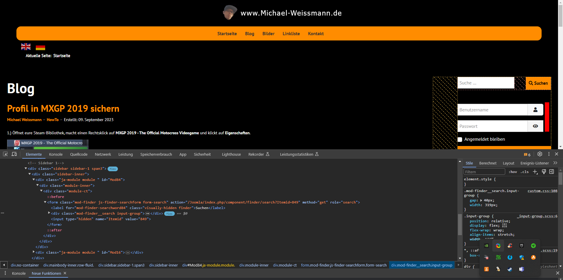
Edit: I don't think you can see anything. I uploaded the image via “My Media”. I thought it would get bigger when you clicked on it.
Hi wishpacker
You can add the following code to the site to fix the issue.
.mod-login .input-group input[type="text"],
.mod-login .input-group input[type="password"] {
    max-width: 100%;
}

.mod-login .input-group {
    flex-wrap: nowrap;
}Thank you for your effort in explaining everything to me, but a spacing of 40px would be ugly anyway. I wanted to understand it, but I didn't. Maybe I'll read something more about the properties in your codes or come back to you. 
