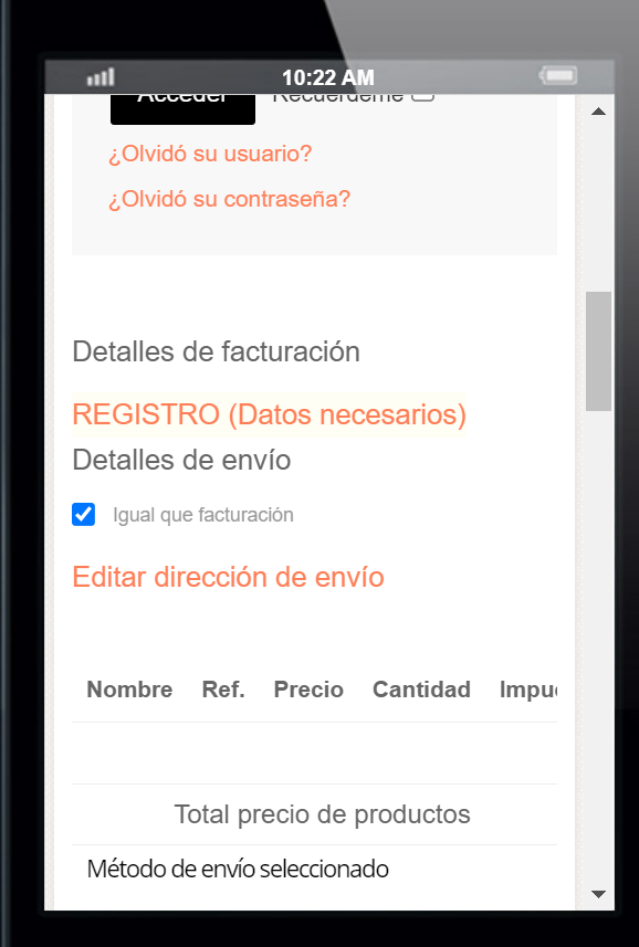
Hello, I do it but is not solved. The mobile device show content partial.

I inform tou that we have other code from before in Custom CSS
.quantity-controls.js-recalculate {
display: block;
}
#gkContentWrap #adminForm {
display: flex;
flex-direction: column;
}
#gkContentWrap #adminForm .buttonBar-right:nth-child(1) {
order: 2;
}
@media (max-width: 767px){
  #checkoutForm {
    overflow-x: scroll;
  }
}
This other subject on bottom is solved. I have seen the changes they have made in sections of the template style in Spanish, in sections that were good before, and I have left them as they were before. I have only added the seguaios code in Custom CSS
(Also this morning I saw a new problem in all devices: Not appears our logo (appears the Storebox logo) And only appears the item HOME (Inicio) from the Main Menu. (Have you did some changes that can produce this?) This happens only in Spanish language.
 )
)