Hello.
There is no difference in the template when it comes to text.
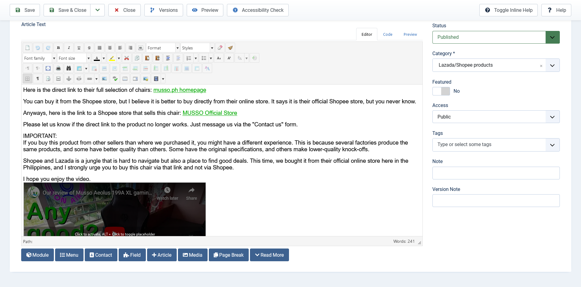
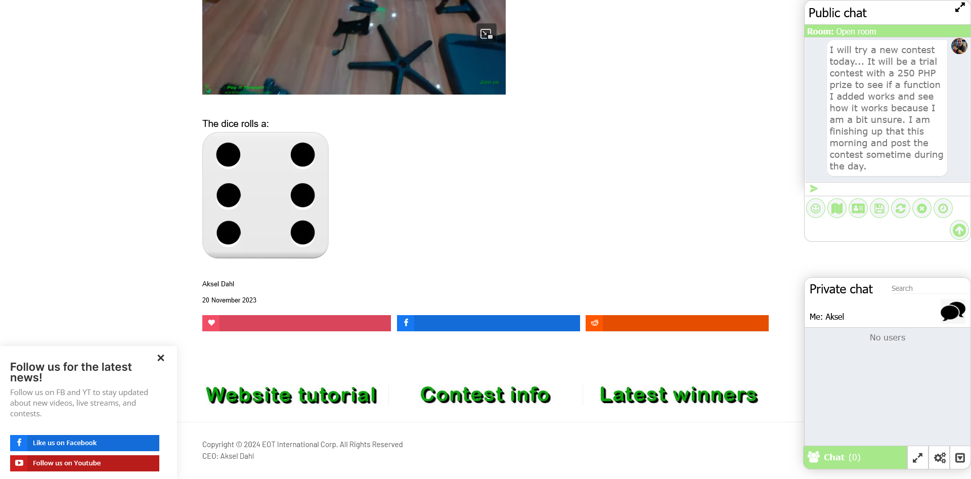
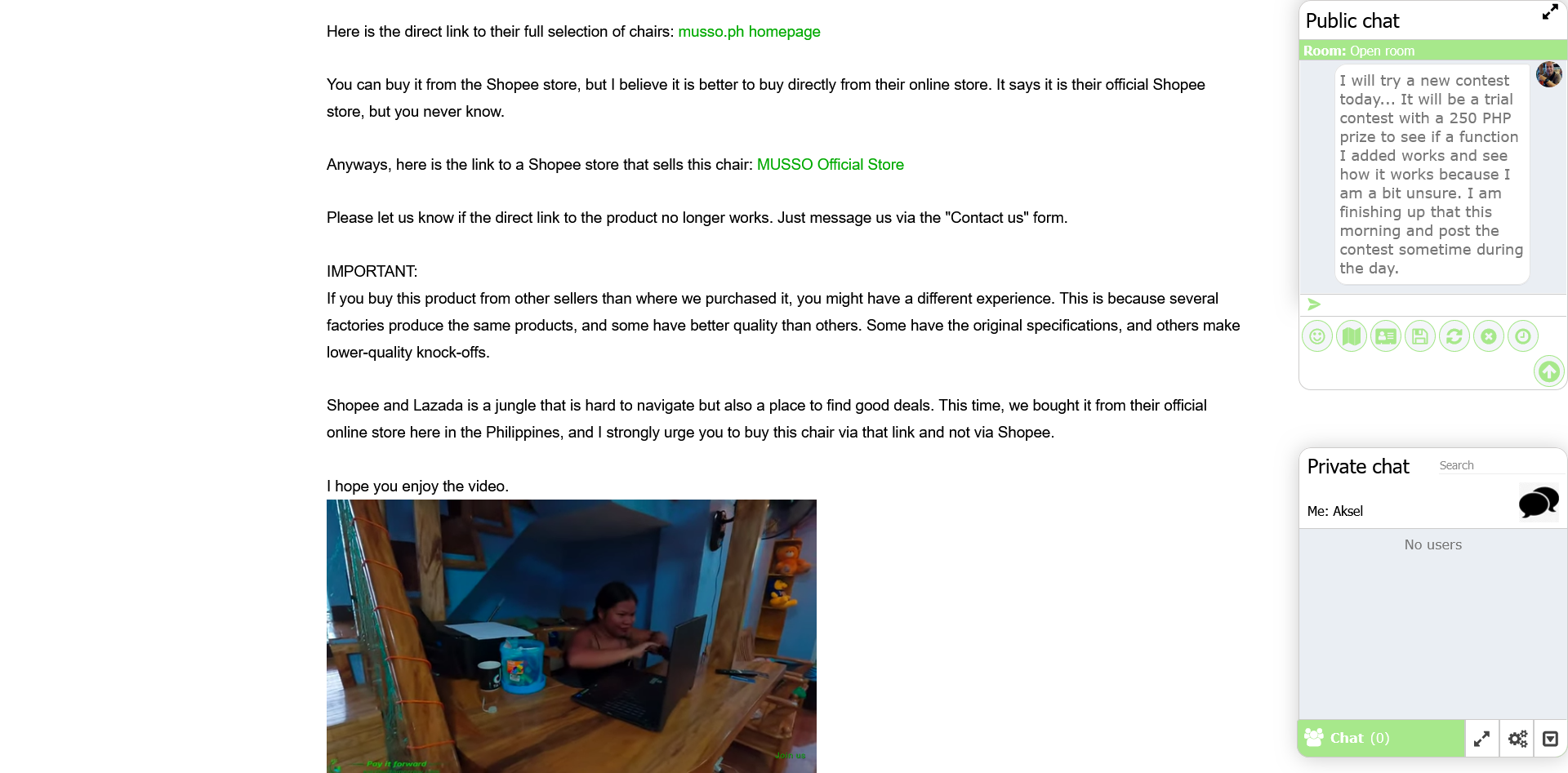
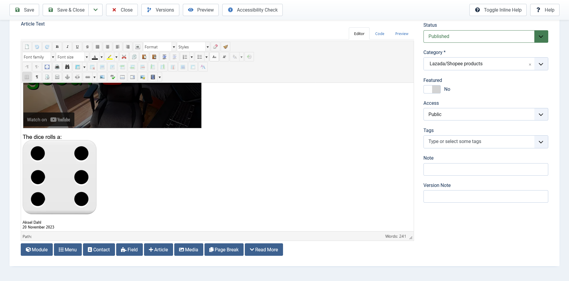
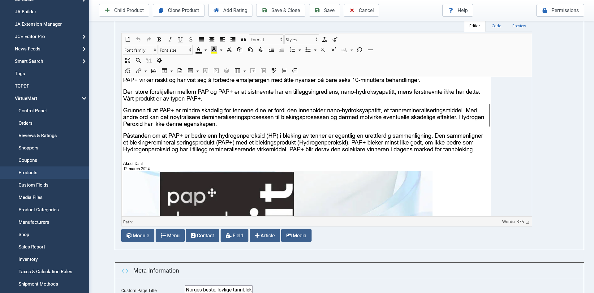
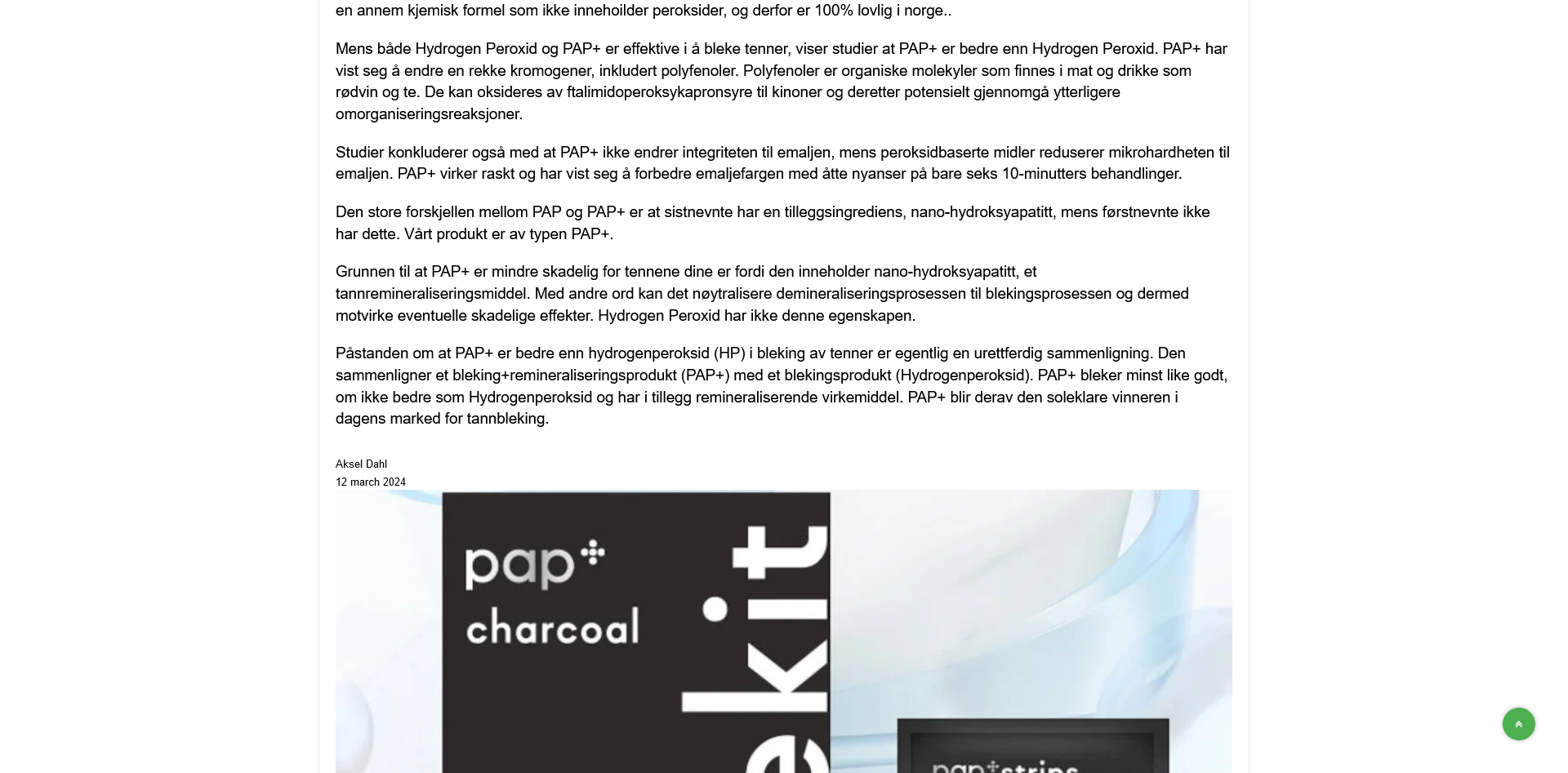
I use the same editor with the same settings and type the same way on both websites. I show you the difference in a photo. Both templates are from you.
One photo from the text on the earthoftomorrow website and one from prisgarantist1.com that I am currently building.
I do not get why you say not to hit enter. I have turned off the paragraph. I have a linebreak, and just like a typewriter, enter equals one line. It is the lines that are far apart. I checked the code within the editor and it comes out correctly.
The PG1 photos show good line break distance; the EOT has a too big gap. If you look at the Signature with the date and name, I am sure you can see it when you look at the difference between the two pages.
Within admin on EOT, in the editor, it shows correctly. It is on the front page. It gets all strange.
I'm not sure what you did, but nothing has changed. The logo link is now good, but the text has a big gap. It was not like this in the last template I used for this website.
I want you to know I am not nagging or trying to be difficult. I love your templates; they are great. It is just it is actually too big to space her.
My wife and I are starting to advertise this website in a few days, and it will probably start growing pretty fast since we have over 3 million followers on TikTok, YT, and FB. I just wanted to have this text sorted first.
Sorry for the late reply. Things are so insanely hectic here that I had to work on another project for a while.
