Just need to have a bigger logo size. For example, mine is 742x100, but shows as 250x33. Where can I change this ?
Logo Size
- Edited
Hi stephane-lavoisard,
You can go to the backend > Site template syles > ja_rights - Default > Layout settings > Header row and click the setting icon.
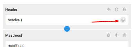
and click edit header block:

Now, you can change with of the logo and main nav.
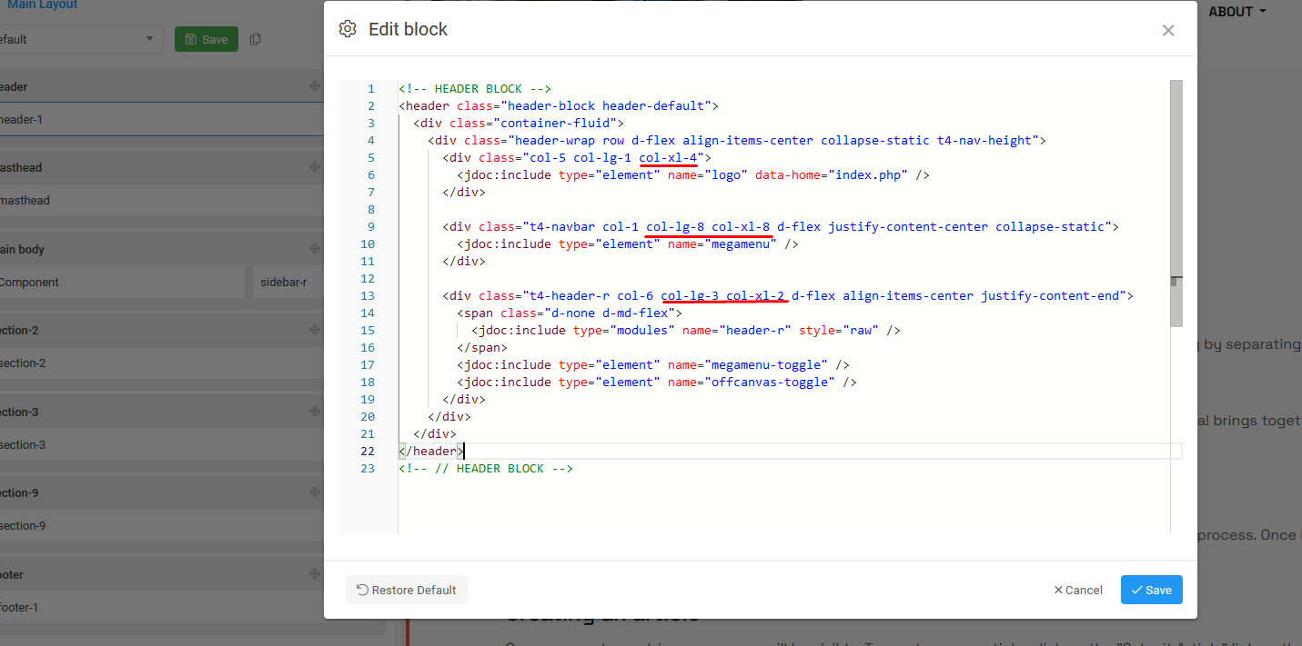
Ok... When I click on edit the only option I have is "mainnav", no "header-1" content. Do I need to create it and type the code you provided ?
dominic
Ok, just input the code to "mainnav" and it's working. Thanks a lot... I must admit I don't really understand everything about this code, any place to find info about this ?
I tried to apply the same code to my other sites using JA-Flix, for which I have the same problem of logo size, especially with the right Offcanvas not appearing on mobile... It did not work but also broke my Home page template  Even after resetting the code, on www.cpourlesenfants.com my logo in not visible on Home Page and menus are totally off. Any specific code to adapt the logo size on JA-Flix ?
Sorry about that... And I think it's my final problem with all our sites transfert, shouldn't asking things all the time till next big Joomla update 
Hi stephane-lavoisard,
The template using the Bootstrap grid, you can refer here
Also, Could you send me the admin account for further checking? We will check and help you resolve this issue.
Hi stephane-lavoisard,
The Bootstrap grid system is a powerful and responsive layout system that allows you to create complex layouts with ease. It is based on a 12-column grid, which makes it flexible and adaptable to various screen sizes and devices.
Columns: Columns are placed inside rows, and the grid system allows you to divide each row into up to 12 columns. You can specify the width of each column using classes like .col-, .col-sm-, .col-md-, .col-lg-, and .col-xl-, where the suffixes represent different screen sizes (extra small, small, medium, large, and extra large, respectively).
For example:
.col-6 creates a column that spans 6 out of 12 columns on all screen sizes.
.col-md-4 creates a column that spans 4 out of 12 columns on medium and larger screen sizes.
With your site, you can try this:
<div class="header-wrap row d-flex align-items-center collapse-static t4-height">
    <div class="col-5 col-lg-4 col-xl-4">
        <!-- logo section -->
    </div>
    <div class="t4-navbar col-1 col-lg-6 col-xl-6 d-flex justify-content-center collapse-static">
        <!-- menu item -->
    </div>

    <div class="t4-header-r col-6 col-lg-2 col-xl-2 d-flex align-items-center justify-content-end">
          <!-- offcanvas -->
    </div>
</div>
The layout consists of 3 columns, each spanning 4 , 6 and 2 out of 12 columns (40% - 60% - 20% width).
I have read this thread from start, and I cant get my head around how the logo configuration works. Have a look on my demo-site: It works well in desktop mode, but smaller screens will not apply. Either it gets bigger than I want, or it gets distorted.
https://2tot-nordic.no/Xoom-demo/Aktivist/
I have asked this question before, but it only partly resolved the problem.
Added this to custom CSS:
.t4-wrapper {background:#fff!important;}
.navbar-brand.logo-control img.logo-img {
max-height: unset !important;
}
Regards
Tor Otto Tollefsen
Hi, I think what I want is obivous, but I can show you how I don´t want it.
(I have made a clean install of Ja Rights to research this issue)
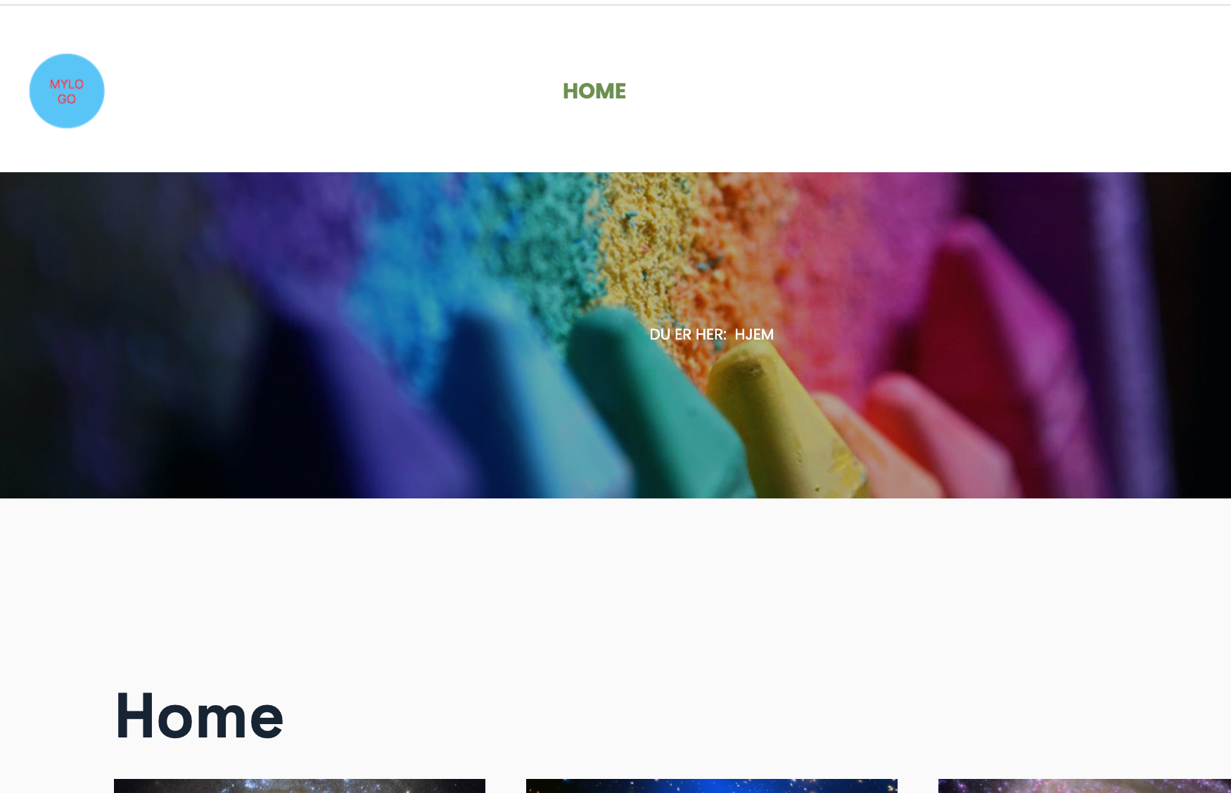
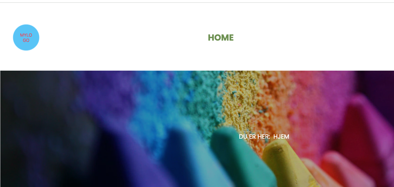
Desktop/big screen is OK. Medium screen, like ipad portrait is good, but ipad landsc shows the smaller logo and mobile screen shows bigger and partly hidden by mastehead module.
#1: Normal - no issues:
#2: I pad landscape: - shows the smaller logo - (should have been bigger):
#3: Mobile screen - shows the bigger logo, hidden behind top of masthead. Should have been the smaller logo. 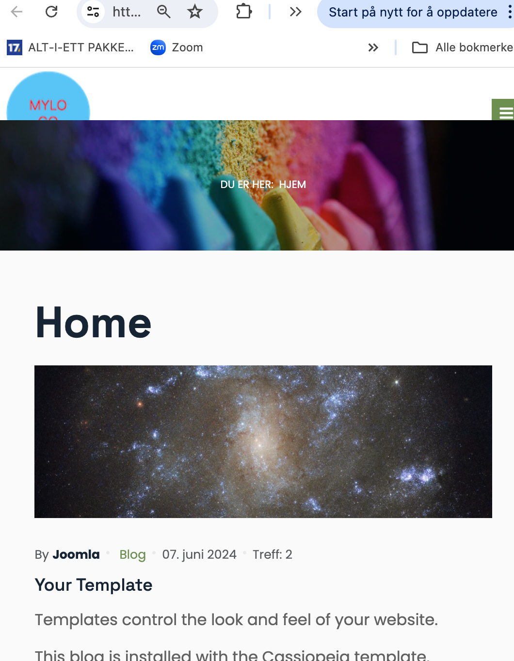
Regards / tot