Hello,
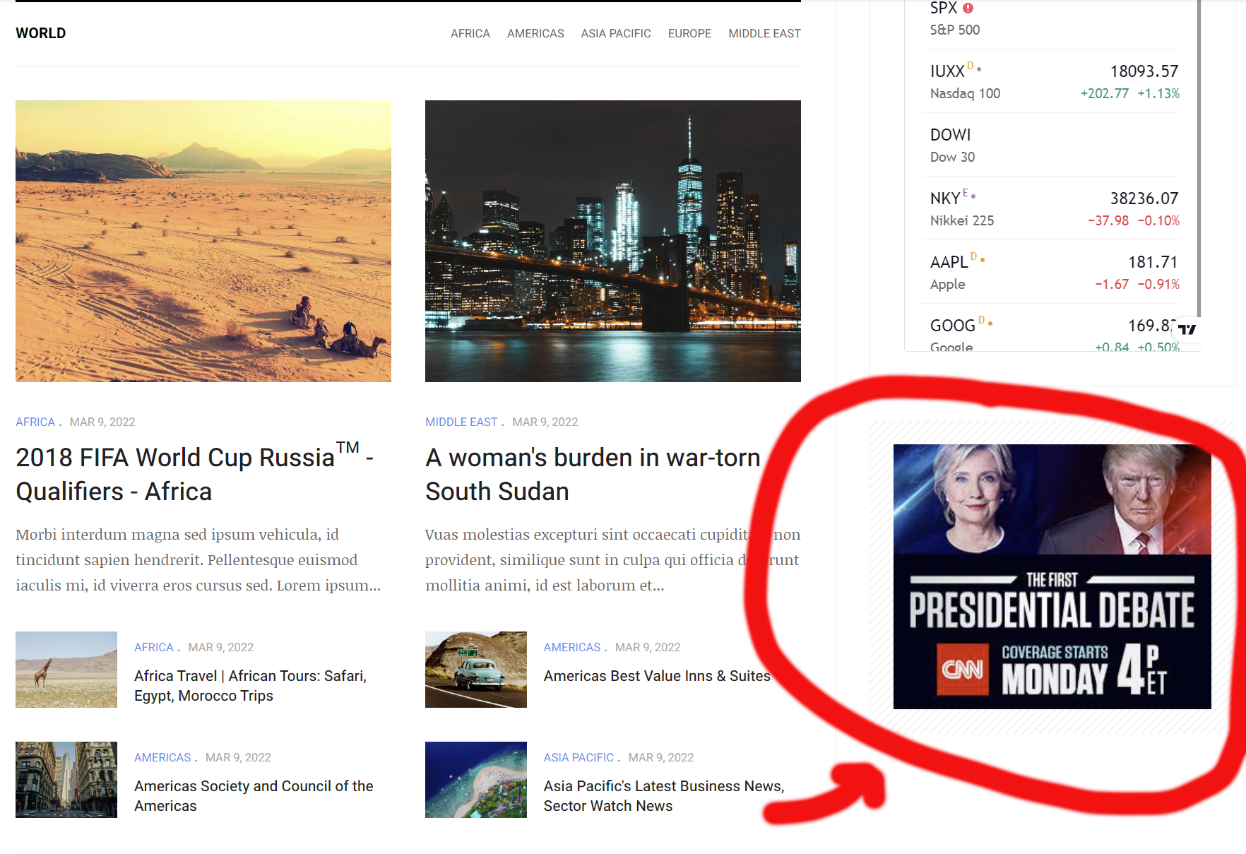
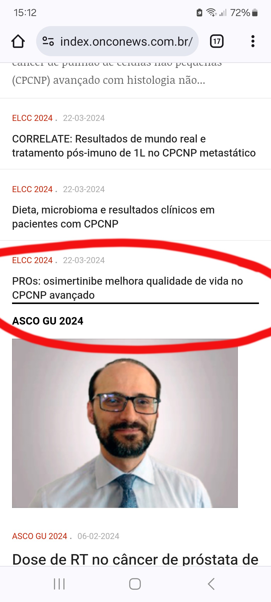
I have created the spolight-2 and spotlight-3 positions as previous instructions, exactly in the necessary positions. However, the format of these modules is very different from what we would like: the columns are narrower; the banners appear smaller and the module title is very far away and different. They are very different on smartphones too (have a look on the URL, please). see:

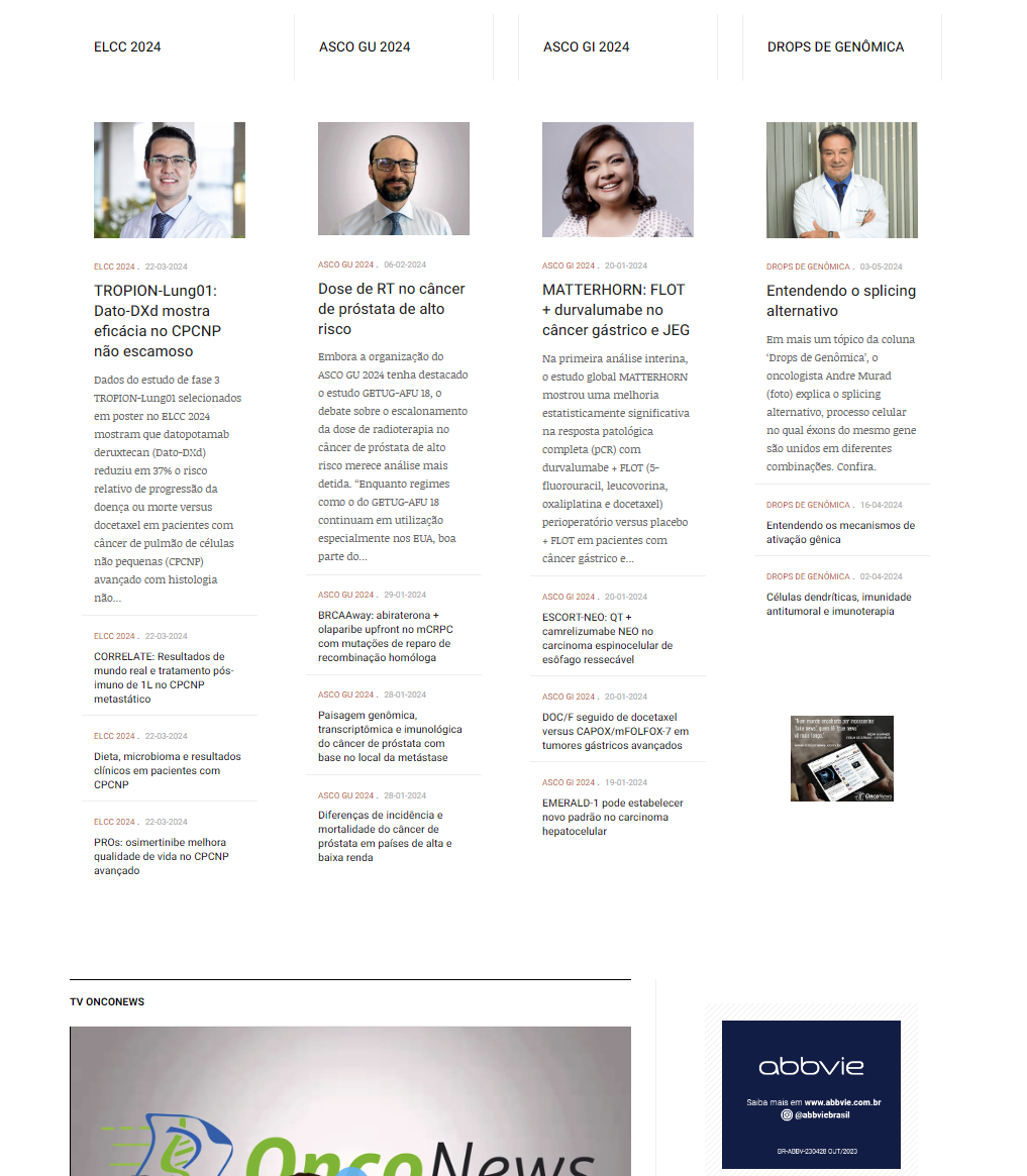
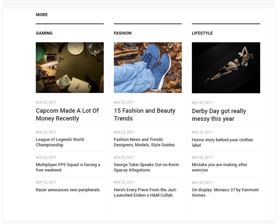
We would like the 4 colluns layout to follow the default column width of the focus column layout on modules articles-category like in the image bellow, also for positions 5,6,7 and 8 of spolight-2 and positions 9,10,11 and 12 of spotlight-3. Could you please help adjust this in this installation. Thanks in advance.

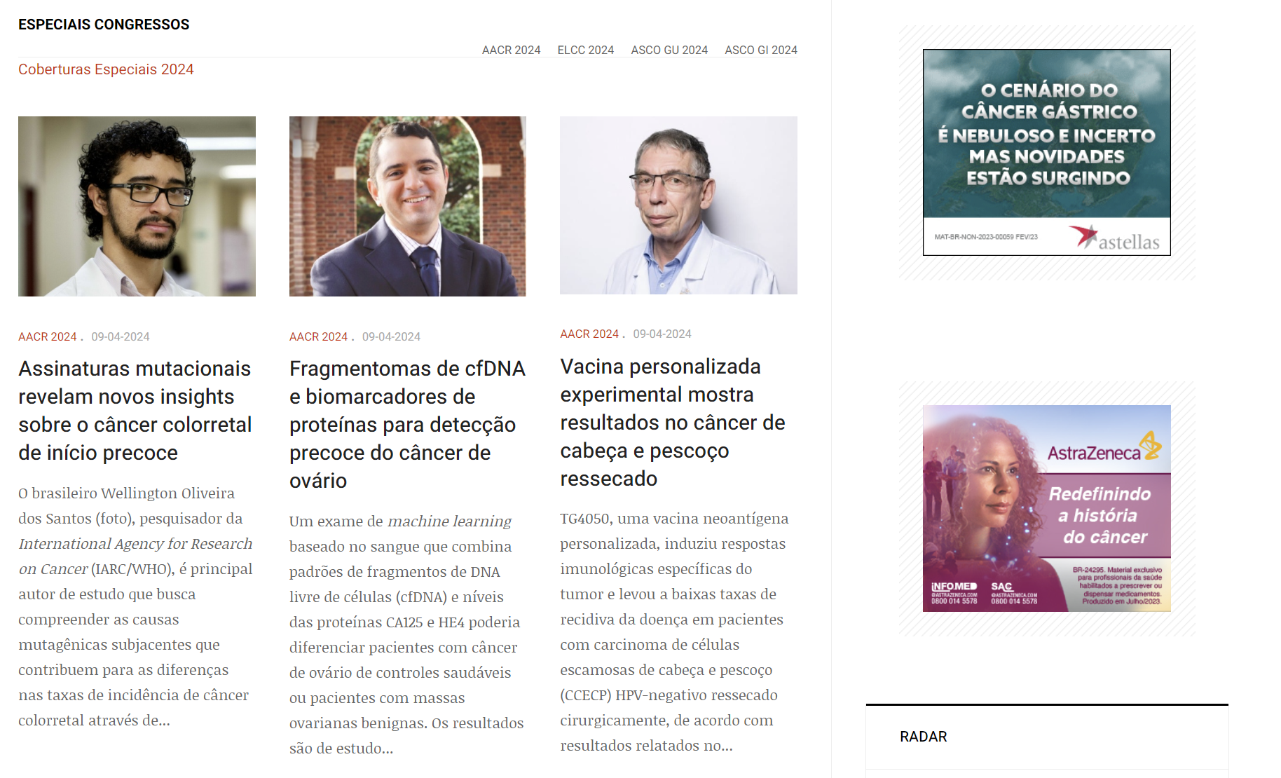
Original layout of tree colunns we were expeting to be showed on this four colunns of spotlight-2 and spotlight-3:

    Hi pugliesijr,
    I have checked and see that you are using the spotlight block to custom and the block won't load the t3-main-content class:
    I have updated the /templates/ja_focus/tpls/blocks/spotlight-2.php file.

    Hello Dominic,
    Thanks for your fast replay. We still have some problems on this spotlight-2 position:
    1) On smarthphones screens it appears in blocks of two columns. Insted of that we'd like it to be showed just one column, one below the other keeping the standart layout of news-6 module with mod-noborder class. Please see bellow:

    Pic 1 - Two collumns on smathphones screen:

    Pic 2 - And two columns are misaligned when article titles have different number of lines, on smatphones screen (if showed in one column it will be fixed too):

    2) banners are still smaller in this spotlight-2 block. As a matter of fact all the banners in positions sidebar-right, sidebar-2 and position-8 are not being showed in real size of w300pix X h250pix, like it appears on Focus live demo. On position-8 its appear even smaller. Compare, please:

    Pic 3 - live demo:

    Pic 4 - banners on position-8 and sidebar-2 (also sidebar-right that is not on this pic but have the same problem)

    Thanks for the precious help,
    Best

      Hi pugliesijr,
      I have added the following CSS code to the custom.css file:

      .t3-sidebar .t3-module .module-ct {
        padding: 0;
      } 

      and update the /templates/ja_focus/local/etc/layout/default.ini file.

      [block1@spotlight-2]
      lg="col-lg-3"
      md="col-md-3"
      sm="col-sm-3"
      xs="col-xs-12"
      position="position-5"
      
      [block2@spotlight-2]
      lg="col-lg-3"
      md="col-md-3"
      sm="col-sm-3"
      xs="col-xs-12"
      position="position-6"
      
      [block3@spotlight-2]
      lg="col-lg-3"
      md="col-md-3"
      sm="col-sm-3"
      xs="col-xs-12"
      position="position-7"
      
      [block4@spotlight-2]
      lg="col-lg-3"
      md="col-md-3"
      sm="col-sm-3"
      xs="col-xs-12"
      position="position-8"

      Now it's ok. You only need a space between one module and another when viewed on smartphones. See the image below:
      Please let me know the adjustment you are going to do because I have do do the same thing on spotlight-3 - positions 9, 10, 11 and 12. Thanks a lot

        Hi pugliesijr,
        You can add the following CSS code to your site:

        @media (max-width: 480px) {
        .t3-main-content .t3-spotlight-2 .col {
            margin-top: 2rem;
            margin-bottom: 6rem;
        }
        } 
        Write a Reply...
        You need to Login to view replies.