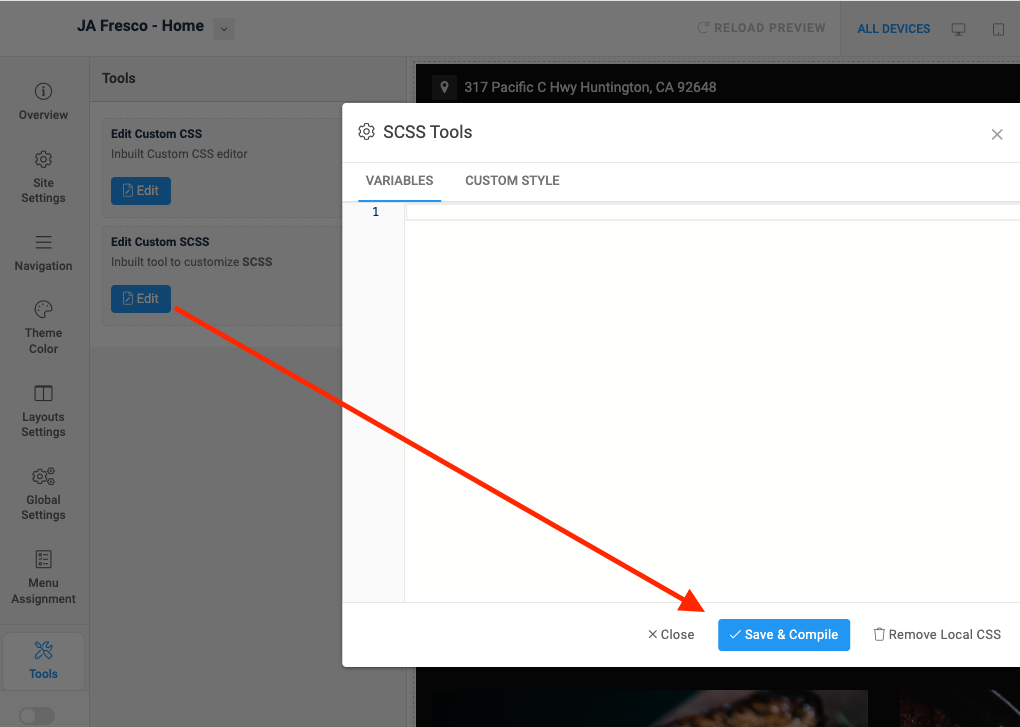
Hi
It's defined in this file: ROOT/templates/your_default_template/scss/_variables.scss
Look for this:
// Grid breakpoints
//
// Define the minimum dimensions at which your layout will change,
// adapting to different screen sizes, for use in media queries.

// scss-docs-start grid-breakpoints
$grid-breakpoints: (
  xs: 0,
  sm: 576px,
  md: 768px,
  lg: 992px,
  xl: 1200px,
  xxl: 1420px
);
// scss-docs-end grid-breakpoints
change to your desired value
Then go to template + compile.
