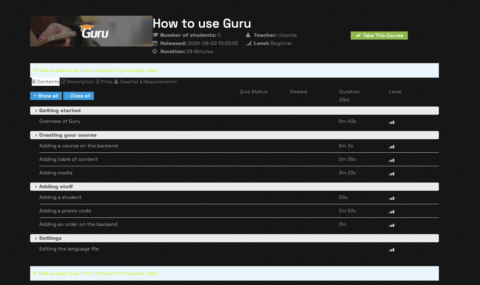
I have figured out how to modify the template style and have changed text colours to make more readable, but can you help with som layout issues please:

The padding between the image and the 'How to use Guru title (and the text below) seems to be zero. How can I increase the size of this?
Also the tabs below the 'Get access to...' box - is there a way to increase the padding and also change the style options for these tabs...I dont link they look like tabs at all in their current form and get lost