Hi,
I added the info for super user login.
Actual situation:
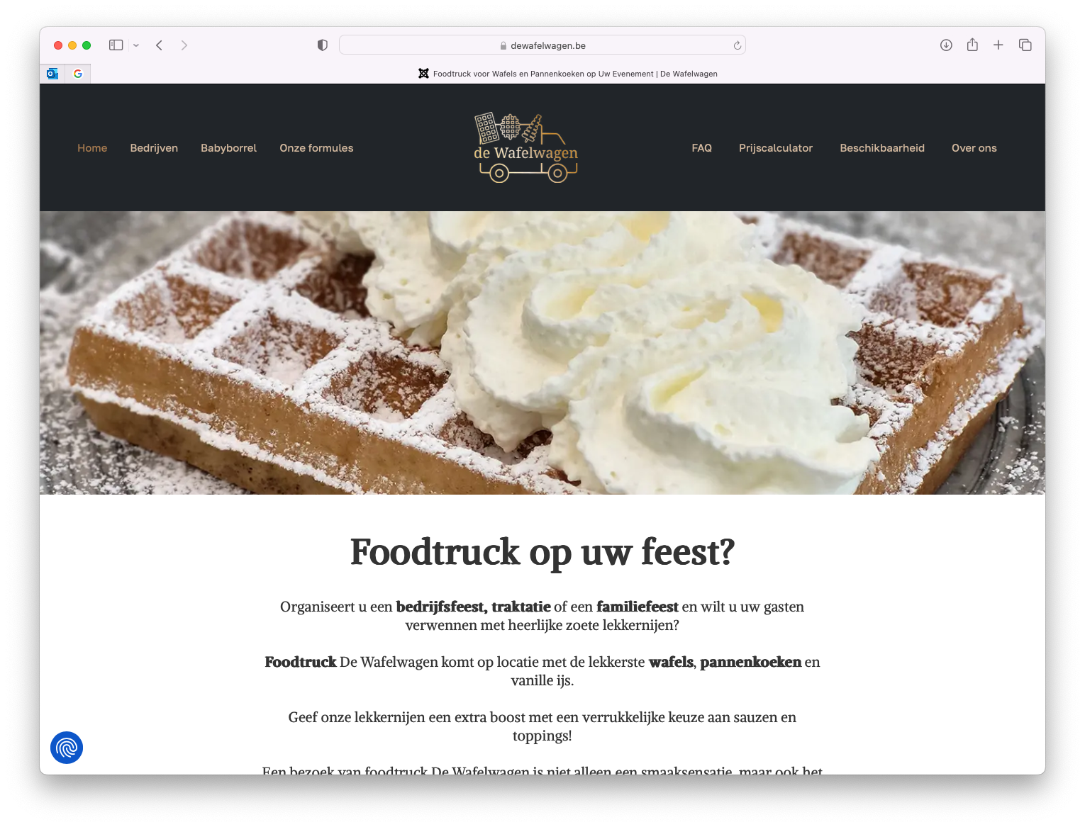
when you open the page on a large screen, you see:
MAIN MENU (Home-Bedrijven-Babyborrel-Onze formules) - LOGO - INFO MENU (FAQ-Prijscalculator-Beschikbaarheid-Over ons)
(cfr print screen 1)
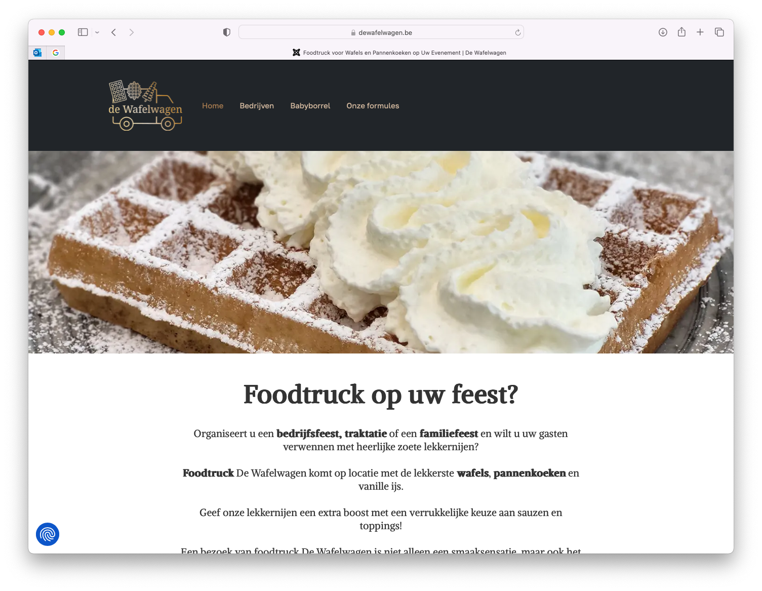
When you resize your screen to a smaller size (for example 1220px) - the info menu disappears, and the logo moves to the left of the main menu, so we get:
LOGO - MAIN MENU (Home-Bedrijven-Babyborrel-Onze formules)
the info-menu can't be found anywhere
(cfr print screen 2)
If you continue to narrow down the screen size, both menu's (main menu & info menu) will collapse to the off canvas position
(cfr print screen 3)
Wanted situation
In all screen sizes, I want to have the logo, and both menu's. If there isn't enough space to put the main menu & info menu in the top nav - they should both collapse, simultaneously to the off canvas menu.
In short, the layout of print screen 1 & 3 is OK. The layout of print screen 2 is not. Since one menu is missing in that view.
I think this can be solved, by making the main menu collapse at the same width, as the width that triggers the infomenu to disappear. 

