I've been using the JA Social II template for years. I use Community Builder for user management and it has its advantages. My problem relates to the responsive format of the menus when viewed on smaller devices. I just upgraded to template version 2.1.0 to ensure that will not be an issue.
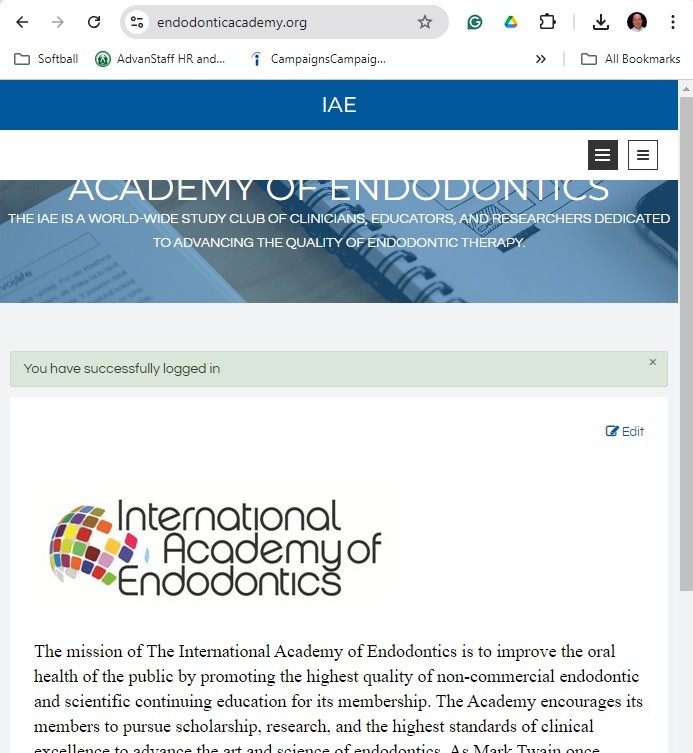
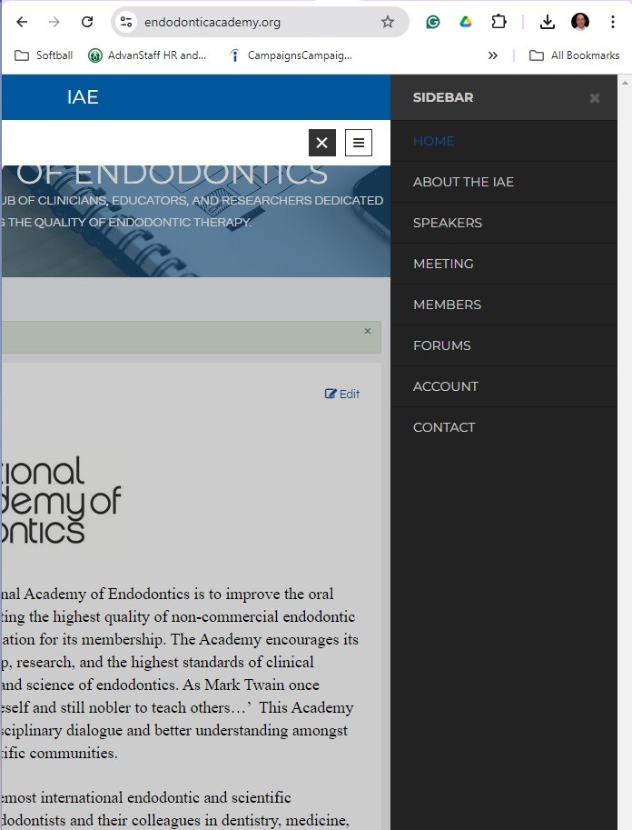
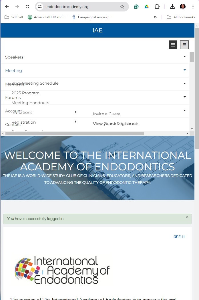
From what I can tell the template features a built-in "sidebar" menu (black menu icon) that is visible at all times and any resolution, it works fine on all devices. But if the browser window is made small, or when viewed on a smaller device, the Top Menu also becomes a competing menu button (white menu icon). Because my Top menu has multiple sublevels, the sublevels do not have the space to display and end up overlapping, resulting in a jumbled menu format. This does not display properly and needs to be fixed.
I have attached screenshots to help you best understand.
I do not need both menus, but I cannot figure out how to disable the responsive (white) menu. If I could force the layout to not display the submenus of the white icon, I could also remove the black sidebar menu because it would be redundant. I can't figure out how to do that, either.
Is there a soluti


on to my problem?

