- Edited
Hi
When I insert a block with 2 og 3 columns, how can I control what happens when I see the page on small screens - like where do I control the breakpoints if it's set to flex?
Regards
Thomas
Hi
When I insert a block with 2 og 3 columns, how can I control what happens when I see the page on small screens - like where do I control the breakpoints if it's set to flex?
Regards
Thomas
Hi Thomas,
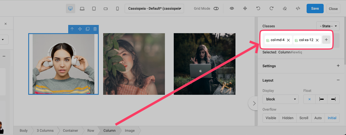
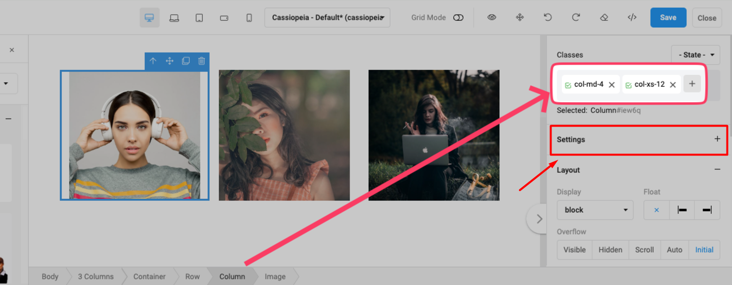
On edit screen, you can select each column and add Bootstrap class as you wish:

Thank you!
But it seems a bit difficult to tell a customer this is the way to do it?
I'll figure it out :-)
Thanks!
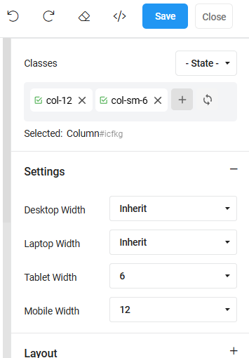
The Settings tab/options allows you to set Bootstrap Grid classes to control the column width on different devices. Setting 12 equals 100% width. Setting 6 equals 50% width, etc. Note that if you set, for example, 50% on tablet, it will inherit this width for larger screens as well unless you set otherwise - so you don't need to set the width for all devices/breakpoints if you want the same width to apply to the larger devices as well.
I only discovered the role of the Settings option today, as I had been trying to add the classes manually, but Pagebuilder was removing them. If you're not familiar with Bootstrap Grid, there is a whole page dedicated to it on their website that explain the rules (but I'm guessing you already know it).

Thank you so much, will test a bit before I talk to the customer about this option :-)
Hi... you need to set the Bootstrap classes using the dropdown settings. Adding them manually will result in the pagebuilder removing them.
Setting the column width to 12 will create 100% width. Setting it to 6 will create 50% width. 4 is 33.3333333%. And so on.
If you want larger screens to display the same as tablet, leave the setting as 'inherit'.
