Hi,
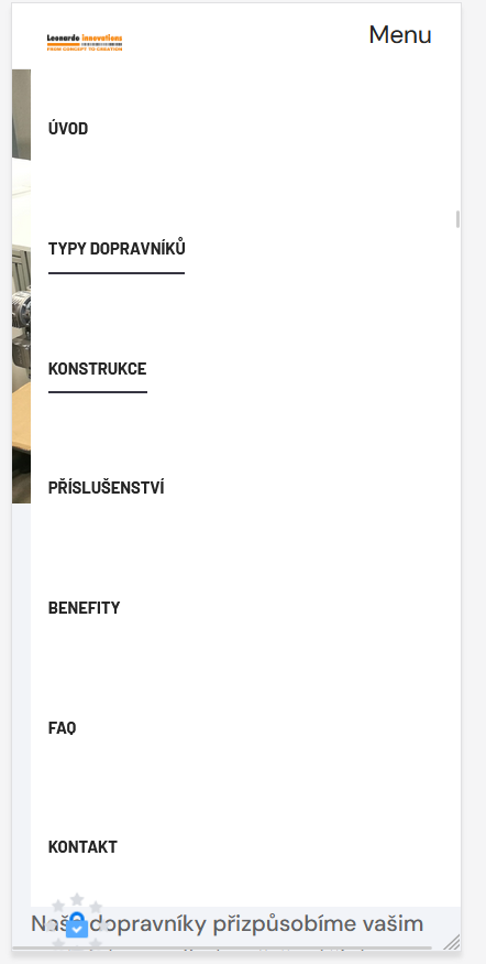
I have built a onepage site with T4 PAge Builder. Everything is fine, I just ran into a problem when viewing it on a mobile phone. The menu (navbar) on the mobile phone remains open even after clicking on the item. I would need it to disappear when the item is clicked. The menu on onepage is created using anchors.
You need to add JavaScript that will listen for clicks on the menu items and close it. If the standard script from the theme doesn't work, you can try the following:
javascript
document.addEventListener('DOMContentLoaded', function () {
    const menuItems = document.querySelectorAll('.navbar-collapse .nav-link'); // Replace the selectors with your selectors
    const menuCollapse = document.querySelector('.navbar-collapse'); // Mobile menu selector

    menuItems.forEach(function (menuItem) {
        menuItem.addEventListener('click', function () {
            if (menuCollapse.classList.contains('show')) { // If the menu is open
                const bsCollapse = new bootstrap.Collapse(menuCollapse, { toggle: true });
                bsCollapse.hide(); // Close the menu
            }
        });
    });
});