Yes with the mobile menu it would have to be the offcanvas menu - the other options would not work as the menu position links are added only from the menu module and it would require js and php to get this to work.

e.g. use the menu mobile option for off canvas and then create a new menu type module just for the off canvas position to simulate the other menu
With having two menus on a desktop - this hasn't really been tried so I'm not sure

There is only one menu position in the template so it would be a case of using an alternate position which is where the potential problems would occur

At the moment our documentation site is offline so I can't actually test this myself at the moment unfortunately

Cheers
Paul

Hi!
I'll do some tests. Can we kindly keep this topic open?
Thank you

13 days later

Hi!
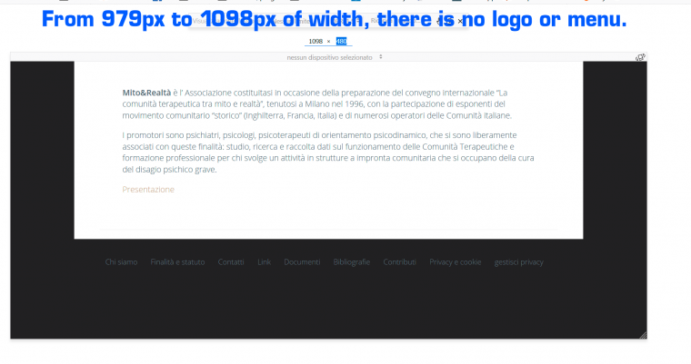
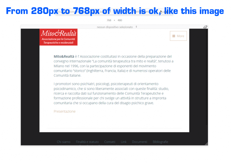
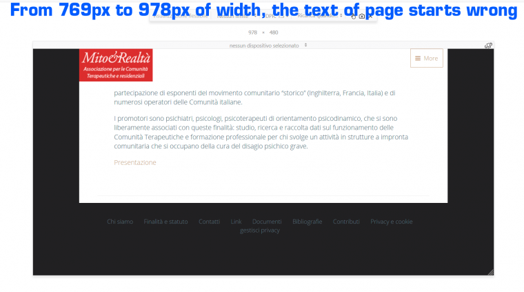
In layout of template settings, I set as a breakpoint 1098px, both as "Tablet Max width," and as "Nav Collapse" and as "Grid Collapse". But I get a strange behavior:

1) from 280px to 768px wide, both the text and the presence of logo and menu are correct.

2) from 769px to 978px wide, the first part of the page text disappears, but there are both logo and menu.

3) from 979px to 1098px wide, the text is correct, but both logo and menu disappear.

Please se attached image.
What should I do?
Thank you!

Hi!
For this site I'm using JB Wedding template.
Cheers

Hi

I'd try using a different row that the toolbar and see how that works - the toolbar does behave slightly differently than other rows

Cheers
Paul

    paulus1031
    Hi!
    By changing the row, the menu, text and logo work.
    This different behavior of the toolbar row is strange.
    Thanks!
    Cheers

    No problem

    I'll mark this thread resolved

    Cheers
    Paul

    Write a Reply...
    You need to Login to view replies.