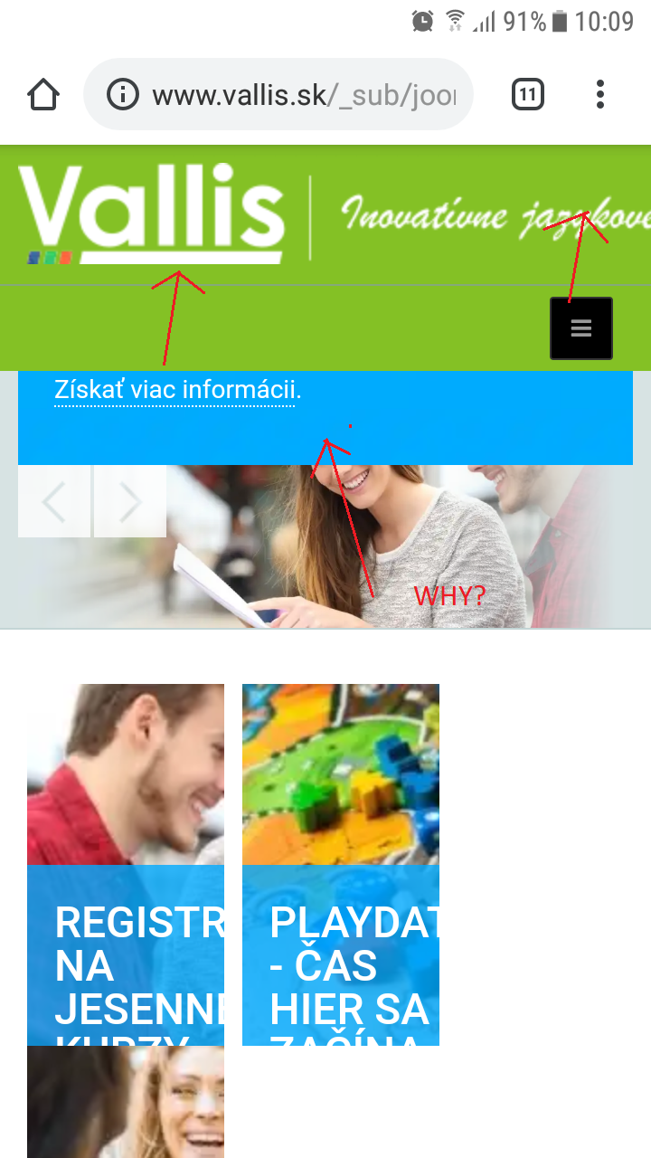
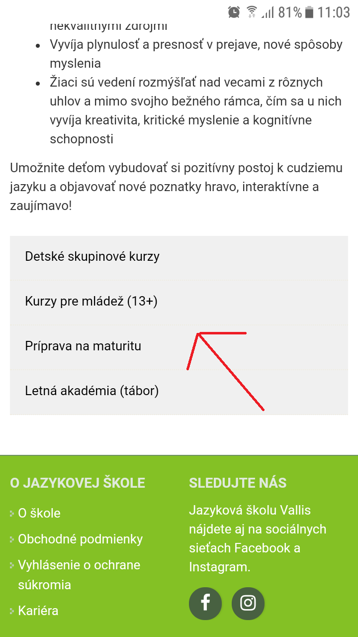
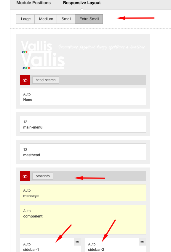
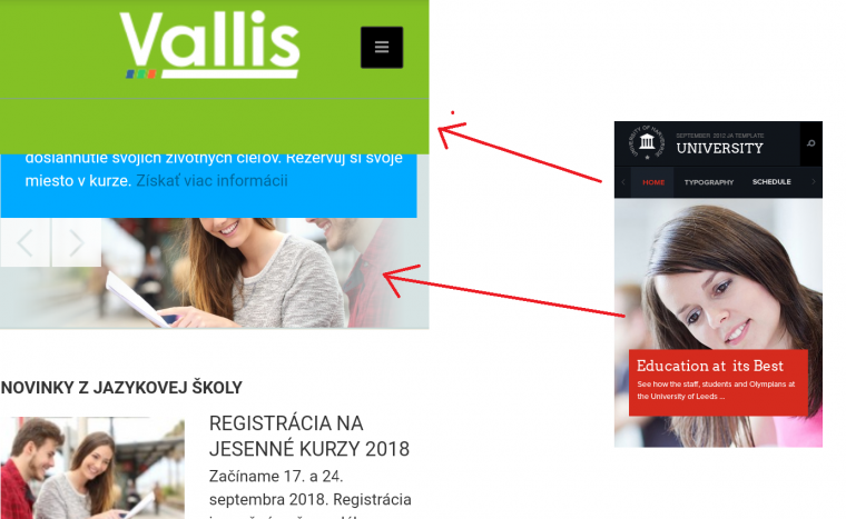
I would like to ask you if you could help me with JA UNIVERSITY which I find sometimes not responsive enough, and not suitable for smart phones. Some of the elements are not fine and I just do not know what if I am supposed to use for tables or div in combination with css. I am trying to study use of css in tables and it looks like it is fine and elements are responsive.

You can see example in link above. I would love, if you could help me with styling etc. As you can see there are three pictures and text is not aligned in center. I used combination of tables and css, but it does not work:

.table-contacts {
background-color: #84c125;
width:100%;
color: #FFFFFF;
text-align: center;
}

    ture@crystalrain123#32354

    I am attaching picture of the mobile version of my site. I would like to
    - move main menu up, I am unable to find this setting in template styling, module positions looks fixed
    - why is not logo responsive?
    - slider is little bit weird :-)

    Could you please make this thread private? Thank you for help!

    Small logo, and slider (is not neccesary in mobile version) should be solved, I found the solution. But moving menu up is not. Please also help me with other menu which is currently in sidebar -1. I would like to movie it before the article. Thank you for help!

      Hi crystalrain123

      Due to the specific layout having sidebar-1 and sidebar-2 positions available at the main-content sides, it will be not possible to override it via css, so my suggestion is to unpublish sidebar-1 position for small devices and use the otherinfo position to publish your menu modules only for small devices, in this way menu will be showed above content.

      Hope it helps

        pavit

        WAW, you are amazing. I appreciate your help. I am sorry but I do not know how to persuade "menus in sidebar" to be different for normal layout and stick to sidebar-1 and then in small devices to stick to "othe info ":-( Could you please help me?

          Hi crystalrain123

          Since i'm not familiar with your language , you can list here id numbers of modules you want to be showed above main content on mobiles views

            am pavit I am sorry, Please try Module ID 114. If it looks good I will apply it to other modules as well.

            I have two other issues:

            1 - home page issue, the titles are different location.

            2 - slider (ID 138) at the homepage is not mobile responsive + I am curious how can I achive menu style like on the original picture from your website.

            Could you please make this thread private? Thank you!

              Hi crystalrain123

              There is an htaccess protection behind your administrator page , please remove it or add in your first post details to access it.

              Regards

                7 days later

                crystalrain123
                Hi
                On Homepage the module title are showing in the same line : http://prntscr.com/ks1prt
                The slideshow on your site had more text in the title and description that increase the height more then the background image, its not possible to show too much text over the image as its can not adapt whole text.
                I noticed you hide the slideshow already in mobile view.

                Regards

                Write a Reply...
                You need to Login to view replies.