
Hi all,
How can I get sidebar 1 and sidebar 2 to stay together at the top of the page on mobile devices?
At the moment I have this page layout on my computer sidebar2 - main content - sidebar1. This is what I want for large devices. Unfortunately on small devices this shows up with sidebar2 at the top of the page, then the main content, then below that is sidebar1. This is not what I want.
Is it possible in Base 3 to have, for small devices, this layout: sidebar2 - sidebar1 - main content?
That way the two sidebars are either side by side, or one under the other on small devices.
Thanks, Nick
Base 3: control sidebar1 and sidebar 2 placement on mobile devices

Hi Nick,
Not really no without editing the template code and creating a new layout together with new css / less coding
Instead I'd try hiding the sidebar modules and create new modules in a different template position and only display them at a certain width
http://getbootstrap.com/2.3.2/scaffolding.html#responsive
This covers the responsive classes needed
Cheers
Paul
e.g. using a custom html module
Thanks, I can work with that.
Here is a quick thought:
Make Sidebar1 (currently on right hand side of page) visible.desktop
Duplicate Sidebar1 (call it sidebar-left) and publish it to existing Sidebar2 (so the two banner ads in each module are now side by side) but make this module hidden.desktop
I'll try it later, but do you think it will work?
they will be one under the other
Cheers
Paul
paulus1031
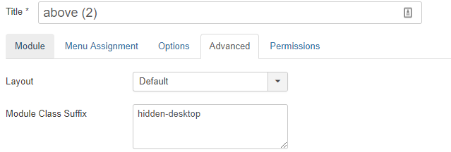
Paul, I've added ' hidden-desktop' to the module (a banner module) in position sidebar-1.
This is to test that the class suffix works; it does not. The advert remains on the page (right hand side - see here:
https://www.treefruit.com.au/orchard/crop-protection/frost
The class suffix is applied (according to dev tools), but ignored.
Any suggestions?

Joshua,
Works beautifully. Thank you.
saguaros locked the discussion.
Sorry Nick I was testing on an older version so the classes were different - Glad we got there
Cheers
Paul