-
AuthorPosts
-
kugelmeier Friend
kugelmeier
- Join date:
- October 2008
- Posts:
- 102
- Downloads:
- 65
- Uploads:
- 60
- Thanks:
- 7
- Thanked:
- 2 times in 2 posts
January 20, 2018 at 4:51 pm #1087824Hallo,
problem on mobile web:
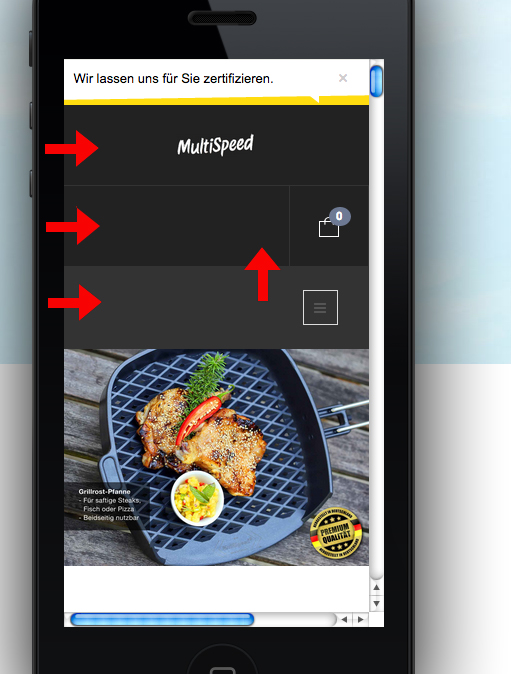
in smartphones the head shows 3 black stripes, logo + shop symbol + menue
Is it possible to reduce them to 2 or 1 stripe? Logo next to shop or menue next to shop?And a general question: Whats happens with the live template when I upgrade this?
Shall I duplicate the template.css and the custum.css?Regards
Klaus
 Pankaj Sharma
Moderator
Pankaj Sharma
- Join date:
- February 2015
- Posts:
- 24589
- Downloads:
- 144
- Uploads:
- 202
- Thanks:
- 127
- Thanked:
- 4196 times in 4019 posts
January 22, 2018 at 3:01 am #1087935Hi
The logo, Menu and cart are defined in 3 different blocks, when u check them in mobile, you will see the logo and cart on first line and menu in the 2nd line
http://prntscr.com/i3qf94
There is not much space to fix all of them on one line.
You can check the site on real mobile devices, the width of the device lower than 368px will show the menu like in your screenshot because there is not enough width to fit them in one row.
If you want I can help you in css change to fit the logo and cart in one row for these devices tooRegards
kugelmeier Friend
kugelmeier
- Join date:
- October 2008
- Posts:
- 102
- Downloads:
- 65
- Uploads:
- 60
- Thanks:
- 7
- Thanked:
- 2 times in 2 posts
January 22, 2018 at 8:21 am #1087997Hallo,
yes thanks. If logo and menue in one row it seems better.
Please help to fit the logo and cart in one row, but only in mobile.Regards
Klaus Pankaj Sharma
Moderator
Pankaj Sharma
- Join date:
- February 2015
- Posts:
- 24589
- Downloads:
- 144
- Uploads:
- 202
- Thanks:
- 127
- Thanked:
- 4196 times in 4019 posts
January 22, 2018 at 10:05 am #1088029Hi
Open /css/custom.css file in the template folder and add this code@media (max-width: 360px) { .logo { width: auto; }}save file, clear Joomla cache and check.
Regards
kugelmeier Friend
kugelmeier
- Join date:
- October 2008
- Posts:
- 102
- Downloads:
- 65
- Uploads:
- 60
- Thanks:
- 7
- Thanked:
- 2 times in 2 posts
January 22, 2018 at 1:34 pm #1088063Hallo,
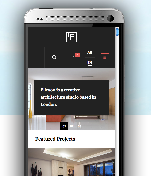
I have done it and it seems ok. But in your Elicyon live demo the menue and basket in one row and the
logo is standing above in the middle. See the screen.
It looks better – is it possible?Regards
Klaus
 Pankaj Sharma
Moderator
Pankaj Sharma
- Join date:
- February 2015
- Posts:
- 24589
- Downloads:
- 144
- Uploads:
- 202
- Thanks:
- 127
- Thanked:
- 4196 times in 4019 posts
January 23, 2018 at 1:55 am #1088116Hi
In the demo site, the menu is off-canvas menu, not the mega menu.
You can disable the collapse navigation for small screen from the template options.
And use the off-canvas sidebar to get the same view.
Here is documentation for menu system in this template.Regards
AuthorPostsViewing 6 posts - 1 through 6 (of 6 total)This topic contains 5 replies, has 2 voices, and was last updated by
 Pankaj Sharma 6 years, 11 months ago.
We moved to new unified forum. Please post all new support queries in our New Forum
Jump to forum


