-
AuthorPosts
-
hpeeters Friend
hpeeters
- Join date:
- January 2008
- Posts:
- 70
- Downloads:
- 0
- Uploads:
- 19
- Thanks:
- 15
- Thanked:
- 2 times in 1 posts
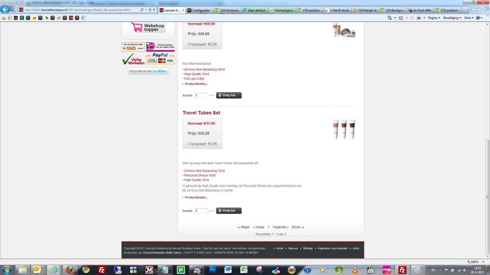
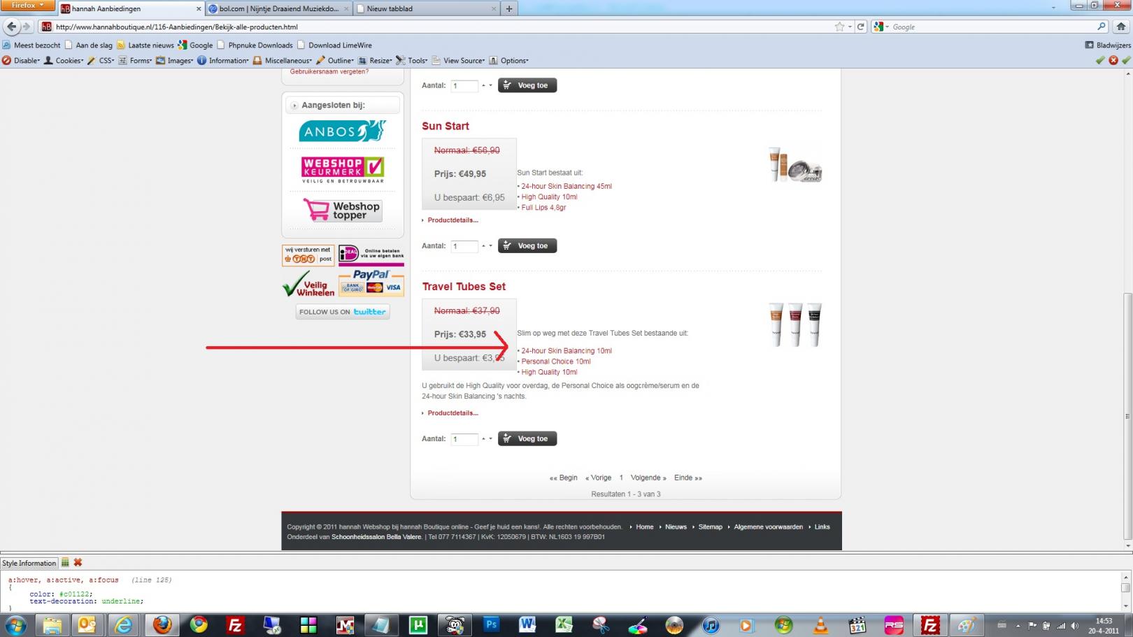
April 22, 2011 at 12:31 pm #163098When a product is on discount the aligment in firefox is not right, however it is ok in internet explorer 7.0. I tried increasing .browseProductDescription margin-top in theme.css but then in internet explorer the distance between the price container and product description doubles! I have no clue how to solve this, probably it is simple but I can’t seem to solve it. It seems that IE 7.0 doubles the margin and firefox doesn’t.
What I want is that in internet explorer 7.0 it shows the same as in firefox.
Please find attached screenshot to see what I mean.
There are still quite a lot of my customers using internet explorer 7.0, so a solution would come in handy.
-
chavan Friend
chavan
- Join date:
- October 2014
- Posts:
- 4612
- Downloads:
- 0
- Uploads:
- 110
- Thanked:
- 1440 times in 1290 posts
April 24, 2011 at 5:58 pm #387848Post your site Url
hpeeters Friend
hpeeters
- Join date:
- January 2008
- Posts:
- 70
- Downloads:
- 0
- Uploads:
- 19
- Thanks:
- 15
- Thanked:
- 2 times in 1 posts
April 26, 2011 at 4:56 pm #388379<em>@Chavan 236110 wrote:</em><blockquote>Post your site Url</blockquote>
I solved it by editing theme.css and added:
“display: inline-block;
padding-right:40px;”to
“.browseProductDescription {
margin-top: 0px;
width: 70%;
}”1 user says Thank You to hpeeters for this useful post
-
AuthorPosts
Viewing 3 posts - 1 through 3 (of 3 total)This topic contains 3 replies, has 2 voices, and was last updated by
hpeeters 13 years, 8 months ago.
We moved to new unified forum. Please post all new support queries in our New Forum
Jump to forum


