-
AuthorPosts
-
splico123 Friend
splico123
- Join date:
- January 2007
- Posts:
- 339
- Downloads:
- 80
- Uploads:
- 7
- Thanks:
- 24
- Thanked:
- 93 times in 16 posts
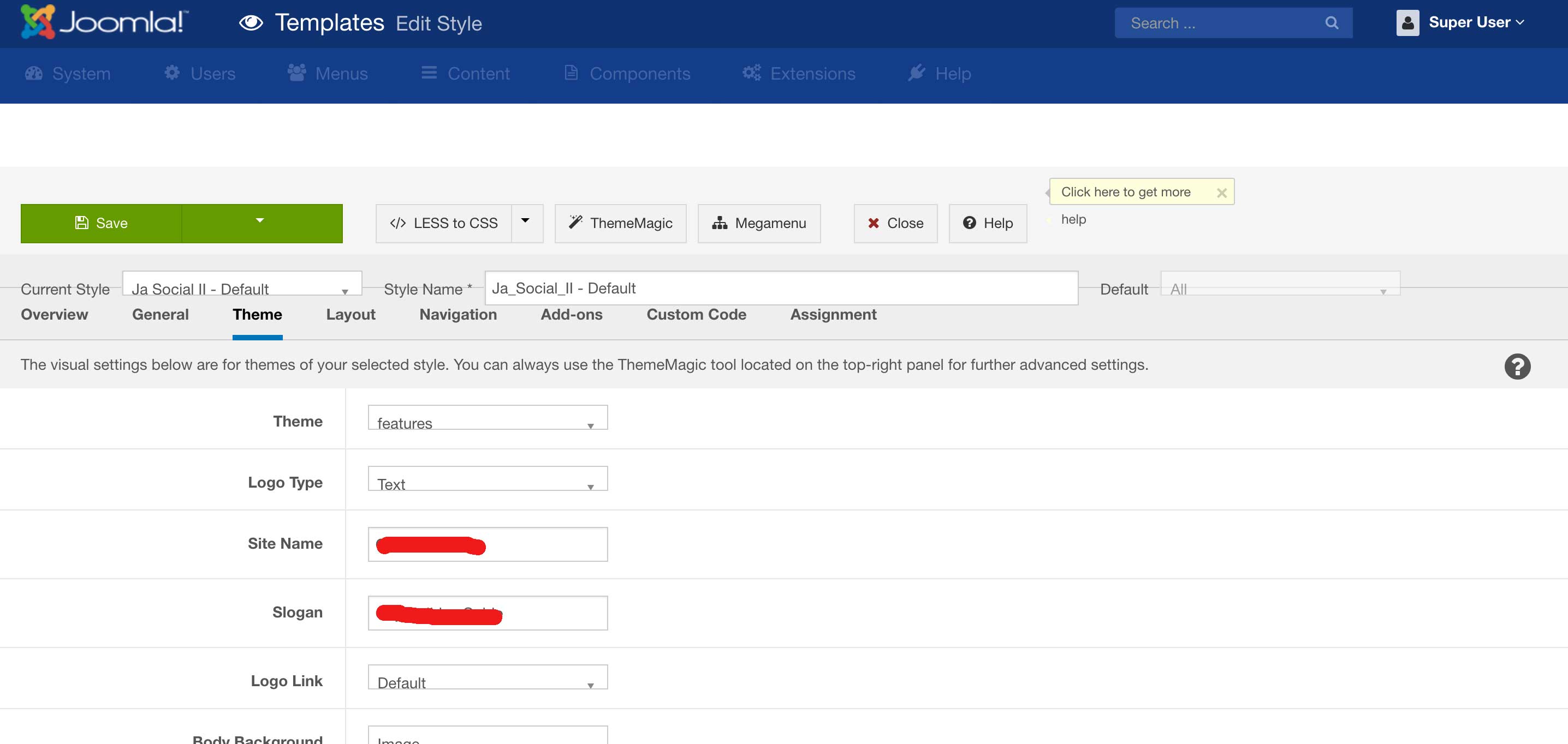
June 24, 2016 at 1:17 pm #9437483 center the logo on the backend login
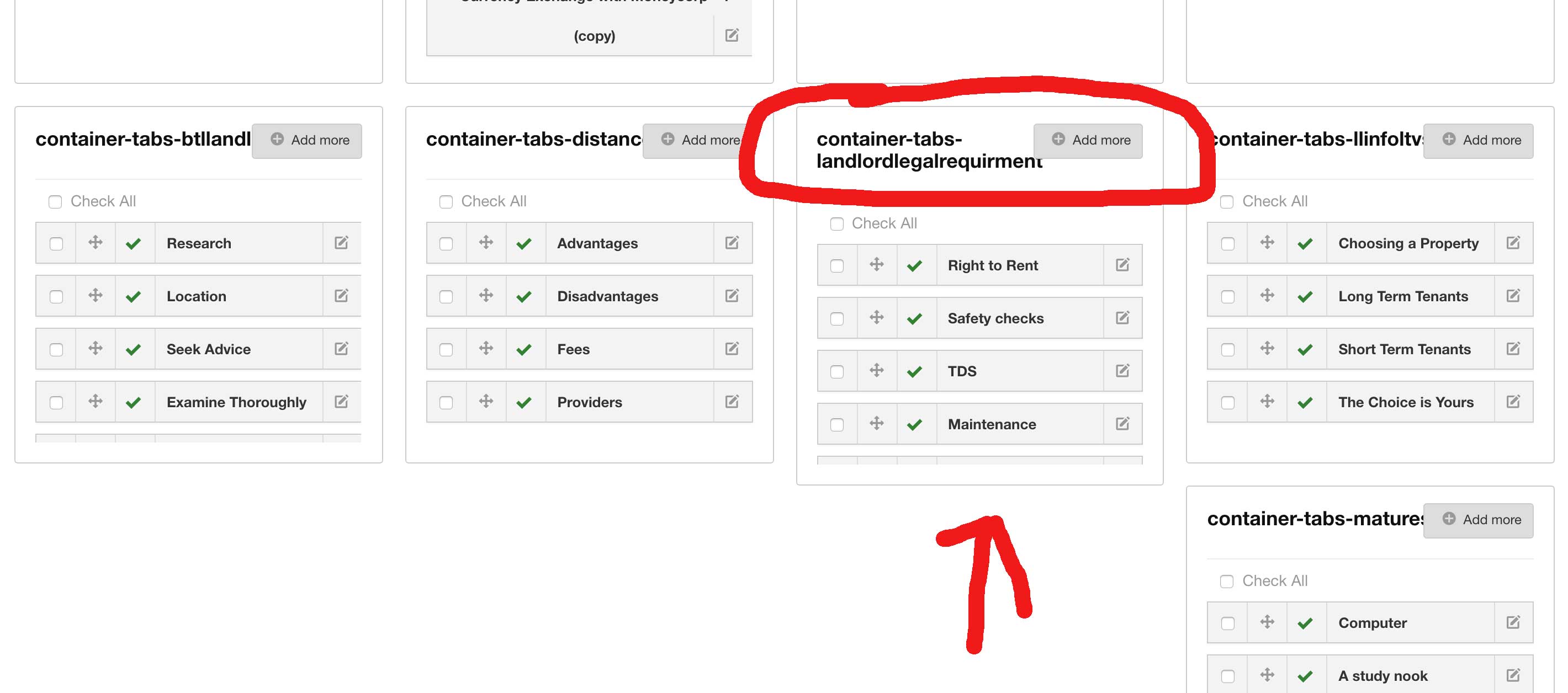
4 if more than 20 positions for modules – they dont stack nicely, 3rd row has 1 module position and then empty space.splico123 Friend
splico123
- Join date:
- January 2007
- Posts:
- 339
- Downloads:
- 80
- Uploads:
- 7
- Thanks:
- 24
- Thanked:
- 93 times in 16 posts
June 24, 2016 at 1:22 pm #943749login on mobile needs some styling fixes since not resizing nicely from landscape to portrait vew.
skylal Friend
skylal
- Join date:
- January 2014
- Posts:
- 20
- Downloads:
- 97
- Uploads:
- 1
- Thanked:
- 3 times in 3 posts
June 25, 2016 at 4:04 am #944039Had a look at your alpha, its full of bugs 🙁 To start with, the sidebar scroll. How to fix? Make it a real sidebar, and use Thea Sticky Scroll – https://github.com/WeCodePixels/theia-sticky-sidebar – I bet no solution can be better than this.
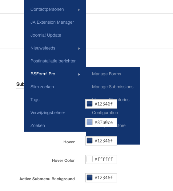
External menu component support- Im not sure if the term I used is right, but some pagebuilders like quix, and other extensions like marketing rocket etc add a menu in administrator section, so that they are more accessible. And JA admin doesn’t seem to encourage them. Screenshot- http://prntscr.com/bkr5t9 where the word "quix" is highlighted menu I am speaking of
The best thing I loved about JA Admin is my ability to search from the dashboard and edit modules directly ___ But however until the sidebar is fixed, I dont believe anyone would have anything to report 🙁
skylal Friend
skylal
- Join date:
- January 2014
- Posts:
- 20
- Downloads:
- 97
- Uploads:
- 1
- Thanked:
- 3 times in 3 posts
June 25, 2016 at 4:18 am #944041http://prntscr.com/bkr75v And forgot to add, JA Admin doesnt seem to like pre-styled backends either..
Arvind Chauhan Moderator
Arvind Chauhan
- Join date:
- September 2014
- Posts:
- 3835
- Downloads:
- 74
- Uploads:
- 92
- Thanks:
- 1240
- Thanked:
- 1334 times in 848 posts
June 27, 2016 at 4:04 am #944413@splico
Please provide screenshot for this >> 4 if more than 20 positions for modules – they dont stack nicely, 3rd row has 1 module position and then empty space.
@skylal >> All points noted and added to backlog. Sidebar needs fix for sure. Lets see how devs can get all the issues fixed with simple fix.
splico123 Friend
splico123
- Join date:
- January 2007
- Posts:
- 339
- Downloads:
- 80
- Uploads:
- 7
- Thanks:
- 24
- Thanked:
- 93 times in 16 posts
June 28, 2016 at 7:58 am #944761Here is another bug, regarding T3 templates with this admin theme on… provided in screenshot you will see styling issues. you will see it when you check screenshot, all dropdowns missaligned etc.
splico123 Friend
splico123
- Join date:
- January 2007
- Posts:
- 339
- Downloads:
- 80
- Uploads:
- 7
- Thanks:
- 24
- Thanked:
- 93 times in 16 posts
June 28, 2016 at 8:08 am #944766here you can see missalignment in module section when module name has more than one row in title.
Arvind Chauhan Moderator
Arvind Chauhan
- Join date:
- September 2014
- Posts:
- 3835
- Downloads:
- 74
- Uploads:
- 92
- Thanks:
- 1240
- Thanked:
- 1334 times in 848 posts
June 29, 2016 at 4:49 am #945227Hey Splico,
Can you add me to skype : joomspot or email me a temp admin login of the site to arvind@joomlart.com . I would like to see that site in question and how you are using the template, would help me to debug the issue too.
Thanks
Arvind
tom_laan84 Friend
tom_laan84
- Join date:
- June 2008
- Posts:
- 348
- Downloads:
- 142
- Uploads:
- 30
- Thanks:
- 88
- Thanked:
- 67 times in 11 posts
June 29, 2016 at 8:44 am #945360tom_laan84 Friend
tom_laan84
- Join date:
- June 2008
- Posts:
- 348
- Downloads:
- 142
- Uploads:
- 30
- Thanks:
- 88
- Thanked:
- 67 times in 11 posts
June 29, 2016 at 8:52 am #945364tom_laan84 Friend
tom_laan84
- Join date:
- June 2008
- Posts:
- 348
- Downloads:
- 142
- Uploads:
- 30
- Thanks:
- 88
- Thanked:
- 67 times in 11 posts
June 29, 2016 at 8:54 am #945366The footer text and joomla icon needs independent color field. Else you can’t have light background and dark button with light text.
tom_laan84 Friend
tom_laan84
- Join date:
- June 2008
- Posts:
- 348
- Downloads:
- 142
- Uploads:
- 30
- Thanks:
- 88
- Thanked:
- 67 times in 11 posts
June 29, 2016 at 8:54 am #945368tom_laan84 Friend
tom_laan84
- Join date:
- June 2008
- Posts:
- 348
- Downloads:
- 142
- Uploads:
- 30
- Thanks:
- 88
- Thanked:
- 67 times in 11 posts
June 29, 2016 at 8:58 am #945370This looks shit. 3 different styles / heights next to eachother.
Also added a screen with a quick fix (you will need to edit better way). But it shows it does not need much.
-
tom_laan84 Friend
tom_laan84
- Join date:
- June 2008
- Posts:
- 348
- Downloads:
- 142
- Uploads:
- 30
- Thanks:
- 88
- Thanked:
- 67 times in 11 posts
June 29, 2016 at 9:15 am #945383tom_laan84 Friend
tom_laan84
- Join date:
- June 2008
- Posts:
- 348
- Downloads:
- 142
- Uploads:
- 30
- Thanks:
- 88
- Thanked:
- 67 times in 11 posts
June 29, 2016 at 9:21 am #945388Screen width 953px screws up top bar for no reason (ton of free space) and the menu does not slide out anymore.
AuthorPostsThis topic contains 42 replies, has 15 voices, and was last updated by
 Ninja Lead 8 years ago.
The topic ‘Bug Reports here’ is closed to new replies.
Jump to forum


