-
AuthorPosts
-
 carlucci
Friend
carlucci
- Join date:
- November 2006
- Posts:
- 509
- Downloads:
- 195
- Uploads:
- 108
- Thanks:
- 172
- Thanked:
- 17 times in 3 posts
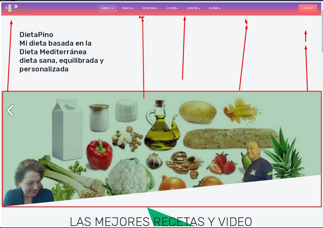
October 19, 2017 at 6:25 am #1068734Can the cover image be reduced? It’s huge! http://pino.dietapino.com/index.php/es/
The image display I want it to be like: http://pino.dietapino.com/index.php/es/blogs.html Regards , Carlucci
-
This topic was modified 7 years, 2 months ago by
 carlucci.
-
This topic was modified 7 years, 2 months ago by
 carlucci.
 Pankaj Sharma
Moderator
Pankaj Sharma
- Join date:
- February 2015
- Posts:
- 24589
- Downloads:
- 144
- Uploads:
- 202
- Thanks:
- 127
- Thanked:
- 4196 times in 4019 posts
October 20, 2017 at 2:55 am #1068971Hi
This is background image used in this place and there is login module over it,
the background size is 100% and it will increase as per the item present over it.
For example the login module height.
See if there is no module height auto reduced http://prntscr.com/gzmheiRegards
1 user says Thank You to Pankaj Sharma for this useful post
 carlucci
Friend
carlucci
- Join date:
- November 2006
- Posts:
- 509
- Downloads:
- 195
- Uploads:
- 108
- Thanks:
- 172
- Thanked:
- 17 times in 3 posts
October 20, 2017 at 4:53 am #1069017 Pankaj Sharma
Moderator
Pankaj Sharma
- Join date:
- February 2015
- Posts:
- 24589
- Downloads:
- 144
- Uploads:
- 202
- Thanks:
- 127
- Thanked:
- 4196 times in 4019 posts
October 20, 2017 at 5:31 am #1069021HI
its different module as compare to masthead showing on the blog page.
You can see the spotlight module published on this position that has a special style for the home page.
If you want to use the masthead on the homepage, please check the homepage menu template style has the masthead position and publish the masthead module
Both pages are completely different blocks.1 user says Thank You to Pankaj Sharma for this useful post
 carlucci
Friend
carlucci
- Join date:
- November 2006
- Posts:
- 509
- Downloads:
- 195
- Uploads:
- 108
- Thanks:
- 172
- Thanked:
- 17 times in 3 posts
October 20, 2017 at 5:45 am #1069023This reply has been marked as private. Pankaj Sharma
Moderator
Pankaj Sharma
- Join date:
- February 2015
- Posts:
- 24589
- Downloads:
- 144
- Uploads:
- 202
- Thanks:
- 127
- Thanked:
- 4196 times in 4019 posts
October 20, 2017 at 6:17 am #1069029This reply has been marked as private. carlucci
Friend
carlucci
- Join date:
- November 2006
- Posts:
- 509
- Downloads:
- 195
- Uploads:
- 108
- Thanks:
- 172
- Thanked:
- 17 times in 3 posts
October 20, 2017 at 6:30 am #1069030Yes that works.
Joomla with the uppercase J Pankaj Sharma
Moderator
Pankaj Sharma
- Join date:
- February 2015
- Posts:
- 24589
- Downloads:
- 144
- Uploads:
- 202
- Thanks:
- 127
- Thanked:
- 4196 times in 4019 posts
 carlucci
Friend
carlucci
- Join date:
- November 2006
- Posts:
- 509
- Downloads:
- 195
- Uploads:
- 108
- Thanks:
- 172
- Thanked:
- 17 times in 3 posts
October 20, 2017 at 10:47 am #1069102This reply has been marked as private. carlucci
Friend
carlucci
- Join date:
- November 2006
- Posts:
- 509
- Downloads:
- 195
- Uploads:
- 108
- Thanks:
- 172
- Thanked:
- 17 times in 3 posts
October 20, 2017 at 10:53 am #1069107Thank you very much for your patience with me.
Regards , Carlucci
 carlucci
Friend
carlucci
- Join date:
- November 2006
- Posts:
- 509
- Downloads:
- 195
- Uploads:
- 108
- Thanks:
- 172
- Thanked:
- 17 times in 3 posts
October 20, 2017 at 8:47 pm #1069207I would like, if possible, that the cover image would look like: see screenshot
My css code:
.layout-home .t3-masthead .t3-masthead-mask {height: 50%;width:100%}
.t3-sections .t3-module { padding-top: 30px; padding-bottom: 100px;}
I’ve disabled my code until you give me the okay.Regards , Carlucci
 Pankaj Sharma
Moderator
Pankaj Sharma
- Join date:
- February 2015
- Posts:
- 24589
- Downloads:
- 144
- Uploads:
- 202
- Thanks:
- 127
- Thanked:
- 4196 times in 4019 posts
October 23, 2017 at 1:43 am #1069399Hi
Below code.t3-sections .t3-module { padding-top: 30px; padding-bottom: 100px;}Will work for all module you will place under the t3section modules.
Please check all other pages of your site if you are not using other modules in this place you can use the code.Regards
1 user says Thank You to Pankaj Sharma for this useful post
 carlucci
Friend
carlucci
- Join date:
- November 2006
- Posts:
- 509
- Downloads:
- 195
- Uploads:
- 108
- Thanks:
- 172
- Thanked:
- 17 times in 3 posts
October 23, 2017 at 6:15 am #1069478Thank you very much.
If it can not be done as seen in the previous screenshot then please tell me and I’ll leave it as it is now. Pankaj Sharma
Moderator
Pankaj Sharma
- Join date:
- February 2015
- Posts:
- 24589
- Downloads:
- 144
- Uploads:
- 202
- Thanks:
- 127
- Thanked:
- 4196 times in 4019 posts
October 23, 2017 at 7:10 am #1069488If it can not be done as seen in the previous screenshot then please tell me and I’ll leave it as it is now.
Hi
I do not understand your last post,
Kindly share more details about this question with screenshot.Regards
1 user says Thank You to Pankaj Sharma for this useful post
 carlucci
Friend
carlucci
- Join date:
- November 2006
- Posts:
- 509
- Downloads:
- 195
- Uploads:
- 108
- Thanks:
- 172
- Thanked:
- 17 times in 3 posts
October 23, 2017 at 8:51 am #1069514Look at the cover in screenshot.
Move the cover up.
If it can not
or do not understand what I say then I have to close the thread.
I think it’s pretty clear, visually. Maybe not verbally.
Regards, Carlucci
AuthorPostsThis topic contains 15 replies, has 2 voices, and was last updated by
 Pankaj Sharma 7 years, 2 months ago.
We moved to new unified forum. Please post all new support queries in our New Forum
Jump to forum


