-
AuthorPosts
-
toloekka Friend
toloekka
- Join date:
- September 2007
- Posts:
- 117
- Downloads:
- 168
- Uploads:
- 35
- Thanks:
- 6
- Thanked:
- 7 times in 1 posts
July 8, 2014 at 12:19 pm #199522Hi.
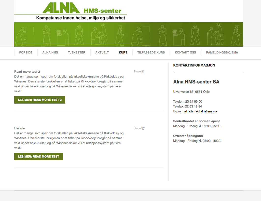
I have two articles in a category called “Test kategori”. Then I use «Category Blog” for a menu called “Kurs” to show those articles in that category, and when clicking on the menu “Kurs”, I got a column where I see a Share icon. I will not have the “Share” icon or that column where the icon are at all. I managed to remove the «Share» icon in the template (Off for «Addthis integration»), but I still wont to remove the column where the «Share» icon was.
When using «Single article» for the menu same menu «Kurs», the column disappear.(In the right place of the template (sidebar), I have a module where you see the “Kontaktinformasjon” info).
I am using Joomla 3.2.3.
Hope someone can help even that the Site is not online.
Kind Regards
Tom Løkka
 Pankaj Sharma
Moderator
Pankaj Sharma
- Join date:
- February 2015
- Posts:
- 24589
- Downloads:
- 144
- Uploads:
- 202
- Thanks:
- 127
- Thanked:
- 4196 times in 4019 posts
July 8, 2014 at 2:30 pm #541560HI
IF you set the >>Off for «Addthis integration from template option
then it should not be there .
If you want i can check it for you . PM me admin credentials of your site .Otherwise you can try this
Go to template/ja Magz/css/custom.css (if there is no custom.css file , then create a file >custom.css)
and this code
.comment-count a {

display: none; }
Hope it helps
toloekka Friend
toloekka
- Join date:
- September 2007
- Posts:
- 117
- Downloads:
- 168
- Uploads:
- 35
- Thanks:
- 6
- Thanked:
- 7 times in 1 posts
July 8, 2014 at 5:35 pm #541598Hi and thanks pankajsharma 🙂
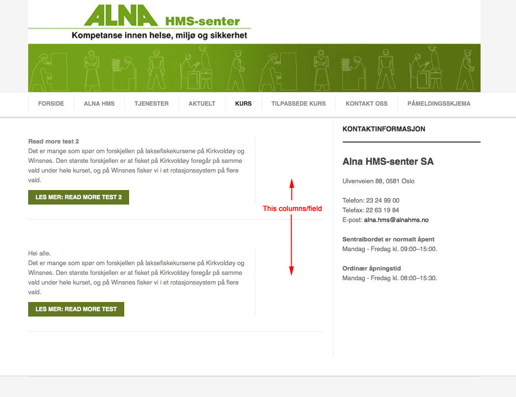
I managed to remove the “Share” icon itself by setting “OFF” for «Addthis integration”, but I also will remove the column/filed where “Share” icon was. How can I do that?
See my attachment.Kind Regards
Tom Løkka
 Pankaj Sharma
Moderator
Pankaj Sharma
- Join date:
- February 2015
- Posts:
- 24589
- Downloads:
- 144
- Uploads:
- 202
- Thanks:
- 127
- Thanked:
- 4196 times in 4019 posts
July 9, 2014 at 4:02 am #541651HI
If you want to remove/Hide the info. panel from blog layout ,
Try this
Add this css rule in your custom.css file.blog .left-blogitem {
width: 100%;
background: none;
}.blog .right-blogitem {
display: none;
}Let me Know if it helps
toloekka Friend
toloekka
- Join date:
- September 2007
- Posts:
- 117
- Downloads:
- 168
- Uploads:
- 35
- Thanks:
- 6
- Thanked:
- 7 times in 1 posts
July 9, 2014 at 7:56 am #541697Hi and thanks again pankajsharma 🙂
That did remove the field so I am happy.
Just wonder, if that field is just for icons/info, would it not be better to have the icons/info field above or under the article so the article text/field gets wider (like it now does when removing the icons/info field)?
Kind Regards
Tom LøkkaAuthorPostsViewing 5 posts - 1 through 5 (of 5 total)This topic contains 5 replies, has 2 voices, and was last updated by
toloekka 10 years, 6 months ago.
We moved to new unified forum. Please post all new support queries in our New Forum
Jump to forum


